It doesn’t matter whether visitors get there via some old page they bookmarked, a referral from another site to a page that no longer exists, or some internal issue on your site. What matters is that now, your site’s user is upset. If you think dealing with a neutral visitor with the attention of a lit match is difficult, just imagine how much harder it is to deal with that same user now that he or she’s annoyed.
That’s the bad news.
The good news is that error pages have been around for a while now, and while we’re learning about new techniques to improve them all the time, there are some solid practices that every site should follow.
Know your “recovery” rate
Just about every clickstream tool there is—from Omniture, to WebTrends, to Google Analytics—has a measure for the exit rate. Here’s the thing: on almost any page on your site, the exit rate is useless. The last page users view before leaving the site tells you nothing. A person who viewed the home page and left on a product page may or may not have gotten what he or she needed.
The exit percentage is pretty useless UNLESS it’s for one of these two areas:
- A step in the checkout process, or similar linear funnels
- The website’s 404 error page
For checkout processes, the exit rate determines whether you have a leaky bucket, and you can fix the pages with the highest exit rates. For 404 error pages, the exit rate determines the percentage of people who see the error and never recover.
If you customize your 404 page and that number goes down significantly, you’ll know you’re on to something.
Be more helpful than creative
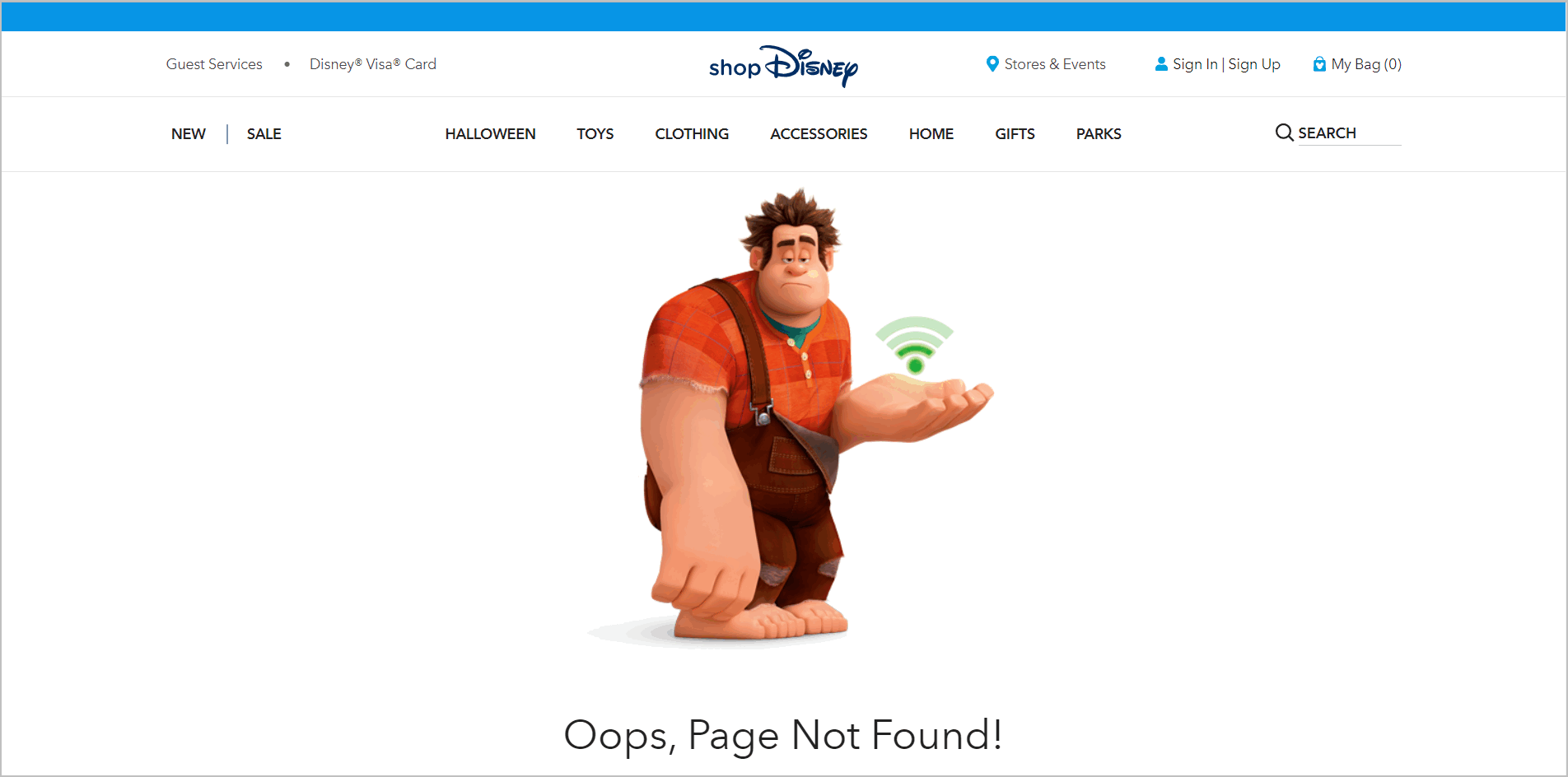
If you’re Disney, you can get away with error pages like this:
If a site is not very task-oriented, you can get away with cute. Just about everyone else who is not Disney should stay away from this.
Everyone else needs to offer more.
Providing more is not that complicated: a good error page is easy to understand, accurate, and helpful.
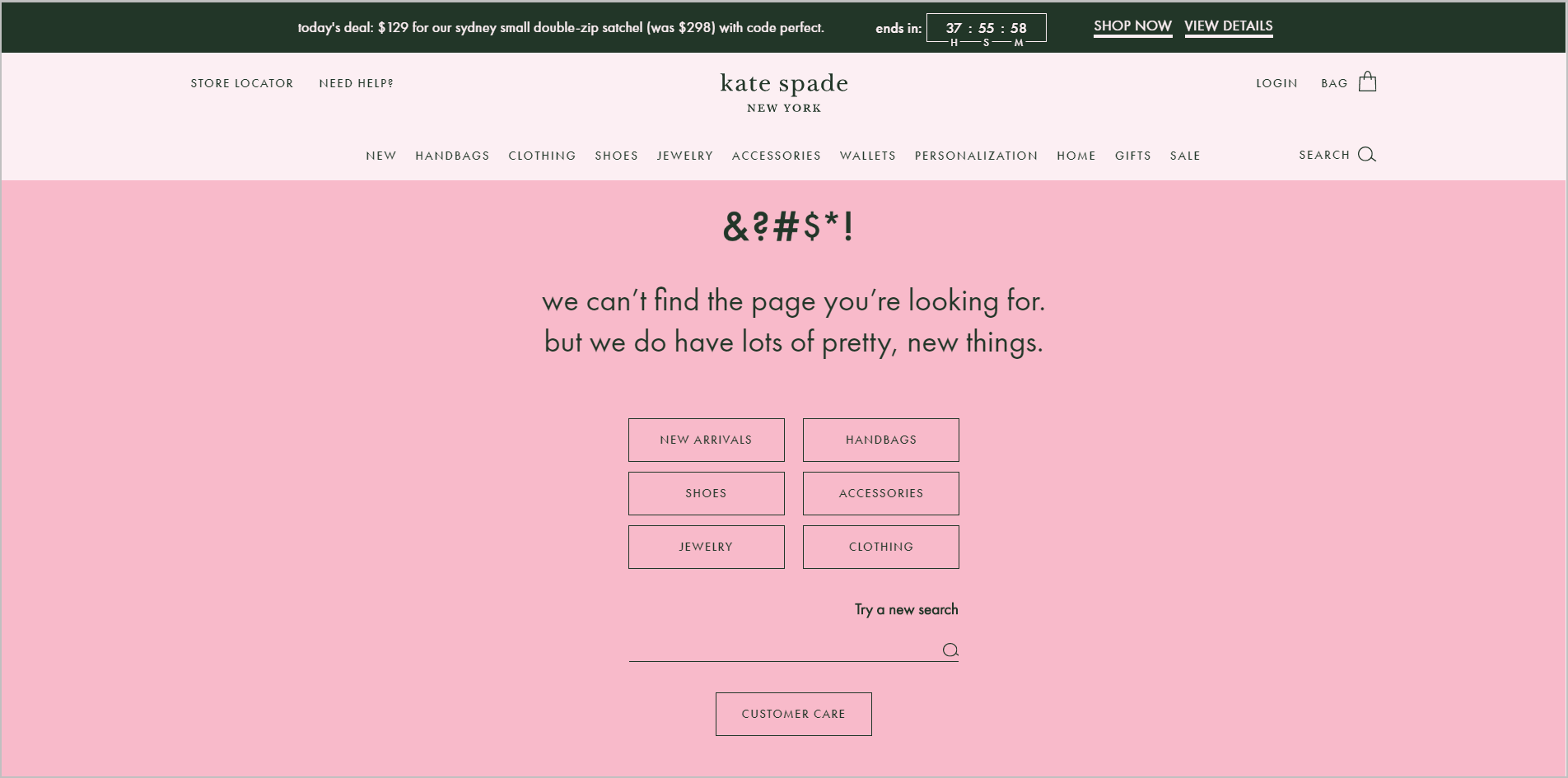
In the early days of the web, error pages were these strange messages that very few people understood. Nobody knew how to design them better, so everybody just kind of accepted it. But since then, the default 404 page become really outdated. One of the reasons is that it’s not hard to design pages like this:
Note the simplicity – the user can choose from the categories, run a search, or go to “Customer Care”. It also helps that it’s written for humans, and it’s not a type 4 error or some other esoteric message. What’s more, it points the user in the right direction in a voice that still communicates the brand’s identity.
It helps to know their tasks
Which of these pages is more likely to be helpful for people using hotel booking websites?
For websites that are strongly associated to one type of task, the Agoda.com model wins, hands down. The 404 error page allows the user to recover right then and there. On the other hand, Trivago.com’s 404 page, while creative, doesn’t provide options to help users get back on track.
The example above is for hotels, but this applies for any commerce-based task on the web: if you know what your user’s tasks are likely to be, put those on your error page. You’ll help a lot of them.
Recovery matters
Put a connected computer in front of a person, and errors are inevitable, even for sites that are really usable. The worst thing you can do for those people is say, “404 – File or directory not found,” and then not leave them any options.
That’s still what a considerable number of websites do. Don’t be one of them. You need to customize your 404 page, base the content on known tasks, and check if your users can recover more.
It doesn’t take a lot of work to help your users precisely at the point when they need the most help.
This article originally appeared in Tim’s Monetate column November 18, 2014 and has been edited to reflect 404 error pages in 2019.


