Don’t Require Registration
The first thing e-commerce websites can do to make checkouts faster is to allow customers to complete their purchases without having to register or create an account. As far back as 2009, noted usability and user experience expert Jared Spool pointed out how annoying and frustrating compulsory registration is, not only for first-time customers but even for repeat purchasers. Usability studies conducted by Spool and his colleagues showed, for instance, that customers hated encountering the registration form, as it forced them to do some really serious memory processing: that of remembering whether they already had an account with the website or not, and then recalling what password they used when they registered.
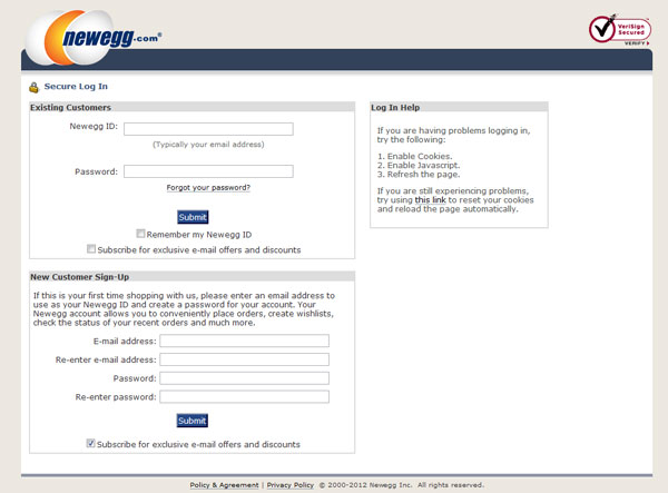
Three years later, you’d expect that e-commerce websites had evolved. Apparently not. For instance, a customer trying to buy a laptop from Newegg’s website has to go through a five-step checkout process. After adding a product to the cart, the customer is first taken to an upsell page, then to the shopping cart, and if she manages to find the checkout button (which is below the fold), she will be taken to the “terms and conditions” page. Just when the customer thought she was seeing the light at the end of the tunnel, the dreaded registration page appears:
Make Your Shipping and Delivery Policies Clear
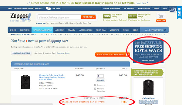
Customer experience during checkouts can also be improved by providing clear and easily identifiable shipping and delivery policies. Make sure your customer knows exactly how much she will be charged and that you don’t surprise her with extraneous fees (e.g., handling charges) during checkout. If you offer free shipping, then make that prominent during the entire checkout process. Zappos.com, for instance, highlights its remarkable 365-day returns policy and free shipping offer through a prominent banner on the right hand of the page. It then reinforces this offer by indicating “free” on the part of the invoice where the shipping cost should be displayed just below the purchase subtotal:
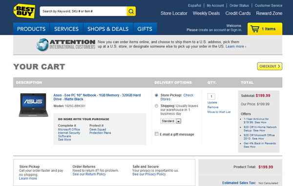
When you compare Zappos’ cart with BestBuy.com, which also offers free shipping but chose to display a vague policy on international orders instead, you instantly see the difference:
Now, since BestBuy.com has stirred up the topic of international orders, I have to say this: please do not waste your customers’ time by misleading them into thinking that they can purchase from you. If you are currently not able to ship to international addresses, then tell customers before they start the checkout process about whatever shipping restrictions you might have.
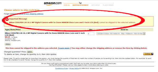
BestBuy.com is not the only big retailer guilty of setting up international customers for annoying and dissatisfying experiences. You’d think retailing giant Amazon.com would know better given its highly advanced personalization and targeting strategies. Try shopping on Amazon as an international customer, however, and you will be surprised at how difficult it is to make a purchase. I have no doubt that the biggest pet peeve of international customers is how Amazon.com will allow customers to add an item to their carts only to proceed to checkout and be told that the product they want and are ready to pay for cannot be delivered to their (international) shipping address. And yes, this happens even when you’re signed in and Amazon supposedly knows which country you\’re shopping from.
Surely there is a better way for Amazon.com to handle international customers, such as showing signed-in customers only those items that can be shipped to international addresses. Otherwise, I can only imagine that if I lived in another country, I would be extremely discouraged to go browsing at Amazon the next time I was buying online.
No doubt there are other simple methods to make your cart experience more customer-friendly, but you can see by these two tips that it doesn’t take a full redesign in order to make major improvements. Sometimes it’s as easy as moving your accepted payment icons from page three to page one of your checkout. After all, if you want your customers’ money, you’ve got to make it easy for them to give it to you.
This article originally appeared in Tim’s ClickZ column December 11, 2012
Take your conversions to the next level.Learn how our experts at SiteTuners can help kickstart your conversion rate optimization process or get better results from your CRO efforts. Give us 30 minutes, and we’ll show you a roadmap to your digital growth! |
