 Amazon gets a bad rap for cluttered pages.
But for every one thing Amazon gets wrong, it gets dozens of things right.
It certainly nails personalization. It nails testing speed and iteration. Perhaps most importantly, it nails the one thing a lot of other sites miss – persuasion.
The company has been testing elements that affect what Human Factors International calls PET design: factors that affect persuasion, emotion, and trust. And what’s interesting is that once you observe and unpack what Amazon does, you’ll realize a fair bit of it is rooted in uncertainty and fear – but not in an overtly bad way, just in a way that recognizes how brains work.
Scarcity and the Fear of Missing Out
When you get to a site, any site, you almost never carry a ton of information with you. You’re usually looking for something, and you hope that the site carries what you need.
You’re uncertain.
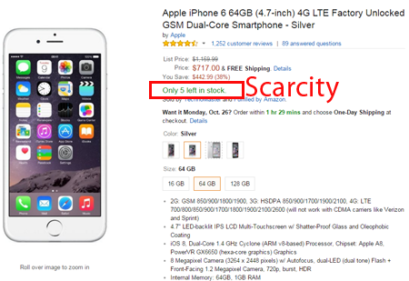
That’s an important frame of mind when you’re confronted with pages like this one:
Emphasis ours, of course. But the point stands – when you’re uncertain and looking for solid footing, just about the most convincing thing you can see is that something is available, but only if you act now.
- The conversation you have with the site changes from “novelty” or “looking for benefits,” to “loss aversion.” Once users feel they almost have it, you’ve motivated them – social research shows that loss aversion is about twice as powerful a motivator than hope for gains.
- Negative consequences work particularly well when people are uncertain, so this scenario capitalizes on the right technique (scarcity) delivered at exactly the right time (user uncertain looking for solid footing)
Social Proof and the Fear of Not Belonging
The other tendency people have when uncertain is to not look inward, logically, for answers. Instead, they turn outward, to see what others would do, or what others have done.
That a lot of others have done the same thing you’re about to do is a “shortcut” the brain takes to make a decision, to say “okay, this works.” Logically, this isn’t true, and there may be a better way to make a decision. But bereft of more information, people would usually take the shortcut.
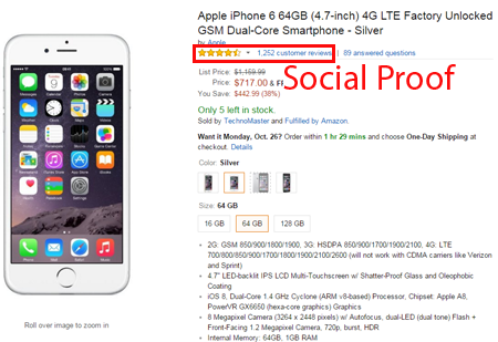
That’s important context when we re-examine the product page:
Just like the content designed to get users to think about scarcity, the social proof indicators are front and center, available for you to view above the fold, and anchored by an image to get you to look there.
By contrast, related products, other things you have viewed, and the rest of the “clutter” Amazon typically gets slammed for are below the fold.
The reason is simple: the fear of not belonging works particularly well here, especially combined with loss aversion from the number of items left in stock, and with all the “savings” that you’re supposed to get when you compare it to the list price.
Putting Fear to Work
There’s obviously a way to use too much fear that would counteract the benefits of the technique described above. And of course, if you don’t have the basics down, like having a clear call to action, adding fear to the equation likely won’t help.
But harnessed correctly, the persuasion techniques described here have the potential to make a lot of things about your product page work better. If you don’t test against elements for scarcity and social proof, you’re just leaving money on the table.


