People like to think they’re rational creatures. But they’re really not.
The human brain is on auto-pilot most of the time because the conscious part is expensive to operate.
So, in online marketing, it doesn’t make sense to try to appeal to the audience’s rational side. The parts of the brain that are mostly in charge are those responsible for …
… reacting (the part that makes sure we stay alive) and
… feeling (the part that stores memories and remembers what we like or dislike).
Remember that these parts are lazy, impatient, and automatic.
If you want visitors to act, take advantage of the brain’s biases, and remember the following when designing online experiences:
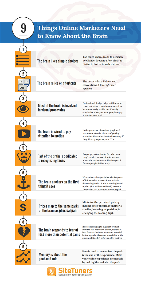
1. The brain likes simple choices
The brain wants choices to be easy. Too much choice will overwhelm the brain and result in the customer putting off making the decision.
What it means for online marketers:
- Present users with a number of simple choices. Scrolling is only convenient if it’s quick visual scanning of physical items that are substantially different visually.
- When appropriate, guide users with wizards. Instead of overwhelming users with dozens of choices, ask them a few questions to lead them to what they’re looking for.
- When designing the Information Architecture for catalog navigation, remember that it’s better to have more easy clicks than a few difficult clicks. So, go deep and narrow, as opposed to shallow and wide.
- Make choices visually obvious. Make it immediately clear how one option is different from others – focus, emphasize, or enlarge distinguishing characteristics.
2. The brain likes shortcuts
The brain is inherently lazy, so it relies on shortcuts to process information.
What it means for online marketers:
- Follow web conventions. Conventions let users interact with websites efficiently. For instance, on an e-commerce site, users expect to find the shopping cart on the upper right-hand corner of the page. Similarly, users expect to be taken to the homepage when they click on your logo at the top of the page.
- Leverage social proof. People use reviews and testimonials as a shortcut to decision-making. They’re huge trust elements that can either make or break a sale, so implement them with care.
Learn how to maximize the benefits of user reviews.Read “8 Customer Reviews Best Practices to Optimize Conversion Rates” |
3. Most of the brain is involved in visual processing
People are visual creatures – more than half of our brain is designed to process visual information.
And visual processing is quick. In fact, we form an impression of something we see in 50 milliseconds or 1/20th of a second. This means we make judgments almost as fast as the eye can take in information.
What it means for online marketers:
- Don’t get disqualified based on appearance. A professional, modern design definitely helps build instant trust online. However, you also have to make sure that trust elements such as your phone number, security symbols, marquee client and media mention logos, and testimonials are visible on the page.
- Visually bias what you want people to pay attention to. You can manipulate visual emphasis through:
- Screen position
- Amount of visual space
- Background color
- Anchoring images
- Contrast or uniqueness
- Motion
Speaking of motion …
4. The brain is wired to pay attention to motion
We can’t help but look at motion. Historically, we’ve had this for survival purposes – if a tiger is jumping out at you, you need to be aware of that right away.
What it means for online marketers:
- On a web page, motion is the nuclear option. If motion is present, text and graphics do not stand a chance of getting attention.
- Use animation and videos sparingly. Use them only if they directly support your main CTA.
5. There’s a part of the brain dedicated solely to recognizing faces and people
This part of our brain is critical for social reasons. We pay extra attention to faces because they’re a rich source of information about the environment.
What it means for online marketers:
Use images of faces and people deliberately. Direct the gaze of the face towards what you want people to interact with (e.g. your form or CTA). Avoid photos of people looking past your page as they will direct attention elsewhere.
6. The brain anchors on the first thing it sees
We evaluate things against the first piece of information we see.
For instance, if you were shopping for wine and you see a bottle that costs $10 and another that costs $50, you’d think the second price ridiculous. But if you see the $50 bottle first, then you’ll consider getting a mid-priced bottle (not the cheapest one because you’ll be suspicious of its quality).
What it means for online marketers:
- Show price in decreasing order. If you show the least expensive item first, then you’ll be pushing a rock uphill.
- Add a new high-end option (which will not sell well). This will frame the choice that you want the customer to pick.
7. Prices map to the same parts of the brain as physical pain
We think of money as a finite resource, so spending money is experienced as a loss of resources. And that maps to the same part of the brain that reacts to other kinds of loss.
What it means for online marketers:
- Make prices physically shorter and smaller to minimize perceived pain.
- If it’s clear that the number represents a price, drop the currency symbol; the symbol itself represents pain in the customer’s mind.
- Strip out extra characters. For instance, $2000 seems lower than $2000.00.
- Lower the position of the price.
- Change the leading digit, if possible, as that’s what our brain pays attention to. For instance, instead of $50 make the price $49.
- Decrease the number of digits, if you can, to make the price seem smaller (e.g. $100 vs. $99).
- If you’re selling high-priced products, make them more appealing by dividing the price into smaller units.
- Roll up the difference in lifetime costs when comparing to higher-priced alternatives.
Learn more about optimizing price presentation. |
8. The brain responds to fear of loss more than potential gains
Loss avoidance is a more powerful motivator than upside gain. If you want people to act with a sense of urgency, tap into their fear of missing out.
What it means for online marketers:
- Instead of focusing on your product or service’s best features, reword your messaging to highlight product or service features that are scarce, rare, or not widely available elsewhere.
- Nudge people to take action by indicating the number of stock items left before a product becomes unavailable or the amount of time left before an offer expires.
9. Memory is about the peak-end rule
In general, people tend to remember the peak and the end of the experience. This is just as true for movies as it is with online shopping.
What it means for online marketers:
- Make your site or app memorable by making the ending also the peak of the experience. Most site visitors are not ready to convert in the same session or visit. Bart Schutz, Co-Founder of Online Dialogue, points out that sites are dependent on people coming back. And people will only come back if their memory of the experience is pleasant.
- Pay attention to areas where people are likely to exit your site. Take a look at the top exit pages from Google Analytics, Adobe Analytics, or whatever your traffic monitoring tool is, and then make sure the experience works really well in those areas. Don’t leave poorly written messages after users submit a form, make sure people who drop off items in the cart understand they can come back and find their items saved, and ensure that your 404 error pages are not cold, and that they actually help people recover.
Appeal to the Irrational Brain
Stop talking to your visitors’ logical side – that’s asleep majority of the time. If you understand how the brain perceives and processes information and then optimize for lazy and irrational brains, your visitors will be much more likely to take action.


