Needless to say, if you care about your conversions, you should care about user experience. And with the copious amounts of available information on creating awesome user experiences, you’d think digital marketers would’ve gotten UX design right by now. Well, don’t get your hopes up too much. It turns out that most websites still routinely send UX experts into fits of agitation.
Here are six of the most common design fails that make UX experts cringe:
1. Assuming your users are experts in your site, products and services
“Most companies design their sites based on THEIR perception of their products or services, instead of how the customers understand the problem they need solving.
Avoiding this common design fail takes just a little extra effort. First (and often hardest), accept the notion that you don’t know your users as well as you think. Second, conduct real user research to identify their perception of their problems. Lastly, redesign your site around those perceptions – solve the user’s problem for them. Give them intelligent suggestions.”
Larry Marine
Director, User Experience
Intuitive Design
Connect with Larry on Twitter: @uxstrategy
2. Hiding critical content below the fold
“The absence of any valuable content or even a CTA above the fold in favor of atmospheric imagery and fuzzy ‘brand’ messaging is a disturbing trend. The assumption that people will always a) find your quirky brand messaging remotely compelling, and b) know to scroll just don’t hold up in some cases. Self-inflicted wounds like this drive me crazy.”
Lance Loveday
CEO, Closed Loop
Connect with Lance on Twitter: @loveday
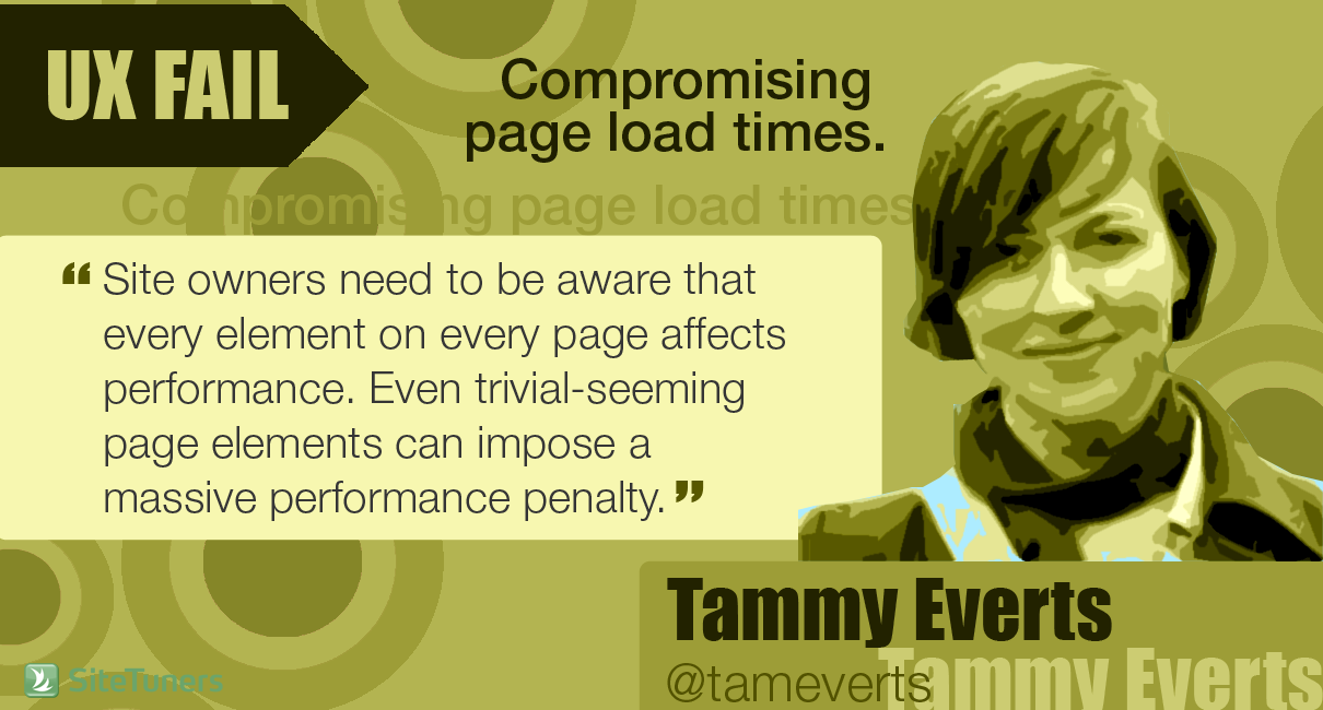
3. Compromising page load times
“I see countless examples of sites that implement new features and functionality without considering what impact this will have on their pages’ load times. This includes things like unoptimized hero images that take precious seconds to download, or third-party tags that block the entire page from rendering.
There’s a direct correlation between load times and conversions — for example, Walmart.com found that, for every second of improvement, they experienced up to a 2% conversion increase. Site owners need to be aware that every element on every page affects performance. Even trivial-seeming page elements can impose a massive performance penalty.”
Tammy Everts
Senior Researcher & Evangelist, SOASTA
Connect with Tammy on Twitter: @tameverts

4. Not focusing on the visitor
“This manifests in many ways, but the two most common are in the choice of language and the organization of the site. Jargon, marketing fluff, and company-focused content don’t help the visitor understand how you can help them. Prioritizing your “About Us” page and prominently displaying “News & Events” on your homepage probably doesn’t give the visitor what they’re looking for. You must understand why visitors are coming to your site; to do that, you must talk to real people.”
5. Not supporting small screens
“You don’t necessarily need a responsive design; there are plenty of solutions that will (generally) make it quick and easy to format (some of) your content for mobile devices. With more and more mobile-only users, increasing use of mobile Internet, and Google starting to devalue sites that aren’t mobile-friendly, this is becoming more important than ever.”
6. Not simplifying data entry
“Forms are easy to do well, but easier to do poorly. Seriously evaluate what information you’re asking for, avoid the default browser formatting, and think about how the form might behave differently when visitors are inputting data with a finger instead of a keyboard/mouse.”
Ian Everdell
Manager, UX & Research
Mediative
Connect with Ian on Twitter: @ianeverdell
Now you know the biggest UX design offenses, go and see if you can help your site avoid any of these.


