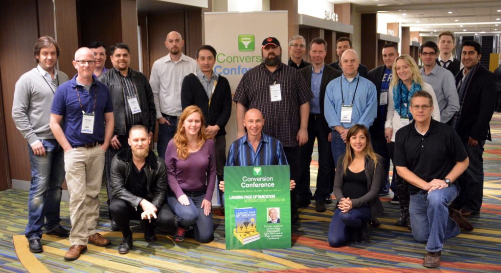
 Thanks to everyone who attended the last Conversion Conference San Francisco 2014, and we’ll see some of you in Chicago. As always, there was a slew of insights from conversion optimization thought leaders. For those who were not able to attend the sessions, here are the most salient points from the conference:
Analytics
Tim Ash notes that what gets measured gets done – establishing a culture of analytics, testing, and conversion is as important as the specific metrics and tests themselves. There are essentially four stages that a company goes through, and you can’t skip your way from being a business with an unoptimized digital presence to a business with advanced optimization techniques.
Tim wasn’t the only one taking people through analytics, though. From desktop to mobile and from B2C to B2B, there was a gamut of useful tidbits:
-
- Conversions aren’t created equal. Some conversions can actually lower revenue, and it’s important to think about the lifetime customer value.
-
- Compare Mondays to Mondays. Day of the week matters quite a bit, and measurement and testing should reflect that.
-
- Some companies are worth observing. 90% of sales happen online, but of the 10% of sales that are online, 30% of them happen on Amazon. It helps that last year, they spent 6.5 billion dollars on R&D
Content Marketing
Content marketing may be a buzzword, but it’s a buzzword with serious results. Not surprisingly, there’s a hefty amount of thought going into the area:
-
- You’re not selling directly with your content distribution plan. You need to do two things: entertain, or teach. For B2B, it’s the latter.
-
- Before, relationships were built directly by people. Now, relationships are built with information. Your content plan matters.
-
- It’s important to understand your buyer personas during the requirements phase. That\’s when you should go and meet them.
-
- You can’t have too much content if you’re measuring effectiveness.
-
- Think about the format you need, from webinars to videos, from product pages to guides, case studies, and White Papers.
-
- If you need new ideas for content, Google Keyword Suggestions are a good place to start.
-
- Quora and Yahoo! Answers are your friends for FAQs about your business and industry.
-
- Hit your headline hard. Content, copy and conversion collide here and now.
-
- Plan ahead. Have an editorial calendar that lists the content types, topics, and a 12-month outlook for selling cycles, holidays, and events.
Mobile Devices and UX
Mobile is, quite understandably, on everyone’s minds right now. From their impact on the marketplace to specific usability-centered tips, mobile got quite a bit of coverage:
-
- Marketing apps are the next wave of digital marketing, and they impact the way people look at landing pages.
-
- You can’t just port your web site, you have to rethink the experience.
-
- Responsive Web Design (RWD) doesn’t always optimize for behavior. The system optimizes for screens. The difference is important.
-
- Mobile versions and RWD can be focused around the desire for something pretty versus the need for something productive. Design for the latter.
-
- Think Homer Simpson when designing for mobile: imagine that your audience is impatient, distracted, and has big thumbs.
-
- Simplify. Think about running a party for 4-year-old kids.
-
- There will be a billion Android devices in the world this year. However, 85% of mobile commerce revenues are on iOS, versus 10% on Android.
-
- 99.5% of smartphone mobile web sessions do not result in a purchase but 65% of email is now opened first on mobile.
Testing
Conversion Conference is probably one of the only events held anywhere where testing as a craft takes more of the spotlight than, say, search. So as expected, there’s a host of useful tips, from strategy to execution:
-
- Cycle times matter for tests. If you fail fast and often, you’re in good shape – you can’t afford to fail slowly.
-
- Be careful about differences in tests. If the change isn’t big enough to notice, it will be tough to say which was better.
-
- If your control page is broken, your test is invalid.
-
- Don’t measure just through the CTA, or just on tools like Optimizely. Figure out the whole story, and connect the dots from the click all the way through to the order, using email and other tools.
-
- Habitual testing pays dividends.
-
- If you’re unsure where you should start testing, go for the pages with high traffic and low conversion rates.
-
- Not all companies use third party tools. For companies like Netflix where A/B testing is critical, 80 tests are running at any given time, and all the tools are in-house.
-
- Don’t just test to fix usability. Conduct tests to maximize emotional engagement.
-
- QA matters. Plan for different devices, operating systems, and browsers.
Usability and Conversion Design
-
- Every test that has ever been done shows conversion is lifted by removing rotating banners.
-
- Your web site is likely broken on one of many screens, and you don’t know it. Screen recording and user testing tools are a must.
-
- Test for your visitors’ browsers and operating systems, not your CEO’s.
-
- QA can drive revenue.
-
- If the visitors don’t see a CTA above the fold, the experience is broken.
-
- If the copy on your web site can’t be understood by a fifth grader, you’re likely doing something wrong.
-
- 99% of what you see is not what comes through your eyes. It is what you infer.
-
- Sometimes, the problem isn’t your landing page. Think about the complete funnel.
-
- Don’t think of everyone in your funnels as the same group of people. They are not.
-
- Think long-term. Most visitors require multiple visits to convert.
-
- Usable is your visitors finding the button. Conversion is your visitors clicking it.
-
- Reserve the top-right corner for support information. Don’t use it for the main CTA.
-
- Learn more is not a Call-to-Action.
Conversion Conference – Now Digital Growth Unleashed!After dozens of shows in the US and Europe since 2010, we are defining a new and more powerful perspective for digital persuasion. Create the most compelling end-to-end customer experiences. Attract, persuade, serve, and the technology to make it happen – we’ve got you covered with four parallel breakout tracks! |
