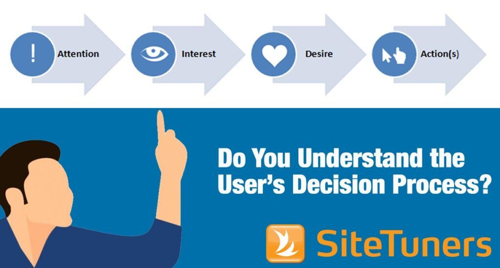
Summary: Website visitors have some level of fear about not accomplishing their task. Scarcity marketing can nudge some of those visitors to convert.
Scarcity Marketing Relies on Consumer Fears
In e-commerce, there are good fears that help drive conversions, and bad fears that dissuade people from making a purchase. You will learn about each of these fears and how to manage them through marketing.
The Good Fears:
- Limited Availability
- Social Proof
- Limited Time Offer
- Date-sensitive Delivery
- Custom Requirements and Preferences
The Bad Fears:
Scarcity marketing relies on pre-existing consumer fears around the shortage of something they want to make a transaction more likely.
For e-commerce websites, these fears are a big part of whether a visitor will become a customer or not. That said, the marketers running a website are not responsible for most of those fears – those come with the territory.
And that has something to do with the fact that website visitors have a task in mind.
- The shopper might want to get flowers delivered on Valentine’s Day, not the day after.
- They want to get a 10 am flight on the 7th, preferably while booking an aisle seat.
- The customer might want to get a non-smoking room because it’s a family vacation.
- They want the promo price for the laptop they’ve had their eye on for a while.
- And they want to avoid getting hit by exorbitant shipping fees.
Most of the fears are inherent to a situation – marketers don’t create them. However, marketers control how much attention gets paid to the elements that scare visitors.
In e-commerce, there are good fears that help drive conversions, and bad fears that dissuade people from making a purchase.
If you’re a marketer in this space, your job is to make sure that the inherent fear in a given situation gets managed. The elements that make visitors more or less afraid should be carefully curated.
The Good Fears: Employing Scarcity Marketing in E-commerce
BJ Fogg, a social scientist, notes that the job of a behavior designer is to put hot triggers in the path of motivated people.
For e-commerce sites, scarcity marketing means driving attention to two things:
- Elements that will get people to act
- Elements that will get people to act sooner
There are a few ways to do that.
1. Limited Availability: There are 2 items left in stock
There’s a lot of uncertainty for online shoppers. Finding the right product at the right price is not a given. Some of that shopper uncertainty works against conversions, but there’s a fair bit of it that allows e-commerce sites to turn tentative visitors into customers.
Persuasion expert Robert Cialdini notes that a good strategy in marketing is to honestly tell people what they stand to lose. Scarcity marketing can be a powerful persuasion tool when used in the right context.
By indicating the number of stock items left before the product becomes unavailable, you’re convincing a visitor to make the decision sooner rather than later. You’re essentially nudging people in the price-and-feature-comparison phase to decide soon, or risk losing the product. The focus for the visitor becomes loss aversion, and that can help put a product you’re selling in context.
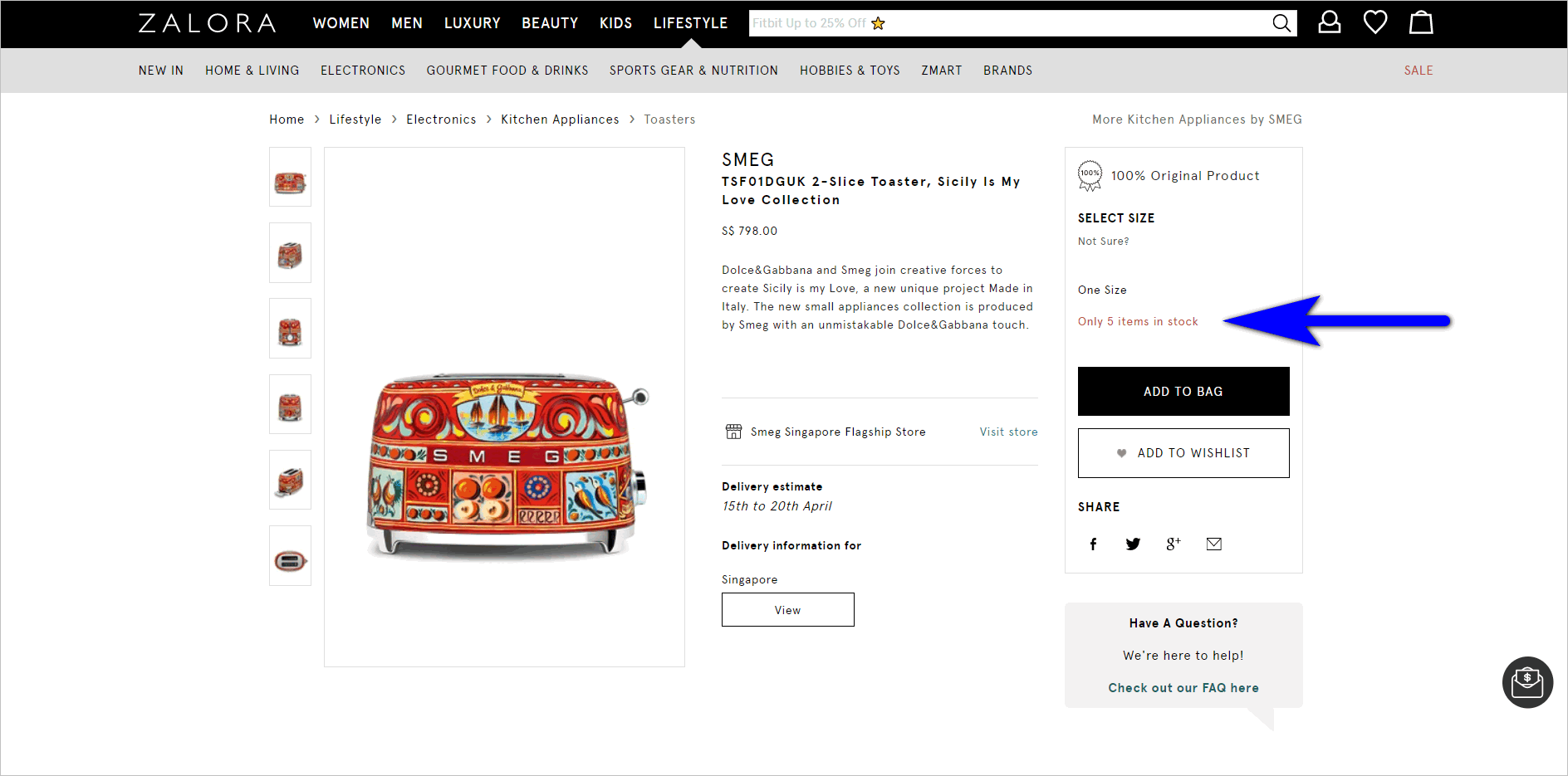
Zalora.com.sg’s product detail page misses the mark by not placing the price in the action block. However, the website does a good job of employing scarcity marketing by indicating the number of stock items left.
Displaying the number of stock items left, particularly for items that tend to run low pretty often, can be a powerful motivator. However, resist the urge to create fake scarcity – you should be honest about your stock items left.
2. Social Proof: Someone in Los Angeles bought a T-shirt
When people are uncertain, availability isn’t the only thing you can test to get people to act. Marketers have another lever: social proof.
This works because when people are on uneven footing, one of the mental shortcuts they use is to see what others think or what others have done, rather than try and look inward to find a logical answer.
When reviews show a product is desirable, or when the “people who bought this have also purchased … ” messaging describes their own “tribe”, visitors can take a shortcut to decision-making and buy the product.
Aside from having product reviews, you can also test adding recent sales popups to tap into shoppers’ fear of missing out (FOMO). If visitors see that other people are buying an item they’re interested in, this can create a sense of urgency.
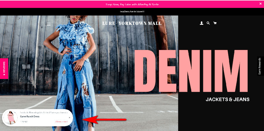
Lure – Yorktonwn Mall’s e-commerce website establishes online trust and tries to persuade visitors to act sooner rather than later by using a recent sales popup.
Be very deliberate with how you configure recent sales popups as a tactic. If you’re selling items that are typically discreetly bought, showing previous customers’ information could repel potential customers rather than entice them.
Subscribe to the SiteTuners Weekly Email
Grow Your Business
Exponentially with Proven
Conversion Rate
Optimization Expertise.
3. Limited Time Offer: This offer expires today
You’re not limited to stock items left when using scarcity marketing to get e-commerce shoppers to act. The scarce resource isn’t always the product itself. The scarce resource can be time.
You can test a few options to get people to act based on when they’ll lose access to the product, promo, or bundle:
Time Remaining
The product offer is only available for a limited amount of time.
Promo Pricing
The promo price will expire in hours or days, depending on what makes sense for the business.
Bundle Availability
You can set bundles to expire to persuade a percentage of your visitors to pull the trigger.
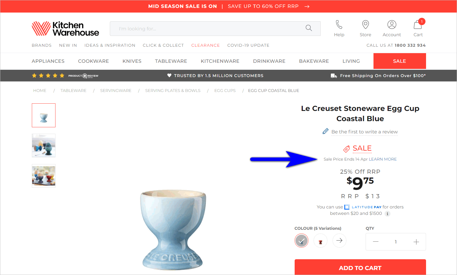
Australian brand Kitchen Warehouse lets e-commerce customers know that they could miss the reduced price if they don’t act soon. The product detail page includes the end date of the sale price.
Pain avoidance is a powerful motivator. Making offers expire can get more visitors to act. But you should test using this tactic carefully. It should be used on a fraction of your offerings rather than the entire portfolio.
We’ve written about other ways you can nudge shoppers to act on your e-commerce website. Read “Conversion Rate Optimization Tips for E-commerce Websites in 2021”
4. Date-sensitive Delivery: Get it delivered in time for Valentine’s Day
Sometimes, the time-based limitation for scarcity isn’t an issue of pricing. It’s an issue of shipping date.
When visitors have seasonal orders like flowers for Valentine’s Day and gifts for Christmas, the messaging about shipping and delivery dates can make or break a purchase. In fact, up to 22% of customers cited “delivery was too slow” as a reason for abandoning a purchase.
Marketers can test messaging like “Order now to have it delivered by … ” to try and maximize seasonal orders.
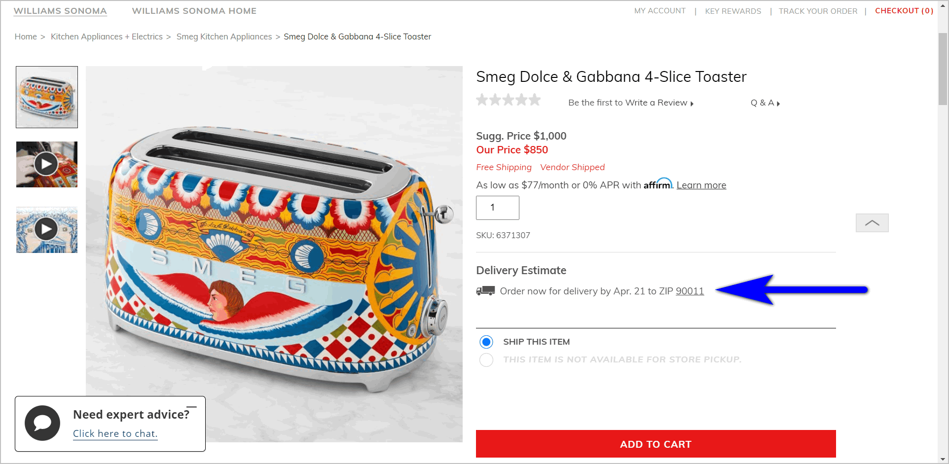
Williams Sonoma lets shoppers know that they’ll need to order “now” if they want the product to be delivered by a certain date.
5. Custom Requirements and Preferences: Only 5 aisle seats left
Scarcity marketing can also be applied to configurations.
Hotels, airlines, and car rentals deserve a special mention here. Sometimes, it’s not enough that customers have a 1pm Southwest Airlines flight, a room at the Marriott, or just any car from Avis. Sometimes, the customer will want that aisle seat, that non-smoking room, that particular SUV.
The messaging around those configurations should be something marketers test. The more important a configuration is to the decision-making process of the visitor, the more prominent the messaging should be.
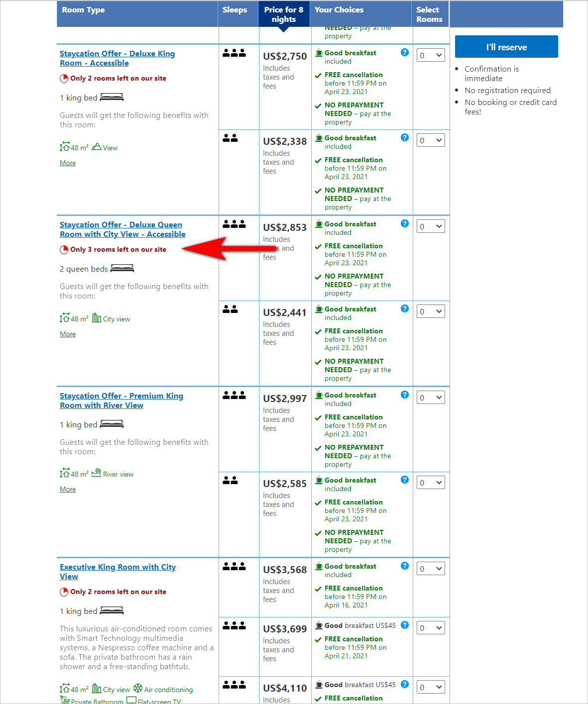
Booking.com shows that it still has several rooms available at a particular hotel for certain dates. However, if the customers wants to snag an accessible Deluxe Queen Room with a city view, they’ll need to make a reservation soon as only 3 of those rooms are left.
Fears can make people act, so marketers should understand the different elements that relate to scarcity. The things that people are afraid of can’t be controlled by marketers. However, the attention given to elements relating to those fears are absolutely within the purview of website professionals. You should carefully test and control the results of those elements.
The Bad Fears: Things that Repel E-commerce Shoppers
Just as good fears can get people to act, bad fears can make people more hesitant to pull the trigger.
Fears that relate to actual costs, security of the customer data, and fear of missing out on deals should be managed by marketers.
1. Hidden Charges: Is this really the price I’m paying?
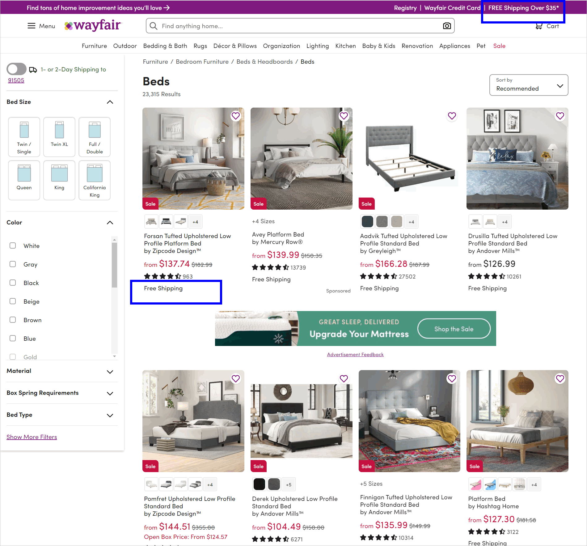
If the messaging about shipping is vague, shoppers can think that they’ll be hit with hidden charges at the end. Marketers should alleviate visitor fears around this by being very explicit about shipping costs and free shipping thresholds.
Wayfair.com increases shopper confidence that they won’t be charged exorbitant shipping fees later on. The website indicates the free shipping threshold in a global banner. The category page also has a “free shipping” label on each product that meets the price requirement.
You can learn more about being upfront with additional costs and other checkout best practices by reading “E-commerce Checkout Best Practices to Consider to Increase Conversions”.
2. Security Issues: Is this site secure?
If visitors do not feel safe, they will not push through with a transaction. Marketers should prominently place trust symbols for security, especially on the cart experience.
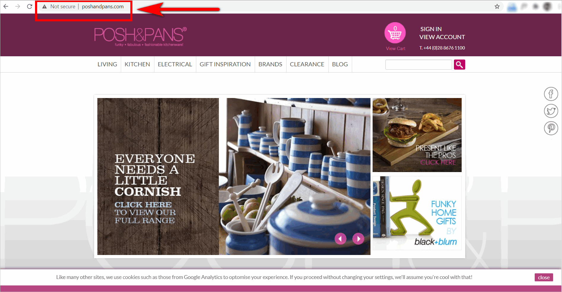
Posh&Pans’s http website and the “Not Secure” warning in the url bar can raise security concerns and deter e-commerce shoppers from converting.
Learn more about how you can immediately get visitors to trust your e-commerce website. Read “Making Web Visitors Feel Good: 6 Things to Consider to Build Trust Online”.
3. Promotion Concerns: Can I get a better deal?
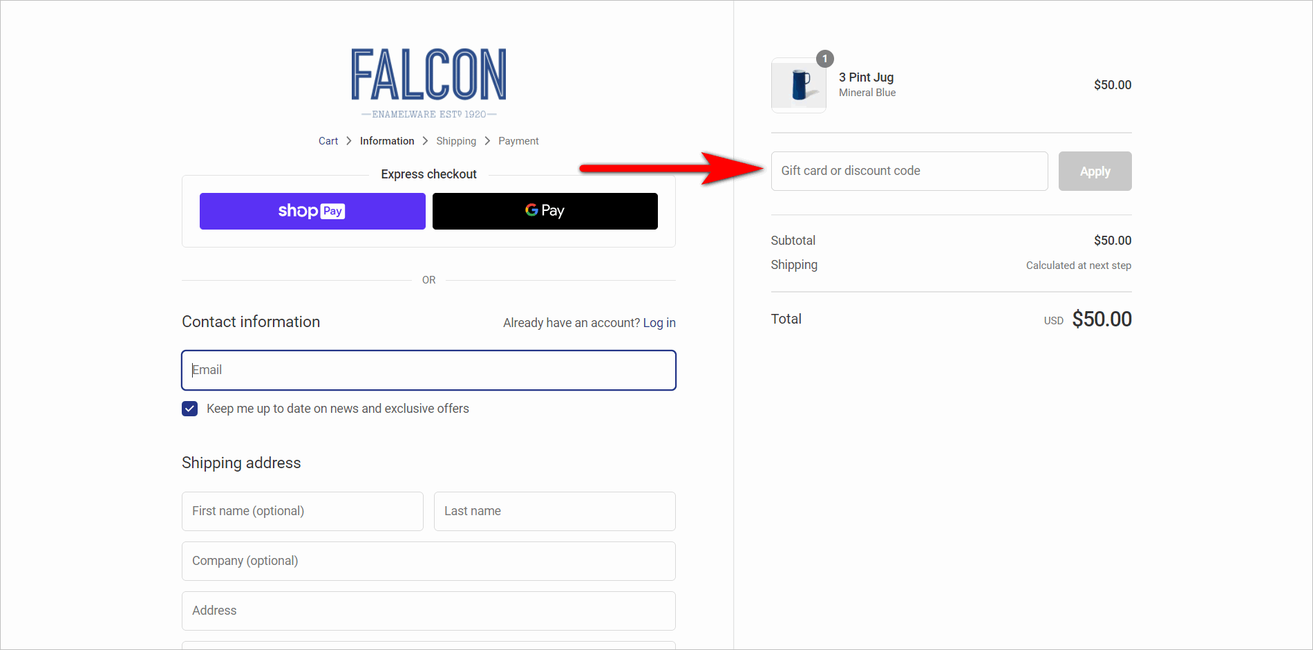
Promo codes are great, except for when shoppers are almost ready to pull the trigger and a promo code gets in the way. Fear of missing out on a deal can happen quite a bit for sites that display discount boxes prominently, especially if there’s no messaging about how the promo codes can be acquired (e.g. refer a friend, sign up for updates, etc.).
Marketers will do well to carefully control the size and interaction design of a promo section.
Falcon Enamelware’s visually emphasized promo code box can encourage shoppers to leave the checkout process and look for a discount code first.
Managing the fears that get in the way of the transaction is a large part of an online marketer’s job.
We’ve previously written about how to best present the promo code field and other discount pricing strategies. Read “Discount Pricing Strategies Online Stores Should Consider”.
Conclusion: Scarcity Marketing and Controlling the Fear
Fear is something all online marketers should be cognizant of.
If you work in online marketing, you should carefully control the elements that get people to act sooner and the elements that can cause visitors to hesitate.
Be wary of creating fake scarcity scenarios, however. Scarcity marketing is a tool that should be used honestly and responsibly, as it can backfire when used inappropriately.
