Here are four things that don’t support that cause and chase customers away instead.
1. The Rotating Banner
Banner ads are evil.
They make marketers lazy and not tighten the editorial story. You need to decide what’s important and what has to be above the fold on the page.
More importantly, our eyes are automatically drawn to motion, so every time the banner swtiches, the customer’s attention is reset.
So instead of putting a rotating banner that takes up a lot of prime real estate on your homepage, elevate more important elements such as your trust symbols.
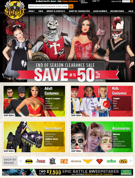
Spirithalloween.com has a grid of high-level categories on their homepage, which shows the breadth of their product line. However, it’s pushed down below the fold by their massive rotating ads.
2. Grab Bag of Products
When you put random items on your home page, you’re essentially guessing at what the customer is looking for.
Instead of throwing up on your visitors by showing product-level images, show the breadth of your product line. Turn the page into a grid that represents all the high-level categories. Have collages of category-level static images that show the diversity in a particular category.
Your product line range should be apparent on visual inspection, so use a belt and suspenders approach. Take your most important categories from the navigation bar and put them into the body of the page, so you’re not solely relying on visitors to read the tiny text in the nav bar.
3. The (Early) Pop-Up Ad
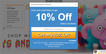
Sure some people might fill it out and give you their e-mail address in exchange of a 10% discount you’re offering, but pop-up ads interrupt visitors on their way in to your site. What’s important for a visitor to understand, especially if it’s their first time there, is if you have anything they want.

Instead, consider presenting the offer within the product detail page or during checkout and say, “Get 10% off if you put in your e-mail address.”
It also makes more sense to use an exit pop-up as the visitor is about to leave your site anyway.
4. The “Buy Now” Button
The call-to-action (CTA) on your homepage should be there to help users navigate to category or sub-category pages. There should be nothing to buy on it.
Deeper in, if you have a set of search results or if you’re displaying several products, consider saying “Get details” instead of “Buy Now,” as the former is not nearly as scary. A whole page full of product summaries with “Buy Now” on each one of them is overwhelming and obnoxious.
Also, it is unlikely that anyone is going to make a considered purchase without going through the product detail page (PDP). So, only the product detail page should have an “Add to cart” button. If they get there, the “Buy Now” becomes less threatening.
Your web site should definitely put fear into play, but the fear should be that a user might miss out on an important offering you have – the fear shouldn’t be your site spooking them away from a purchase. If you play it smart, avoid rotating banners and early popup ads, and choose your elements wisely, only your competitors should be afraid.

