And it is dead simple – if you’re horrible at it.
If you’re good, you know this area can get pretty complex pretty quickly – and you that you need all the help you can get. Here are two things to keep in mind:
Use graphics deliberately to make the CTA explicit
The call-to-action is the reason your page exists – it’s what you want visitors to do on the page. If your visitors cannot figure out what to do because your CTA is unclear or there’s clutter around it, then you’re losing leads.
Make sure the picture in the background does not dominate the scene, and that the form is not so bland against the color graphic. The CTA should naturally arise from the Zen-stillness of your page.
Affordable-Home-Insurance.org’s CTA button stands out from the rest of the page, and immediately grabs the visitor’s attention.
Another thing to keep in mind is that faces will get attention. We will always look at faces because they’re a rich source of information about the environment. We have a general object recognition system, and near our emotional mid-brain, we have a separate part for recognizing faces and people. That allows us to judge someone’s attitude or aggression towards us, and this is all critical for social and survival reasons.
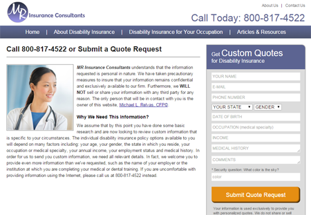
MR Insurance Consultants’ photo of a woman gazing towards the form directs the visitor’s attention to the CTA area.
On your page, the direction of the gaze of the face matters. Generally, you don’t want photos of people looking past your form or off the page. They direct the attention elsewhere, and will be taken as a signal of something interesting on the page. So, you want photos of people looking in the direction of your form or your CTA, instead.
Shorten the form (or at least make it appear short)
Don’t try to get all of the customer’s information in one shot.
Before you add that extra field into your form, ask yourself, “Is this absolutely necessary to complete the transaction?” If it’s information you can get from the customer later on in the process when you’ve built some relationship with them, then get rid of that additional field.
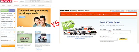
U-HAUL and PODS are both in the moving and storage business, yet the former asks for very little information. U-HAUL’s form looks easier and less invasive by asking only for essential information.
In the real world, you wouldn’t want to be rude or too forward. So don’t ask for too much information, too early in the process when there’s no obvious benefit for the customer to give up that information.
For downloads, you don’t even have to get any information from the visitor. You can let them download your whitepaper freely, so it can go viral and you establish your thought-leadership in the process. If you don’t gate your content, people can see your CTA at the end, and then you can ask them for their information.
If a lot of information is necessary, experiment with staging the form in different ways. Consider dividing the form into separate screens or a lightbox pop-over sequence (e.g. one screen for contact information, another screen for personal information, and so on).
Also, make sure your form is free from security questions or CAPTCHA. They’re just another hoop for your customer to jump through and are barriers to conversion.
Boring and short work in Lead Gen
It’s critical that other graphic elements of your page don’t compete with your CTA for attention, so visitors know right off the bat what they’re supposed to do. Also, remember – you’re not your visitor’s doctor. You don’t need all that information, certainly not at the start of the process. If you keep your lead generation pages relatively boring and short, you’ll be better off.
