 Form conversion rate optimization goes beyond the form itself.
You have to ensure that the entire experience – before the visitor gets to the form and after they fill it out – is effortless.
Keep these tips in mind to make sure people don’t leave when they get to your page, they fill out the form, and you amplify the lead capture:
1. Match Upstream Intent
We’ve said it before, and we’ll say it again here: the number 1 driver of conversion is matching visitor intent.
What visitors expect to be on your page is set by what they see upstream.
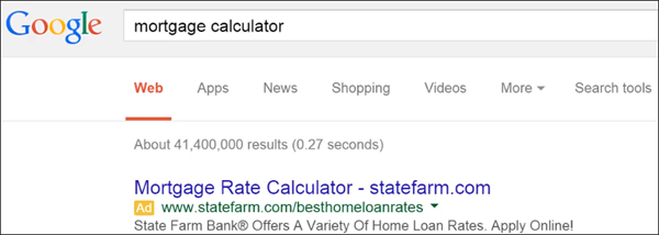
Say someone does a search for ‘mortgage calculator’ in Google. That tells you something about their intent – they probably want to know what their mortgage will be, given a certain loan amount and interest.
They see this ad from State Farm which very closely matches their intent of getting to a mortgage calculator:
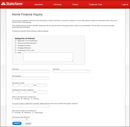
But when they click on the ad, they’re taken here:
There’s no mortgage calculator. Instead, the page asks the visitor to fill out the form to apply for a mortgage.
The ballpark chances of the visitor filling out that form is, well, zero.
The problem isn’t the form itself, but how they got to the form.
If you falsely promise something, you can get a lot of clicks to an ad. That said, if you don’t follow through on that promise on your landing page, people are going to bail, leaving you just footing the bill for the ad.
Remember:
- Review the promises made in your upstream experiences
- Do not intentionally bend or break those promises
2. Ask Only for Necessary Information
The brain is inherently lazy. And the more fields you have on your form, the less likely people are going to fill it out.
So, don’t be greedy.
Don’t try to get as much information from the visitor as you can the first time they interact with you. You haven’t earned that right yet.
One way to identify whether a form field should stay or go is to ask yourself: Is this information absolutely necessary to complete the current transaction?
For instance, if you have a whitepaper, the reality is, you don’t need to ask the visitor for any information, not even an e-mail address. The visitor can just click on the button to download the guide and view it in their browser.
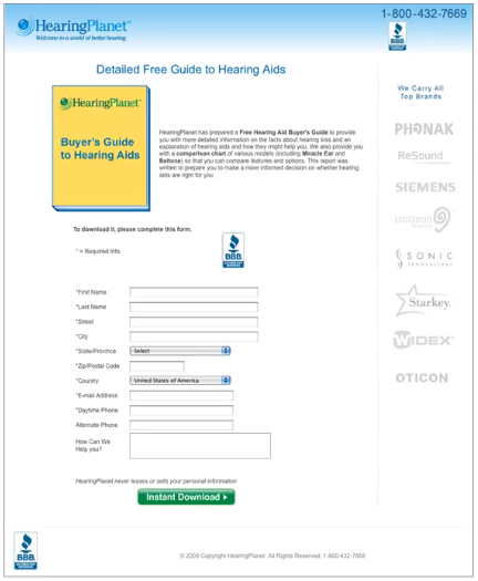
Consider this pay-per-click landing page for a downloadable guide to hearing aids:
HearingPlanet was being useful to their visitors since getting a hearing aid is a complex buying decision. The guide has the potential to be passed around the visitor’s insurance company, medical professionals, or family members because it answers questions critical to decision-making.
‘Problem is, the form asks for too much information.
It asks for information the company doesn’t really need, such as street address, phone number, and alternate phone number.
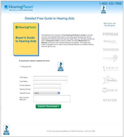
We managed to convince them to at least get rid of the fields for the street address.
And they got a 17% increase in form fills just by doing that.
Remember:
- Consider the balance between give and get.
You should give a lot more than ask for in return. Give high-quality information and ask for the minimum of information.
- Use progressive disclosure to collect information overall multiple interactions.
Collect the information you want over time in smaller pieces. People won’t give up their street address to get a free guide. But the last page in that downloadable guide could be ‘Sign up for your free hearing test nearby,‘ for instance. And that could take them to a landing page where they can sign up for the hearing test. That’s when you ask them for their address to identify the location closest to them. In that context, people will be much more likely to give you their address because it’s absolutely necessary to complete the current transaction.
3. Set Clear Expectations
Often, visitors get confused about what a page is about because of visual clutter.
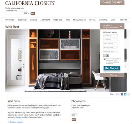
Take this California Closets home page, for instance:
The form is small and overpowered by the other elements on the page.
When the visitor gets here, they’ll see the giant picture of the closet organizer and the bed under it. They’ll see ‘Wall Bed’ – the page title. And they’ll see the blue button that says ‘Get Started.’
This does not give the visitor enough context to understand the purpose of the page. Poor visual prioritization makes it unclear what the visitor is supposed to do here.
Remember:
- Remove visual distractions that interfere with the form.
A giant graphic is bad enough. Motion, more so. Motion will trump the static form it’s competing with. If you have strong graphics or motion in the visual field, it’s difficult to get the users to pay attention to the static form.
- Have clear motivation to complete form.
A big part of expectation setting is achieved through a clear form title. The title should communicate to the visitors the benefit they get out of interacting with the form. And an even worse offense than an unclear form title is having no form title at all (i.e. a decapitated form).
- Make sure the action button describes what happens next as a benefit to the visitor.
The action button should be specific. Saying ‘Continue’ or ‘Get Started’ is vague. The button should say what happens when the visitor clicks on it. It should complete the phrase “I want to …” You can for instance complete this by putting ‘Get instant mortgage quotes’ on the action button.
4. Assume that Visitors Will Incorrectly Fill Out Forms
Online, it pays to remember that aside from being lazy, people can be stupid. So assume that people will make mistakes in filling out your form.
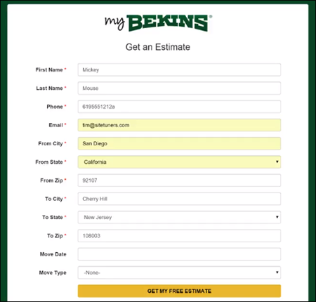
Take this form, for instance:
After being given a phone number with an ‘a’ at the end and a 6-digit zip code, this form did not complain.
That’s a huge issue.
Make sure that you’re doing error validation. Your form should be able to correct, suggest, and recover in the moment.
It’s a mistake to allow visitors fill in several fields with incorrect information then ask them later to go back and correct those fields. As the user is in a particular form field, help them correct it. For example, you can show a green check mark as an indicator that the input is correct.
Credit card information
You also need to be tolerant of the different ways people type credit card information.
For example, people typically type their Visa or Mastercard numbers in chunks of 4 and isolate those visually with dashes and spaces in between.
If the visitor types their card number that way, make sure your form doesn’t reject that. Behind the scene, strip out the non-numeric characters to see if it’s 16 digits and if it corresponds to an actual credit card number.
Functionality changes
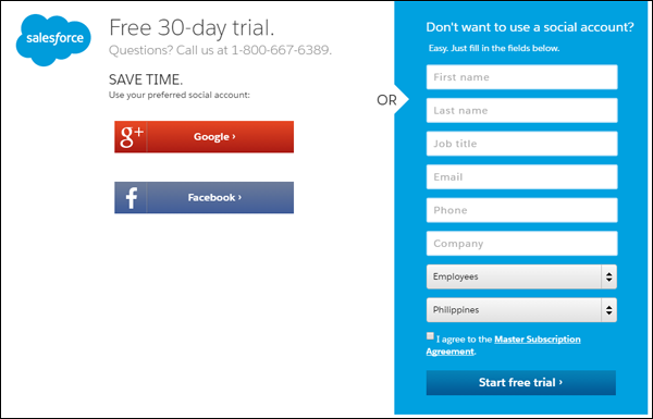
With the Salesforce form above, if the user tries to submit the form without ticking the ‘Master Subscription Agreement’ checkbox, here’s what happens:
The bottom of the form changes – an error indicator appears but the link to the ‘Master Subscription Agreement’ disappears. The only way to get the link back is to tick the checkbox.
That’s not cool. It will confuse the user about what to do next.
Don’t surprise visitors with functional changes in the form as a result of them interacting with pieces of the form. This is especially true if the changes are happening away from where the interaction happened.
Remember:
- Do error correction.
Otherwise you’ll end up with junk information that will give you distorted measurements of your online marketing activities and how successful they are.
- Encourage social login whenever possible.
A good alternative to asking visitors to fill out a form is social login, especially for mobile. Aside from making it easier for visitors to sign up, social login gives you the information you’re asking for and a lot more. If the visitor signs up via a Facebook login, for example, you get a lot of information from their profile. And you can use that rich data to create models to see which kinds of people end up being your actual customers.
- Don’t have confusing functionality changes on your form in response to inputs.
5. Think About the Mobile Experience Early On
According to the Mary Meeker Internet Trends 2015 Report, mobile use has overtaken desktop and laptop use.
So if your forms are not mobile-optimized, you’re leaving a lot of money on the table.
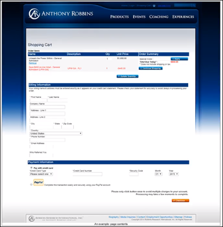
Consider the desktop version of this shopping cart form:
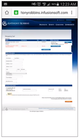
The web experience isn’t great to begin with – the form isn’t laid out well and it’s chopped up into many sections.
The mobile experience, however, is even worse:
It’s distorted and slightly tweaked with tiny portions of the same exact web page.
Keep conventions in mind for doing mobile forms:
- Avoid using dropdown fields.
- Turn radio buttons into fat buttons that visitors can click on to select an option.
- Have single columns instead of multiple columns.
Remember:
- Have a separate mobile form experience.
- Avoid popups and interstitials. Try to avoid any kind of layering – use the full screen. Having to dismiss pop-ups on mobile will only annoy visitors.
- Change to easily ‘press-able’ controls.
- Consider alternate response mechanisms. Sometimes the best response mechanism is a click-to-call button. If the user is on a mobile device, the chances of them wanting to call are much higher. And for majority of businesses, prospects who call will convert higher. So present click-to-call as an easy option.
6. Optimize the Thank-You Page
The job doesn’t end when the visitor submits the form.
You need to pay attention to what happens after visitors fill out the form. Otherwise, you devalue the visitor’s upstream experience by taking them to a poorly designed thank-you page.
Take this experience, for instance:
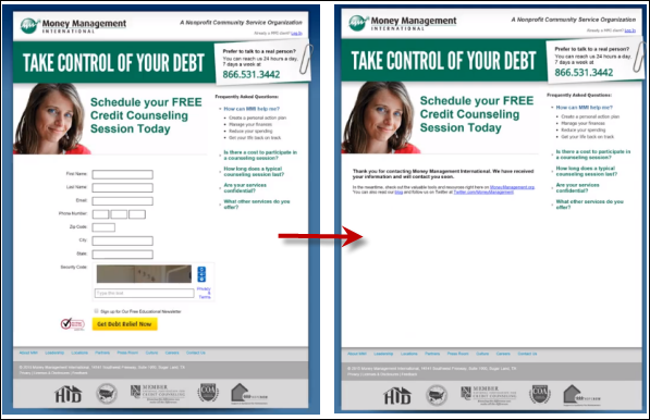
After the visitor completes the form, they’re taken to a page that looks very similar to the previous one.
This is what the tiny thank-you text says:
The visitor will probably feel disappointed. You got them hyped up, enough for them to actually fill out the form, then they get a transactional message.
This thank-you page fails to set the visitor’s expectation of when they can expect a response by.
On the form itself, a responsiveness expectation should already be set. For instance, you can say ‘Schedule a credit counseling session within 1 business day,’ or ‘We’ll get back to you within an hour to schedule your session.’ Then, that should be reinforced on the thank-you page.
Remember:
- Make sure your thank-you page looks professional.
- Personalize it. Put some excitement in your messaging, and echo back some of the information the visitor has already given you.
- Ask for additional calls-to-action. Leverage the visitor’s psychological momentum. They’ve already filled out a form – asking them to share on Facebook, ‘Like’ your page, getting any other social commitment should be easy at this point.
7. Focus on the After-Form fill Experience
You can’t afford to send weak e-mails as follow-up to the form fill experience.
Like your thank-you page, your e-mail needs to be personalized and has to maintain the excitement.
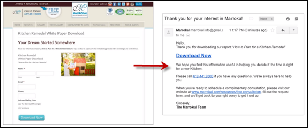
This e-mail from Marrokal, for instance, has a generic subject and is not branded like the web site is, so it lacks messaging continuity. The text formatting also leaves a lot to be desired.
Remember:
- Make sure everything works. Check the follow up e-mail sequence and see how targeted it is.
- Make sure there is clarity and messaging continuity.
- Make it personal.
Putting It All Together
Your visitors aren’t as invested and familiar with your forms as you are.
Visitors are on your page for a reason. You need to be useful to them – give them what you promised. And don’t ask for all the information you want the first chance you get.
You also need fault tolerance – people will type in things like dashes and spaces between credit card numbers, and perform all sorts of actions that can lead to errors. You need to show users where they make errors in real time to avoid junk information, and auto-correct for basic formatting issues.
And if you really want to make the most of your lead capture, don’t ignore your after form-fill experience. Otherwise, you‘ll miss out on a huge opportunity.
Remember, the actual form isn’t all there is to form conversion – if you optimize the whole experience, you’ll do better than competitors who optimize just the form.
