As mobile devices became popular, so too did responsive web design and mobile versions of web sites.
And that’s a great thing – people shouldn’t have to choose between laptops and smart phones when consuming content.
You should absolutely try to get good at both – after all, people will decide to consume your content however they see fit.
That said, responsive web design and mobile versions of web sites aren’t the only design offshoots of the mobile age – pointless pizzazz seems to be back in vogue. Now, we have the rise of ghost buttons, video landing pages, centered logos, masonry layout for e-Commerce sites, and a whole range of other poor design choices that snuck in on the back of mobile-ready sites.
The idea is that they make web sites “exciting again.”
Here’s the thing – when web sites were starting out, people tried to make them exciting.
- We had “splash” landing pages, the page that we forced the user to visit before the actual home page, wasting a ton of time
- We basically massacred readability by doing weird things with text – scrolling text, blinking text, and text superimposed against images where you can barely see them
Somewhere down the line, we stopped doing those macabre things, and instead of trying to be “exciting,” we tried to be “effective.” As a result, people got more done on the web.
Now, however, “exciting” is a thing again, a Trojan horse powered in large part by executives who like things shiny.
Let’s go through the reasons making e-Commerce web sites “exciting” is a bad idea.
1. The first thing users do is get oriented
Consult almost any eye-tracking study, and you’ll see very similar patterns emerge. Things usually happen in this order:
- People attempt to get the lay of the land
- People scan a particular “type” of element that supports their given task
- People click on what they need, or move into “focused reading” mode
Your job here is to make it quick and painless for them to transition into the mode they need to get into to get the job done.
On a “predictable” site, that transition is seamless:
- If they landed from a search engine, they can quickly glance at the logo at the upper left to verify they are in the right place
- When they need to scan the categories, the main categories are taking up most of the real estate
Now, on an “exciting” site, that transition can be … painful:
- If they landed from a search engine, they can quickly glance at the logo at the upper left and find a big wad of nothing, because your logo is centered
- When they need to scan the categories, the main categories are hidden, because a video is playing on repeat, with a ghost button on top of it
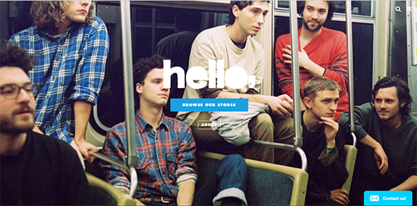
The company logo missing from the upper-left corner is just one of usability issues on Hello Merch’s home page. Top-level navigation options, despite the large real estate, are hidden under the hamburger icon, which is also placed in an unconventional location.
2. Users should be able to operate your site on auto-pilot
Think about most of the activities you do daily – eating breakfast, brushing your teeth, heading to work. A significant chunk of your daily routine, you can probably do with minimal thought, right? In web parlance, that’s low cognitive load.
Now, without using any device, try and divide 437 by 19. Very different, right? You get a jolt, and you know you should switch from auto-pilot to manual controls. You can do it, but you’re now very actively thinking about what you’re doing. That’s high cognitive load.
When you’re selling something online, high cognitive load is death:
- People will only process whether your offer is good enough, not how to get to your offer
- You want users to get to the thing they need easily, without thinking about it, because that means getting a higher number of visitors you can convert
- Every distraction is a chance to lose people
Now, think about what being “exciting” can entail:
- Your video takes time to mentally process, and visitors can leave in the process
- Your ghost button has low readability, and some users will not know how to pick up the information scent to get to the product they need
If people can’t use your web site easily, they can’t use it, period. Being fancy is too much of a trade-off against being usable.
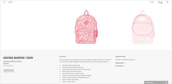
Users might have a hard time locating the ‘Add to Cart’ button on Herschel Supply Co.’s product detail page, as it breaks predictability. Web visitors expect the product image to be on the right and the call-to-action block to be on the left side of the page.
3. Users spend a ton of time on other web sites
When users attempt to get oriented on your web site, they don’t do that in a vacuum. They’re taking years of experience with them using other web sites. Those years teach them things like conventions, which are essentially shortcuts to getting to some place, efficiently.
Your logo at the top left that leads back to the home page, the primary navigation near the top of the web site, the grid categories built for easy scanning, the quick links to other places at the web site footer – they are not discovering that from your web site, they have learned that from years of seeing conventions.
Now, think about what happens to e-Commerce sites that use minor things like a masonry layout on category pages, a video on repeat at the home page:
- Conventions have taught users to scan the home page to get where they need to next, only to find that they need to process the information at your speed instead of theirs, with some of them leaving rather than going to a primary navigation element – but your site might be slightly more impressive at first glance
- Years of web navigation have taught users to scan for similar information on a grid, and your uneven layout is going to get them to struggle to get to the page they need – but they might be slightly impressed that you have one impressive large image surrounded by an army of smaller ones
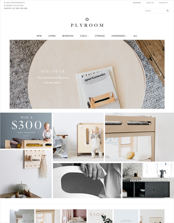
The mansory layout on Plyroom.com.au makes it difficult to compare navigation elements.
Putting It All Together
There’s room for some pizzazz on the web. If people aren’t on a focused, task-based path, the masonry layout might be a good way to randomly scan interesting things. If people are just looking at sites for inspiration, the video on repeat might just be worth sitting through.
For task-based places like eCommerce sites, though, it’s usually best to stay away from pizzazz built for the sake of pizzazz. If you help users get oriented on your site, follow conventions, and allow people to navigate on auto-pilot, your executive team’s excitement will likely come not from the pages themselves, but from your conversion figures.
