 In a session called “Afternoon at the Improv” at Conversion Conference in Chicago last June, I had the chance to give spontaneous, live feedback on landing pages that were submitted by attendees. One volunteer was Hancock.it, a website for email signature management software.
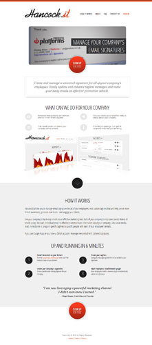
When I recently visited the website, I was surprised – and a bit disappointed – to see that the home page has not changed at all since my critique. It still looks exactly the same as it did almost three months ago. So let Hancock’s loss be your gain – maybe some of the advice I gave to this site is something you can apply to your own site.
The Good: Uncluttered Design
I usually start a live review with the good things about the Hancock.it home page. First, it has a clean, simple design with lots of whitespace, which minimizes potential distractions. Second, it employs contrast to guide visitors’ eyes to important parts of the page. It’s impossible to miss that big, shiny, red button positioned front and center on the page. And finally, it has a call-to-action that’s instantly recognizable: “sign up for free.”
The Bad: Lack of Social Proof and Trust
What the Hancock home page sorely lacks, however, is proof of its trustworthiness. This is a shame since the first job of any landing page is to keep people from leaving. I don’t know enough about this company to trust what it is saying without some indication that others trust doing business with it. For that reason alone, if I landed on this page I would leave, and I’m guessing other visitors feel the same way.
Building trust can be as simple and as instantaneous as putting blog/media coverage, reviews, or seals of approval where visitors will immediately see them. And the payoff can be huge. Why are trust symbols, testimonials, and other indicators of social proof so important? It’s simple: our brains rely on shortcuts. When we’re in an uncertain situation, following the herd is a simple solution that helps us feel more at ease.
The Greedy: Premature Call-to-Action
Let’s go back to that big, shiny, red button on the top of the page. It’s the first thing that draws attention and it has a pretty clear call-to-action. That’s a good thing, right? But there’s one problem: who knows what they’re signing up for? The answer: no one.
This is a symptom of what I call The Greedy Marketer Syndrome. Sadly, it’s an endemic disease among us. “Here’s the sales funnel – I wanna squeeze the bottom of it and make dollar signs! Sign up now! Give me your money!” The Greedy Marketer Syndrome is what makes us neglect the most nagging questions on our visitors’ minds: sign up for what? I don’t know what it is or whether I need it. What does it do that I can’t do with my existing email program? Will it install spyware on my computer? Do other people like it? How long will it be free?
To its credit, the Hancock home page does list some of the things that its software can do, like “announcing new products and services directly in your email’s taglines.” But do visitors even have an inkling what email signature management software is? What if the whole category doesn’t exist in people’s minds yet? Before firing off a list of benefits, it would be better to introduce the concept first. Address visitors’ questions and objections – what is it? How does it work? Why do people need it? How does it pay for itself? Who’s buying it? Are they having successful outcomes?
Now you see that “sign up for free” is way too premature. The call-to-action is literally asking people to make the big jump. It’s worse than asking someone to jump into bed with you on the first date – it’s asking them to sleep with you as soon as you meet them!
Lessons
Granted, it can always be argued that the page was designed precisely for people who are already familiar with the concept. But if you are going to alienate the bulk of customers at the top of the funnel, then you should be willing to accept the mediocre fate of your conversion optimization efforts. Also, I highly doubt many people would be moving toward the end of the funnel in the absence of trust symbols and social proof.
Always match your call-to-action to where your visitors are in the funnel. If you are offering a novel service or product, don’t neglect your visitors’ needs for education and security. Establish your credibility and trustworthiness first so people can move through the funnel without anxiety or hesitation.
This article originally appeared in Tim’s ClickZ column October 2, 2012
Take your conversions to the next level.Learn how our experts at SiteTuners can help kickstart your conversion rate optimization process or get better results from your CRO efforts. Give us 30 minutes, and we’ll show you a roadmap to your digital growth! |
