 The word “flat” seems to get a bad rap. Flat broke. Flat line. Flat-busted. Even flat beer (or soda, if you prefer). But in recent months, there’s been a lot of buzz about flat design, and most of it has been pretty good. Although the concept of flat design has been around for some time now, its recent rise in popularity is largely tied to the increasing use of mobile: Flat designs tend to load much more quickly on mobile devices, making them more popular with users who appreciate the speed.
So just what is flat design and what does it have to do with conversion rate optimization (CRO)?
If flat design were a TV character, it would be Dragnet’s Joe Friday: “Just the facts, ma’am.” Essentially, flat design does away with shadows, gradients, bevels, and other elements that lend the perception of depth to your site, resulting in a two-dimensional appearance. Every design element has a specific purpose; no element is included “just for kicks” or solely for visual appeal. It also tends to use a specific color scheme, typically with two or three or, in some cases, even four colors, most often used in more block-like designs.
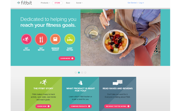
Fitbit and other products or services designed for mobile use are particularly good candidates for a flat design.
Many designers love flat design because of its modern look, clean lines, and lack of embellishment. In flat design, the impression is one of simplicity; there’s nothing too showy, nothing too complex or distracting – just a straightforward design with a central purpose of helping users do what they came to do quickly and easily. And for this reason, some companies have found that a switch to flat design results in significantly higher conversions.
Columbia’s Jam Session
The idea of “less is more” when it comes to making purchasing decisions has some real, consumer-based data to back it up. In one study from Columbia University, two tasting booths were set up outside an upscale grocery store. On one table, shoppers found an assortment of six flavors of jam; the other table had a display of 24 different flavors of jam. Now, based on the popular theory that people love having more choices, you’d think the shoppers who were given more choices would be more likely to purchase, right? Well, as it turns out, that’s not what happened. Although more people sampled jam at the table with 24 choices compared to the one with only six (60 percent vs. 40 percent), when it came time to purchase, only 3 percent of the people who had 24 jams to choose from actually bought anything; of those with six choices, 30 percent made purchases.
On websites, as with jam, less may well be more. Because flat design puts the focus squarely on content, it can make the site experience easier for the visitor. And let’s face it: With the possible exception of entertainment sites, most people go to a website to complete a task. The easier, faster, and more straightforward it is to complete that task, the more satisfying the experience will be. And that can translate to higher conversions.
But Where’s the Button?
While the premise behind flat design’s simplicity is to improve usability, one of the biggest disadvantages is that flat design interaction is quite different from what people are used to. Some users only recognize a button because it has dimension and looks like its real-world equivalent. Flat design removes that dimension, leaving a button looking like nothing more than a block of color.

Changing convention can be a long, slow process. For years, users have grown accustomed to viewing some dimensionality on websites, which has helped them to understand what elements are actionable and what elements are static. And since conversion relies on action, any marketer concerned with CRO should be wary of adopting new design elements that could make it difficult for users to complete their action.
Is Flat Design Right for You?
That’s a huge question, and ultimately one that only your target audience can answer. Not everyone is sold on the flat design concept or its ability to drive conversions. Usability guru Jakob Nielsen says, “Totally flat design, like in Windows 8, is a terrible usability mistake because it removes the users’ ability to see at a glance where they can click.” On the other hand, removing excessive embellishments and unnecessary design elements is generally considered a best practice in terms of conversion optimization.
If you are considering giving your site a flat makeover, approach the change cautiously and test along the way. While the clean look may appeal to you (or your senior management team), completely eliminating the three-dimensionality of buttons and other interactive elements could cause major problems with the site’s usability. Start small by incorporating some flat elements without making a full-scale switch. You might begin by eliminating some of your graphics to offer users a more streamlined, less cluttered page, by rethinking your color scheme, or by eliminating shadows or gradients on an entire page or just in the headers or other elements. Then test the changes, both for usability and conversions.
The moral here is the same as it is with any site design change: Keep an eye on your metrics to get a true idea of how successful your transition to a flat design really is in raising your conversion numbers. Only then will you know for sure if your clean, modern design is effective, or if conversions – like your design – have fallen flat.
This article originally appeared in Tim’s ClickZ column March 4, 2014
Take your conversions to the next level.Learn how our experts at SiteTuners can help kickstart your conversion rate optimization process or get better results from your CRO efforts. Give us 30 minutes, and we’ll show you a roadmap to your digital growth! |


