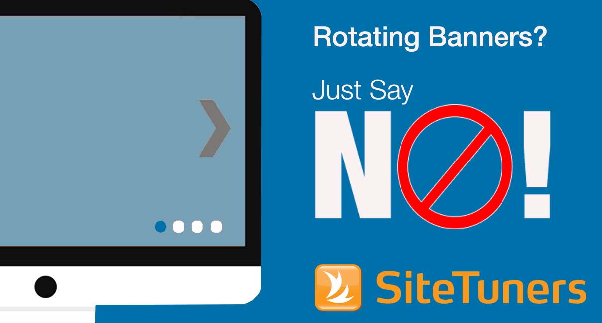
 We’ve all seen them, on large e-commerce websites as well as small online retailers. CEOs love them, and conversion optimizers loathe them. I’m talking about the large rotating banner that slides, fades, or otherwise transitions from one promotion to the next across a website home page. This popular design element is – for many – the go-to solution when there are more messages to put on the home page than there is room to put them. Rather than make the tough decisions that require prioritizing conversion goals, web teams turn to the rotating banner as an offer of compromise – giving each message prime positioning, if only for a second or two before the slideshow loops and the next message is presented.
If this scenario sounds familiar, then this post is for you. Rotating banners are absolutely evil and should be removed immediately. Here is a short list of the many reasons why:
Large File Sizes
Typically banners include several still images, animation, or video that result in larger files sizes compared to other page elements. Google in particular is on a mission to speed up the online experience because it has found that longer page load times will result in lower conversion rates and lower user satisfaction with the search experience (reflecting on them). As a result, Google has started to consider page load times in its search results algorithm.
Inconsistent Messaging and Look
Often the individual frames of your slideshow will look very different. They will use wildly divergent messaging, visual imagery, and calls to action. Since they are so visually dominant on the page, the experience of your site radically and repeatedly changes within the span of a few seconds – creating a schizophrenic identity for your site.
Lack of Editorial Responsibility
Rotating banners are a bad idea because you have basically abdicated your responsibility for curating and editing the content on your page. You have thrown up your hands and said, “I’m not sure what is important, so I am going to throw it all up against the wall and see what sticks.” You need to prioritize importance of your content and edit or remove non-essential items. If something is truly important, it deserves permanent real estate on your page.
Wasted Time
No one likes to wait. On the web, people are especially impatient because they are in a highly activated, information-seeking mode and because there is a world of infinite options available. By forcing the visitor to involuntarily sit through a series of commercials, you are forcing them to have a linear and out-of-control experience. This is the wrong metaphor for the web. We will (barely) tolerate interruptive commercials when watching TV, but only because we have voluntarily locked ourselves into longer-timeframe and passive linear unfolding experiences. On the web we are in control, and a 10- to 15-second slideshow is way outside what we are willing to sit still for. Instead of letting someone actively find what they are looking for, you are wasting their time.
Motion-Triggered Reassessment
Motion in a scene triggers the reptilian portion of our brain. This occurs at the level of automatic survival instinct and cannot be avoided. Frequent motion changes in a part of the page keep stealing the visitors’ attention and make it difficult to visually prioritize or to consume any other content on the page.
Pushing Navigation Down
The primary purpose of your home page should be to create a high-level map of the world for your visitors so they can understand the range of available products that you carry. The giant banner will take up all of the prime real estate on the home page and push this navigation off the visible top of the page – sabotaging the page’s primary purpose.
Print this column out and keep a copy in your desk drawer. Chances are good that someday your CEO, product managers, or other heavyweights in your organization are going to ask you to put up a home page banner. It’s your job to just say “No.” Then hand them this post and politely send them on their way.
This article originally appeared in Tim’s ClickZ column April 3, 2012
Take your conversions to the next level.Learn how our experts at SiteTuners can help kickstart your conversion rate optimization process or get better results from your CRO efforts. Give us 30 minutes, and we’ll show you a roadmap to your digital growth! |


