Summary: The lack of sensory product experience has always been a disadvantage for online stores. In e-commerce, where customers can’t hold or touch items, product images and visuals can make or break a sale. Therefore, it’s imperative for product images to provide shoppers with enough information to persuade them to convert.
In this article, we’ll talk about ways to optimize your e-commerce product images:
Introduction: Why E-commerce Product Images Matter
The absence of sensory and experiential details is a bane for e-commerce. At a physical store, shoppers can try on a pair of glasses, feel the texture of a dress, and assess the size of a couch, for example.
These are things that customers don’t get online and are potential conversion barriers. They’re reasons shoppers will not buy from your e-commerce store. So, your visual media needs to do an excellent job of mitigating the lack of sensory experience that customers get at brick-and-mortar locations.
Well-presented e-commerce images not only make your product appear more attractive and desirable, potentially increasing sales. They also help customers make informed buying decisions. This can …
- lower online return rates,
- minimize strain on your inventory management, and
- increase customer confidence and satisfaction.
Additionally, e-commerce product images are crucial in search engine optimization (SEO). They help improve the visibility of a product in the search results, which can increase the likelihood of a customer discovering and purchasing your product.
Here are tips to ensure your e-commerce product images and visuals represent items accurately and set customer expectations properly.
1. Highlight What Makes a Product Unique
If you’re selling similar items, make sure it’s easy to identify how one item differs. Highlight what makes a product distinct through your product images.
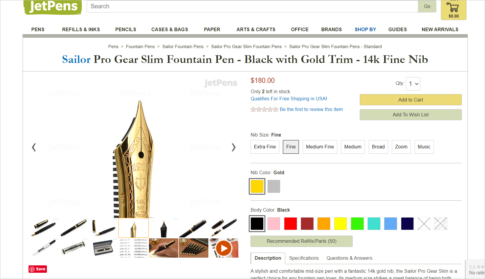
For example, JetPens, an online stationery store, has product images of fountain pens down pat. They sell pens with different nib sizes (e.g., fine, medium, broad, etc.). However, what makes each pen different is difficult to detect just by looking at wide-angle photos.
So for each nib size, JetPens has a telephoto or zoomed-in product image that shows the nib up close. This makes it possible for the customer to see any engraving on the nib and what the tip of the nib looks like:
E-commerce product images that do not immediately convey what makes a product different from others when you’re selling similar items create friction in the user experience (UX). Having to figure out what makes a product unique will tire the user’s brain. This could discourage buyers from pushing through with the purchase.
2. Show the Product from Multiple Angles and in Different Contexts
A customer might hesitate to add a product to their cart because they are unable to see it from different angles. Customers should be able to see what the product looks like from the side or back and up close, so they can evaluate the product better.
Example of Using E-commerce Product Images to Show an Item from Different Angles
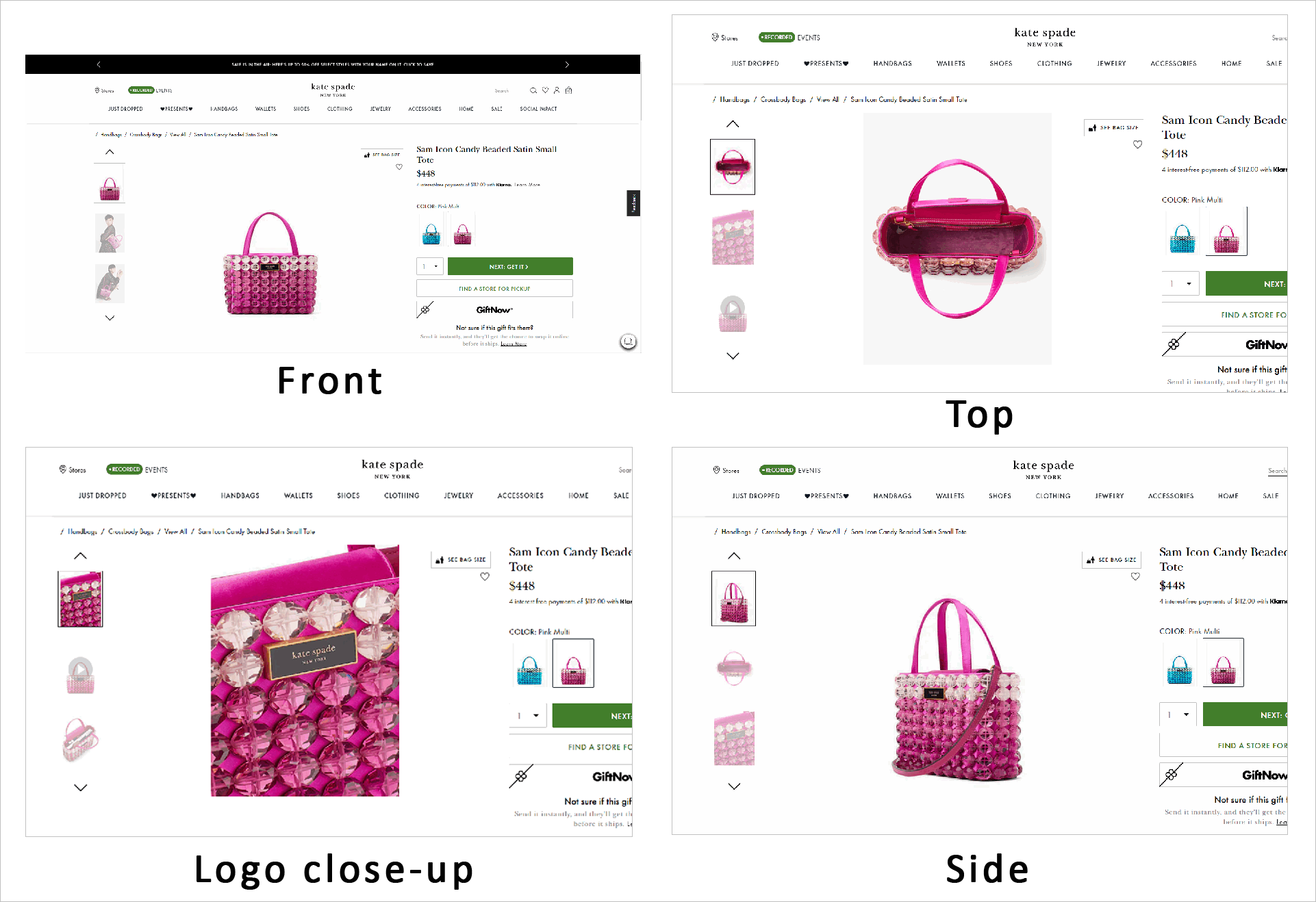
A website that’s excellent at utilizing images to give shoppers a clear and detailed view of products is KateSpade.com. Their product detail page (PDP) includes several photos that show the front, side and top view of the product:
The website also uses a visualization modal on the PDP which shows the product in context. For instance, it allows shoppers to configure the model’s height and body size to envision better how a handbag would look on them. Users can also better appreciate the size of the bag, as the widget lets them put the product next to other items like a phone or a water bottle:
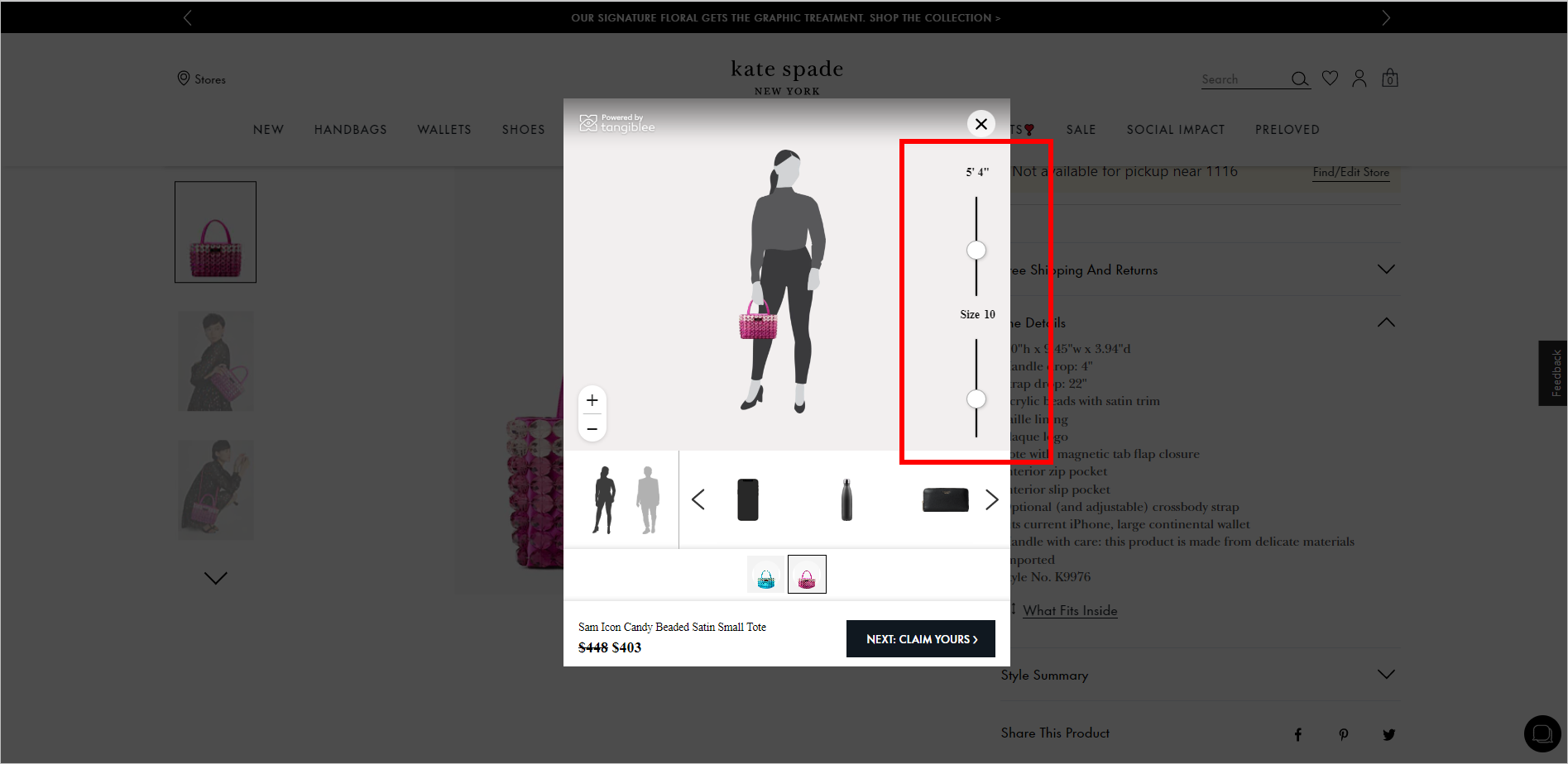
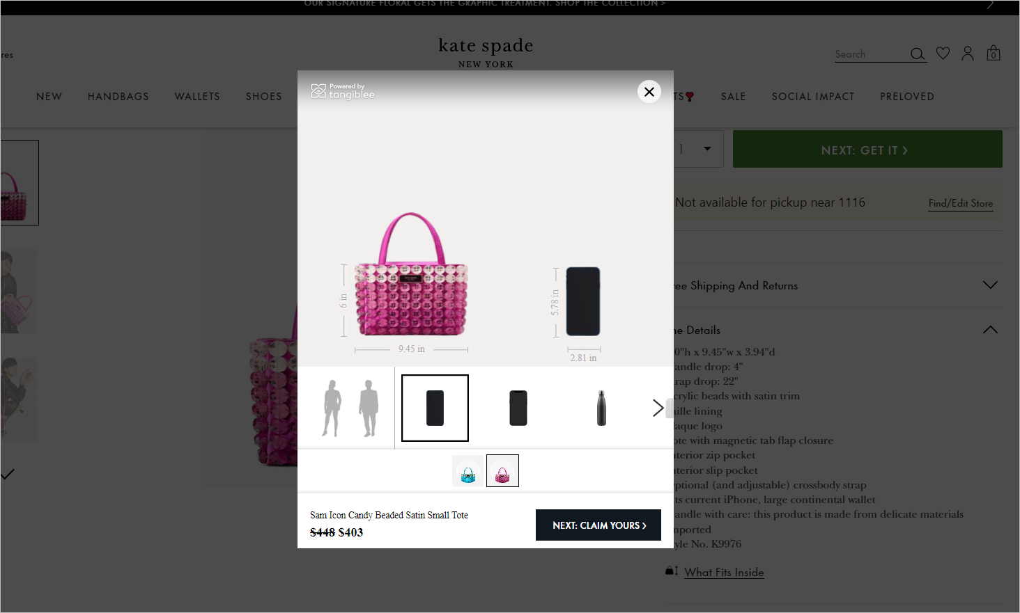
Minimize buyer uncertainty as much as possible. Use high-quality product images to give shoppers a detailed view of the product. This includes showing the item from different perspectives and putting it beside everyday items for context and scale, if appropriate.
3. Display the Product in Different Colors and Variations
In case a product is available in multiple colors, include pictures that display the product in each of the available colors. This way, shoppers can easily visualize their options and make an informed buying decision.
Example of Showing Available Colors in E-commerce Product Images
JetPens.com makes it easy for shoppers to discover the variations of a specific fountain pen. Their PDP shows all the body colors the pen is available in and what nib size and color it can be combined with.
When the user clicks on a certain body color, they’re shown several images of the fountain pen in that color. Each color has its own set of product images – photos of the fountain pen capped and uncapped, a close-up of the tip of the cap, a photo of the pen being used, etc.
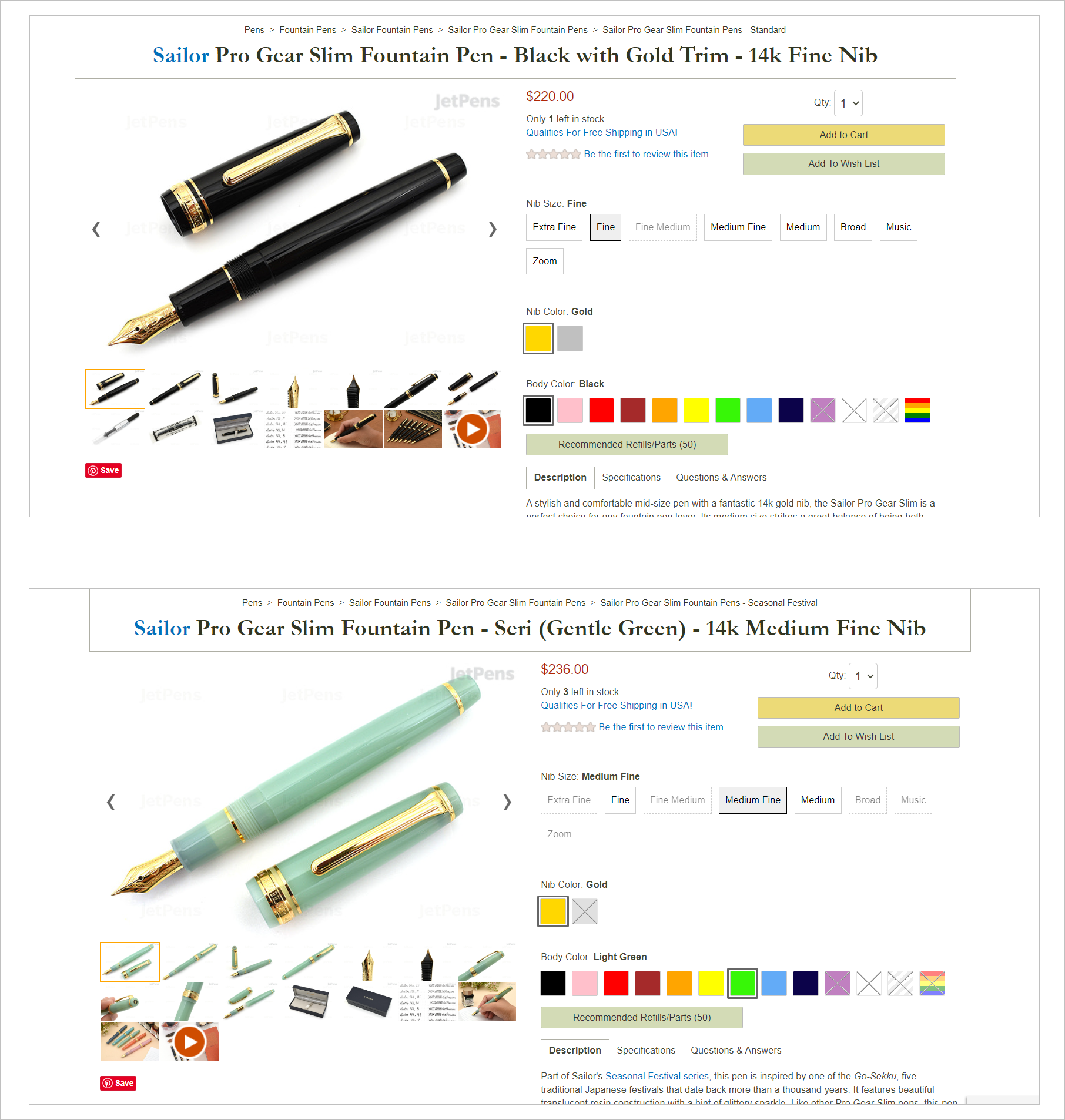
Showing different color options can also increase your website’s chance of making a sale. Customers will be more likely to find a color they like and prefer, leading to a higher conversion rate. Be careful, however, with how you present choices. Too many options can overwhelm users and are detrimental to conversions.
4. Make It Immediately Clear Which Product the Image Represents
A shopper’s experience on your e-commerce website should be as effortless as possible. Otherwise, they might put off deciding for another day.
Customers shouldn’t exert much effort in figuring out things on your website. For instance, it should be instantaneously apparent what a product image represents. Shoppers shouldn’t have to spend time trying to identify where in the picture the product you’re selling is.
Take this Banana Republic PDP, for example. It has only one product image. It’s a photo of the model wearing several things, so it’s unclear which is the “Petite Roll-Cuff Top.” The product is also barely visible because it’s worn under a jacket and tucked in the pants. The shopper can’t see most of the top, including the “roll-cuff” part, which is supposedly the product’s distinguishing feature:
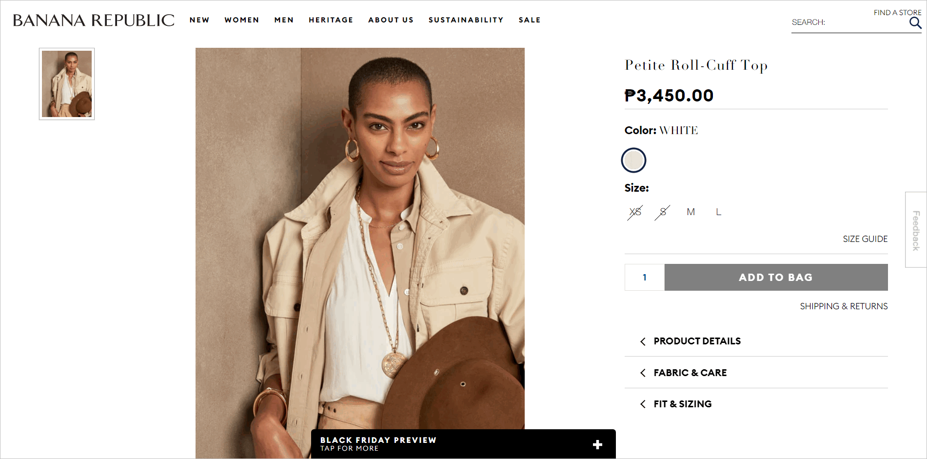
Make it easy for e-commerce shoppers to decide by reducing user load. If it’s not immediately clear where your product is on an image, you’re adding cognitive and visual load on visitors. That’s bad for conversions.
Identify conversion barriers on your e-commerce website.
Get help from an expert and uncover new revenue opportunities.
5. Include User-submitted Visuals on the Product Detail Page
Social proof has always been one of online shoppers’ most utilized shortcuts when purchasing. These days, social proof is not limited to textual reviews submitted by other customers. Online customers now rely on user-generated visuals to decide whether or not to buy a product.
Bazaarvoice’s 2022 Annual Shopper Experience Index revealed that 71% of American consumers say user-submitted photos on the product page increase their likelihood of purchasing a product.
Example of Utilizing User-submitted Visuals as Social Proof
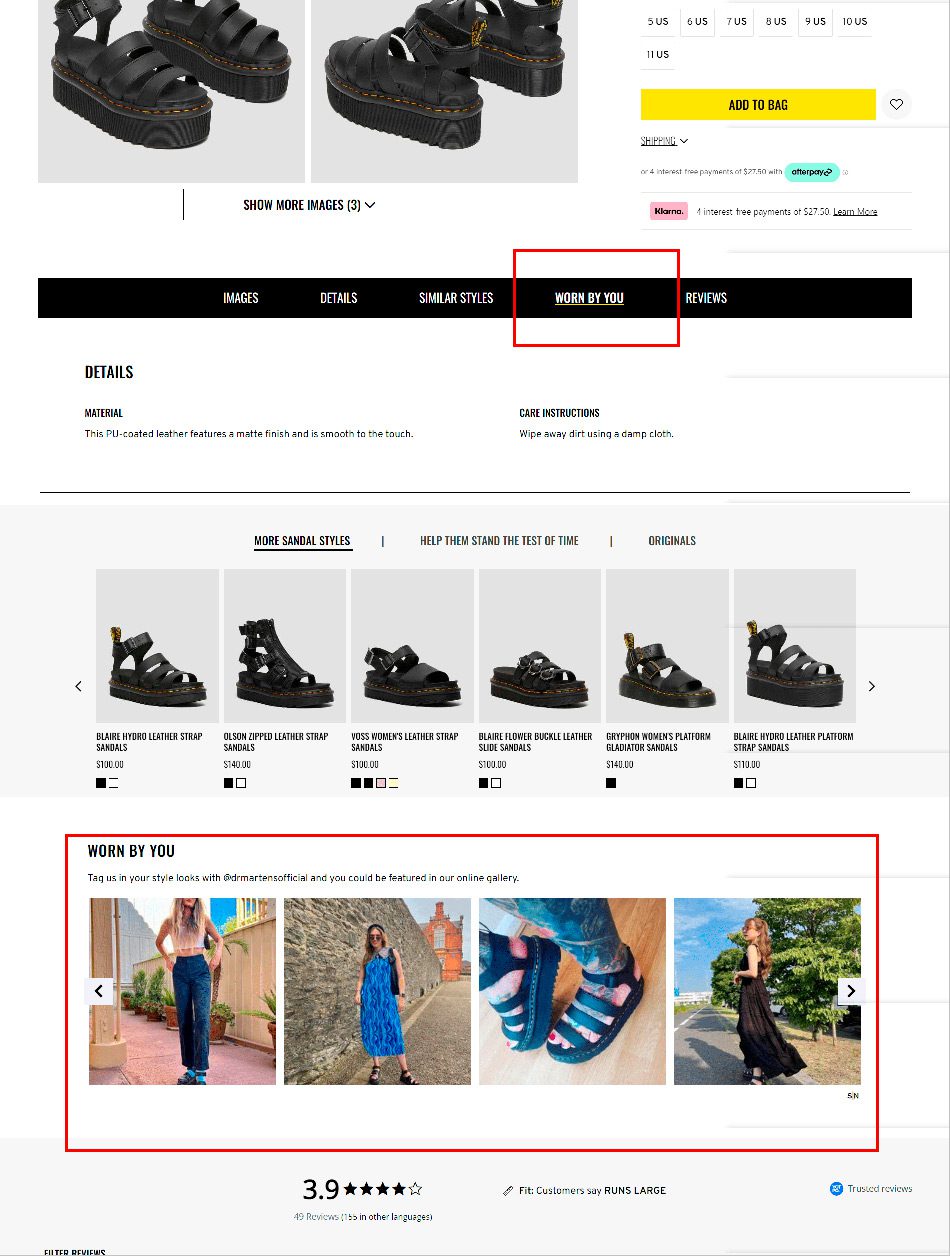
One company that tries to harness the power of user-submitted visuals is Dr. Martens. The website’s PDP includes an online gallery of real-life customers wearing the product. The photos serve as persuasion elements because they show the product in different real-life settings, worn by real people. They help potential buyers visualize how a pair of sandals, for instance, would look on their feet and how they would look when paired with different outfits.
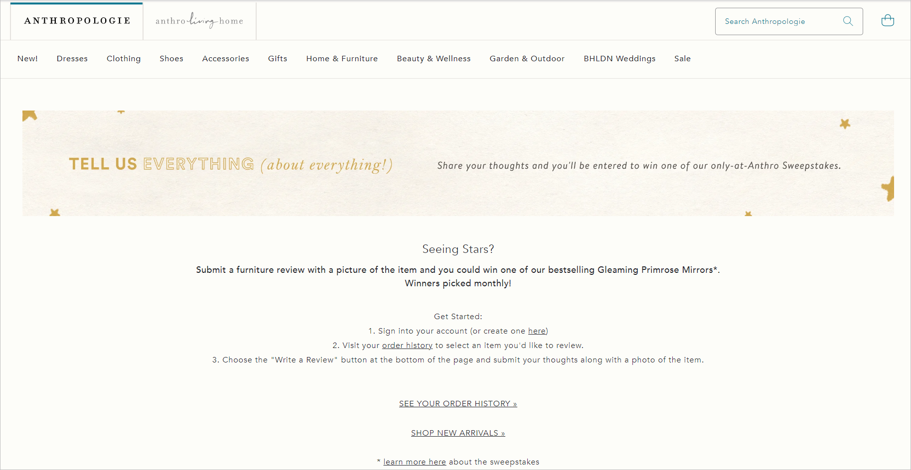
You can try to collect customer visuals by “gamifying“ your user-generated content (UGC) program. Bazaarvoice’s 2022 Shopper Preference Report showed that 77% of global consumers said that they would submit UGC for a reward.
Anthropologie.com, for example, nudges shoppers to submit reviews with pictures through a monthly raffle:
Learn more about the importance of customer-submitted visuals and leveraging social proof in general. Read “8 Customer Reviews Best Practices to Optimize Conversion Rates”.
6. Add Videos to Your E-commerce Product Detail Page
Livestream shopping has been growing in popularity. Companies that host real-time virtual shopping events have even reported “seeing 10X over their traditional website conversion rates.”
One reason for online shoppers’ fondness for live shopping events is the ability to see products in context and from different angles.
Livestreams help customers better understand product information, like size or material. These are details they otherwise won’t get from static images or textual descriptions.
Even if you don’t dabble in livestream shopping, you can still integrate some aspects people love about livestreaming into your e-commerce website.
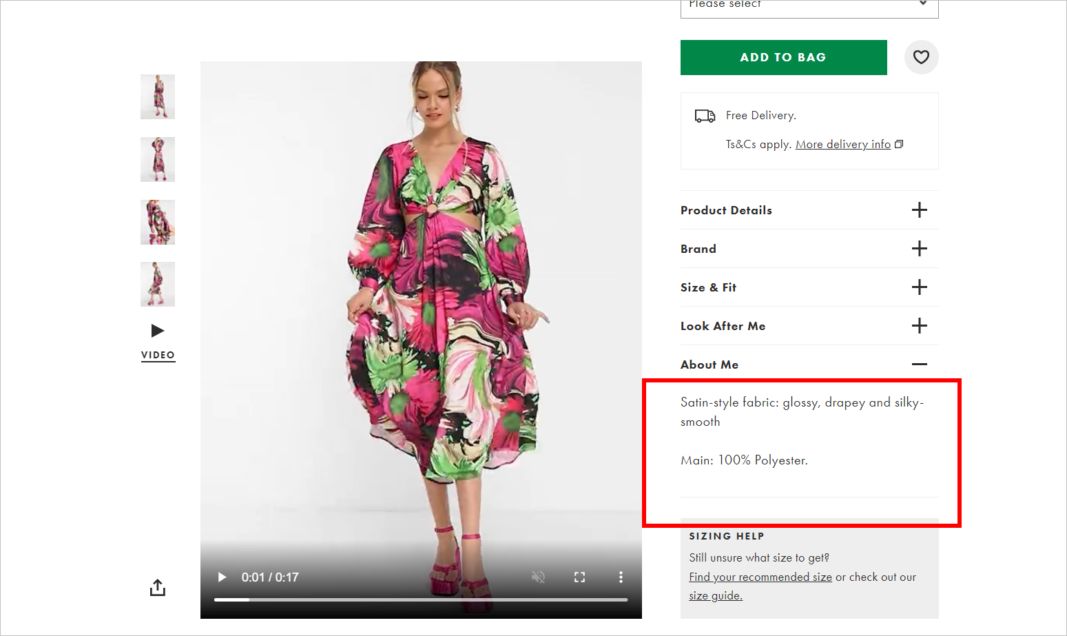
For example, you can add videos to your product detail page that show the item worn by a model if you sell clothes. That way, buyers can better assess the material and the fit.
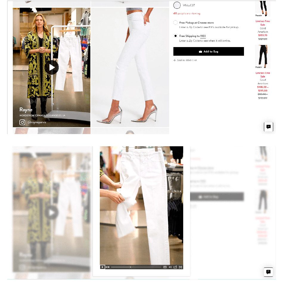
Or, you can adopt a strategy straight from the live shopping playbook: include a video of sales representatives showcasing the product’s features and how it might be used.
Nordstrom, for instance, has PDPs for fashion items with short videos of sales reps talking about the product. They describe the material and fit and highlight certain details about the item.
Real-time live shopping events might not be for everyone. However, e-commerce websites will do well to explore more engaging methods that provide buyers with richer details about the product, like adding videos to the PDP.

Harness the power of social proof through customer reviews.
7. Consider Investing in Augmented Reality (AR)
Augmented Reality (AR) is on the rise in e-commerce.
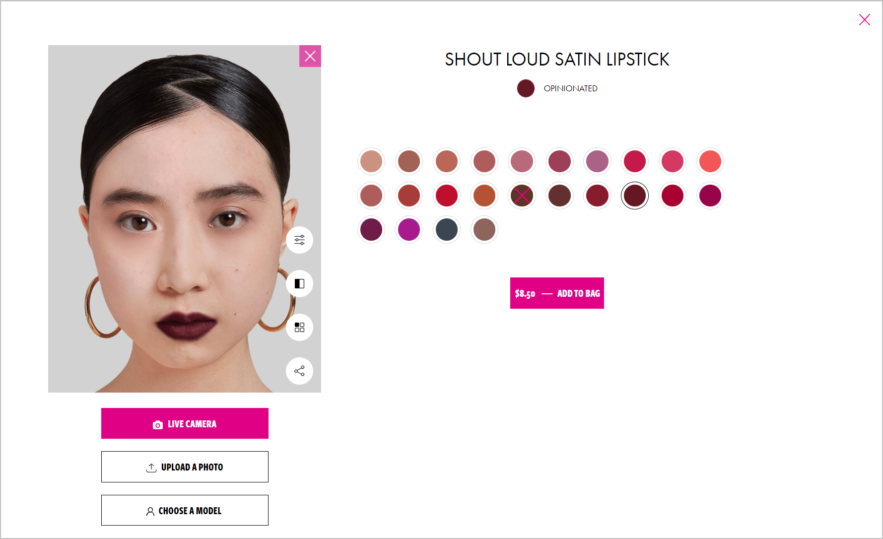
Some online stores are compensating for the lack of sensory product information through AR. This technology lets shoppers virtually interact, test, and try on products through an electronic device by layering digital information over the real world. Through AR, shoppers can see how a couch would fit in their home, for instance.

Giving shoppers more contextual and visual information through AR can increase the shopper’s confidence that what they’re buying will match their expectations. This, in turn, will decrease return rates, increase customer satisfaction, and boost brand loyalty.
It’s important to note that according to the 2022 Bazaarvoice Shopper Experience Index (with data collected from December 2021 to January 2022), only 12% of global shoppers included augmented reality in their “five must-have factors” when buying confidently.
So, augmented reality might not be essential to the e-commerce conversion rate optimization toolbox … yet, depending on the type of products you sell. For some industries, the pandemic has made augmented reality table stakes.
Augmented Reality in the Beauty Industry
Beauty brand L’Oreal, for example, had been using AR technology to allow customers to try on their products even before the COVID outbreak virtually. And even pre-pandemic, using the technology resulted in a 3x increase in sales for the beauty company.
The pandemic has made virtual try-ons essential for makeup brands, even for in-store experiences. As shoppers are no longer able to physically try on makeup samples due to hygiene and safety concerns, they depend on augmented reality to see if a beauty product complements their skin tone, for instance.
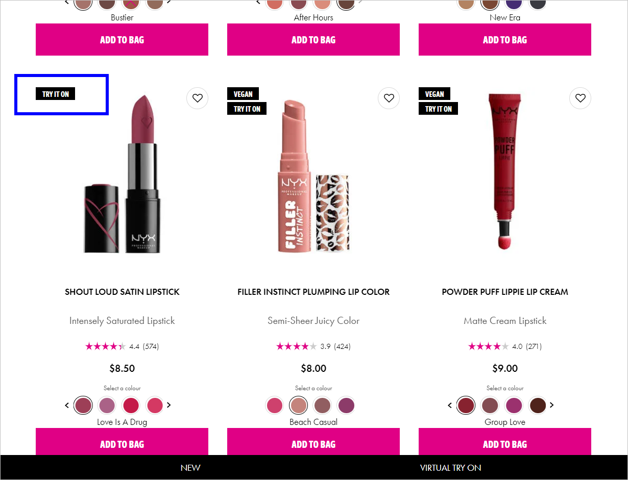
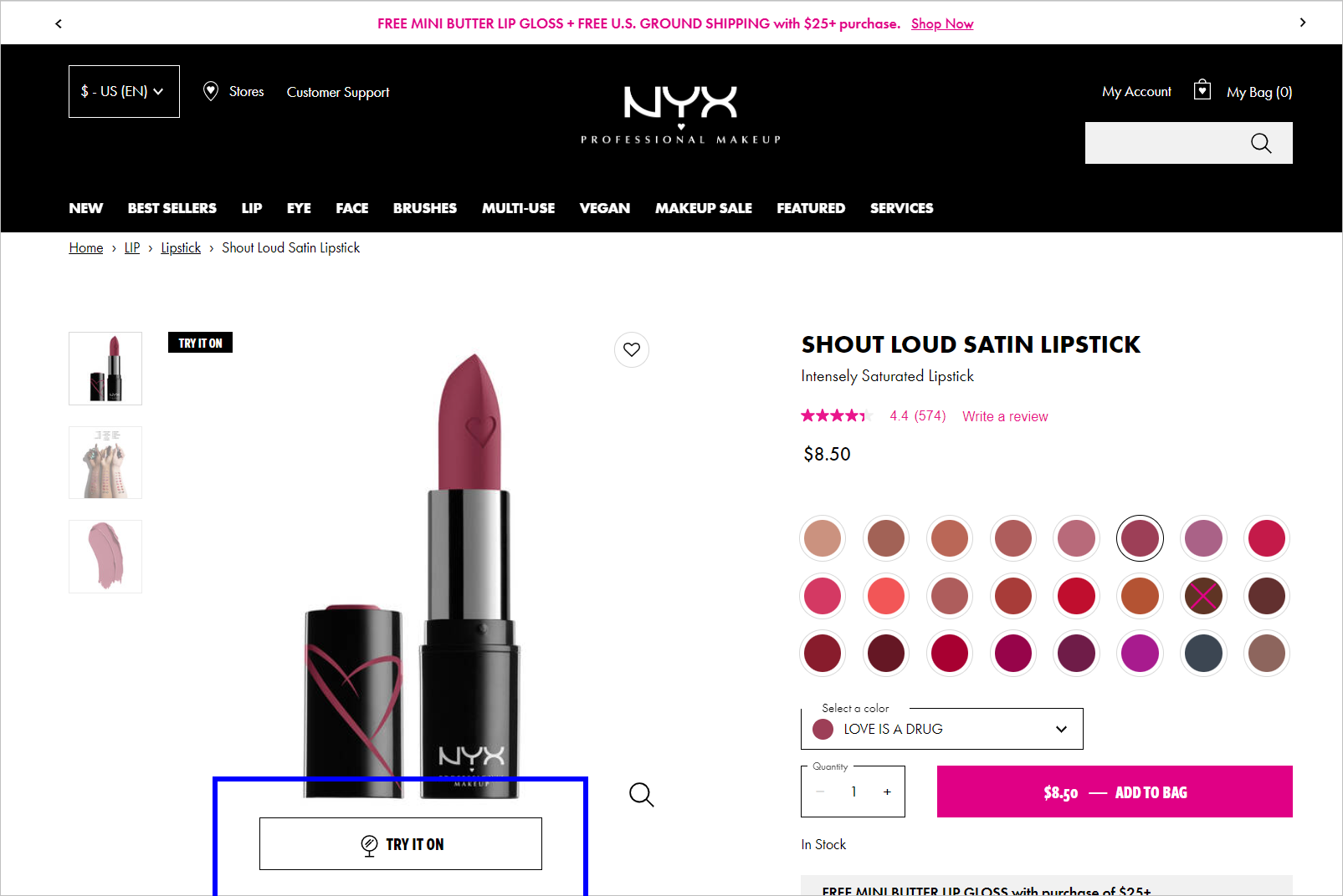
NYX Professional Makeup, a subsidiary of L’Oreal, gets a couple of things right about using AR to help shoppers pick items best suited to them. For one, they make immediately obvious on the category page which items the shopper can virtually try on:
Is Augmented Reality Important for E-commerce?
According to 2020 data from Vertebrae, a company specializing in AR and 3D commerce, conversion rates go up by 90% for consumers who engage in AR compared to those who don’t.
Shopify also noted in September 2021 that while there wasn’t much reliable research on how AR affects conversion rates yet, their internal data showed AR’s strong potential.
So, if it makes sense for your business and you have the resources, consider letting your customers preview and interact with your products through augmented reality. It is predicted, after all, that nearly 75% of people worldwide and almost all smartphone users will be frequent AR users by 2025.
You can dip your toes in AR for shopping by utilizing applications like SnapAR and Meta Spark. Be warned, however, that even these apps require technical skills. You’ll need someone with the expertise to make art or 3D models to use in the AR environment.
Conclusion: Let Your E-commerce Product Images Paint a Picture for Shoppers
If you want visitors to buy from your e-commerce website, give them the necessary information to decide confidently. One way to accomplish that is through high-quality images and visuals that accurately represent your products.
If you …
- highlight the distinct features of a product,
- show the item from different viewpoints and used in different situations,
- present the product in different colors and variations,
- make it immediately obvious which product the photo represents,
- include user-submitted visuals,
- add videos on your PDP, and
- utilize augmented reality (if it makes sense for your business)
… you’ll increase the chances of the shopper converting on your website, decrease the likelihood of them returning the item, and create a positive customer experience overall.


