Summary: Unlock key insights into using strategic discounts to enhance conversion rates and foster customer loyalty. Delve into practical techniques for crafting compelling offers that balance profitability with customer satisfaction, all while safeguarding your brand’s value. Learn how to do discounts, what is a discount, and the meaning of discounting, ensuring these tactics contribute positively to your overall conversion rate optimization efforts. This guide illuminates how to find the discount price and write a discount offer that resonates, providing a roadmap to leverage bargain deals for immediate sales and long-term engagement. Understand the impact of a well-calculated discount price and the significance behind discounted prices, unlocking the full potential of discounted price meaning in your marketing strategy.
Deals and bargain deals not only delight and excite customers but also serve as a practical demonstration of a discount: a strategic reduction in pricing designed to increase customer happiness and engagement.
A 2012 research commissioned by Coupons.com and led by Dr. Paul J. Zak, a professor of Neuroeconomics at Claremont Graduate University, showed that coupons make people happy. The study revealed that those who received a $10 voucher were 11% happier compared to those who did not.
Delighting customers shouldn’t come at the expense of your bottom line, however. It would help if you created a win-win scenario where customers are happy and you increase your conversions and profits.
Here are some discount pricing strategies to think about:
Generating Quick Interest with Strategic Discounts
To navigate the fine line between delighting customers and maintaining profitability, it’s essential to consider the strategic use of discount pricing. Discounts can be a powerful tool to generate quick interest when employed judiciously. By offering discounts, businesses can capture the attention of potential customers, creating a buzz. However, using these strategically is crucial to avoid devaluing the brand. Overuse can lead to a perception of the brand as low-value, contrary to generating genuine interest.
Such strategic promotions lay a strong foundation, not only by attracting immediate attention but also by encouraging potential buyers to consider making a purchase. Incorporating discounts into your marketing campaigns and knowing how to write a discount offer can add a significant boost, whether through advertisements, emails, or social media posts. Highlighting a discount instantly grabs consumer interest, creating a sense of urgency that encourages quicker decision-making and increases the likelihood of conversion.
Moreover, the positive word of mouth generated by satisfied customers who benefit from these deals can further enhance your brand’s visibility. This can attract a broader audience, amplifying the quick interest your promotions generate. Ultimately, employing discount pricing strategically—rather than as a constant expectation—can bolster your marketing efforts and drive engagement without undermining the perceived value of your offerings.
Discount Pricing Strategies
1. Don’t Offer Discounts Regularly
Offering discounts regularly can do more harm than good to your business, as this tends to train customers to wait for deals and be unwilling to pay the total price. Discount pricing can warp brand perception if not implemented carefully by distorting customers’ perception of the brand’s value and quality. Discount pricing can create a customer base that expects discounts by conditioning customers to anticipate and rely on discounted prices.
Consistently offering significant discounts can cast a business as a “bargain brand” because it may give the impression that the business is cheap or low-rent. When customers see frequent discounts, they may perceive the brand as one that constantly relies on lowering prices, which can diminish its perceived value and quality.
You risk negating the scarcity principle and loss aversion bias by giving discounts regularly. Regular discounts may dilute the sense of urgency typically driven by the scarcity principle, diminishing the strategic value of discounted prices.
Be selective with when and to whom you give the discounts. You can consider offering discounts to do one of the following:
Get New Visitors Into Your Sales Funnel
Employ the reciprocity principle to funnel in first-time visitors. To drive visitors deeper into the sales funnel, you can offer them a discount in exchange for their email address.
Carefully consider how to find a discount price that appeals to new customers. When a business consistently offers discounts, customers may expect those lower prices as the standard. This can lead to customers being less willing to purchase at the total cost and waiting for the following discount offer. Additionally, suppose customers come to expect discounts as the norm. In that case, it may become difficult for the business to sell products or services at their original price, leading to a potential revenue loss and brand devaluation.
Discounting too frequently or aggressively can have several potential consequences. Firstly, it can lead to a sense of entitlement and dissatisfaction when discounts are unavailable, generating customer frustration if the business cannot sustain the discounting strategy over time. Additionally, it may result in bad publicity if customers perceive the discounts as deceptive or if competitors criticize the business for devaluing its products or services. Ultimately, this strategy can even lead to a loss of business if it undermines the brand’s perceived value and erodes profitability.
Most sites automatically load an entry popup with the signup discount before visitors can process what’s on the site. Bloomingdales.com, for instance, immediately shows this popup once the visitor lands on the homepage, making it a practical example of what a discount means in action.
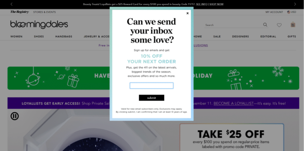
Weigh the pros and cons of discounts for your site. Entry popups may encourage people to sign up for your newsletter but may also frustrate users, highlighting the importance of understanding what a discount and discounting mean.
An alternative to launching an entry popup is to use an exit-intent popup – trigger the popup as the user moves their cursor out of the active browser window, a savvy discount price strategy.
Done correctly, offering discounts to attract new subscribers can ensure that you have a healthy marketable contacts database without frustrating users. This demonstrates how to write a discount offer that converts.
Build a Relationship with Existing Customers
Innovative companies know that focusing on customer retention instead of customer acquisition is key to success. This is because attracting a new customer costs five times more than retaining an existing one, illustrating the discounted price meaning in fostering loyalty.
It’s essential to gain your existing customers’ loyalty, so you reduce the costs of attracting new prospects, a discounted pricing strategy that pays off long term.
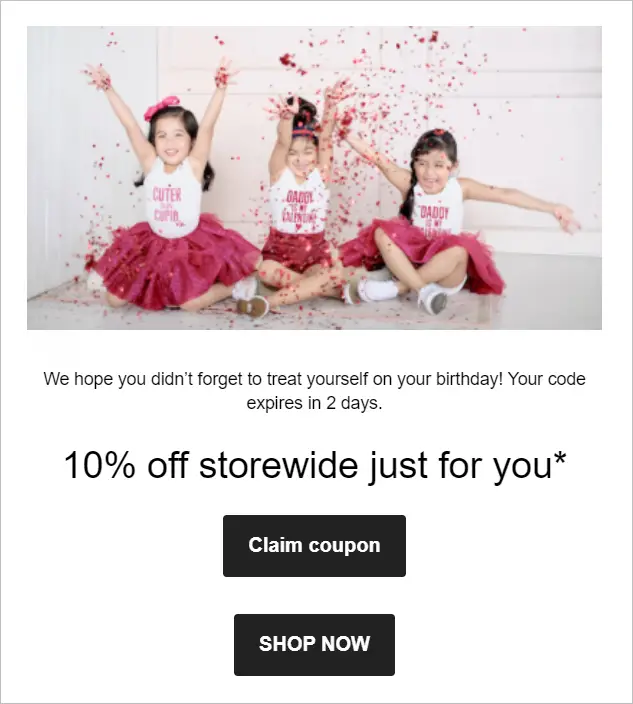
One way to build a relationship with your existing customers is by sending them coupons. For example, a birthday discount coupon sent via email cultivates goodwill and gives the customer a reason to shop with you again. This practice demonstrates how to find the discount price that appeals directly to your audience, enhancing the connection with your brand.
Enhancing Engagement Through Referral Rewards
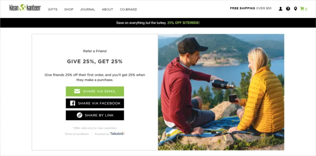
You can also incentivize customers with discounted prices through a referral program, an excellent method of offering discounts that benefit both the referrer and the referred customer.
This will require the company to spend, but the results can be worth it. A referral program leverages people’s trust in people they know (i.e., your existing customers) to beef up your new customer pipeline, a tangible discounted price meaning in marketing.
It can also influence customer retention, turning regular customers into brand advocates. This, in turn, can increase your customer lifetime value. And because referred customers tend to spend more than customers acquired through other channels, referral marketing is something you should consider for your business, effectively applying discounted price strategies to enhance community engagement and loyalty.
Klean Kanteen exemplifies this strategy by enticing website visitors to promote their brand, offering a 25% discount to the referrer and their friends. This initiative serves as an exemplary model of how to write a discount offer that effectively resonates and engages.
Promoting a New Platform with Incentives
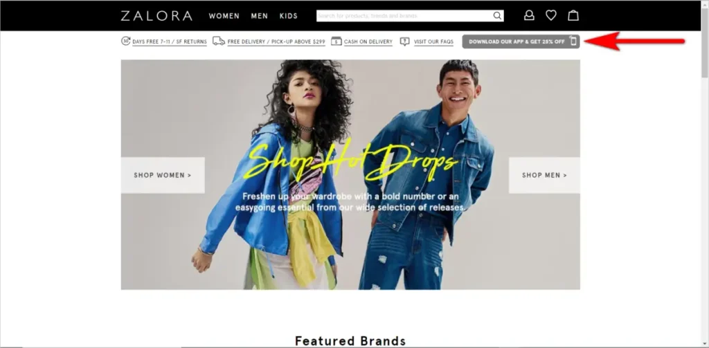
If a mobile app makes sense for your business, you can get more people to download the app by offering an incentive. That way, your brand can be present on a user’s mobile device, from the company logo on the app icon to occasional push notifications. Offering discounts as a bargain deal can effectively encourage app installations.
Zalora, an e-commerce site, for instance, motivates desktop users to switch to its mobile app by offering a 25% discount. This strategic move redefines how discounts are offered in digital commerce. This approach not only boosts app downloads but also enriches the discounted-price shopping experience online.
2. Discount Presentation: Be Deliberate About How You Display the Discount
You might not have control over the amount you can deduct from prices to make your products appealing. What you can control, however, is the discount that is presented. You can optimize how you display the discount so customers perceive it to be more compelling. Effectively showcasing discounts as a bargain deal can make offers more enticing.
Apply the “Rule of 100” for Impactful Discounts
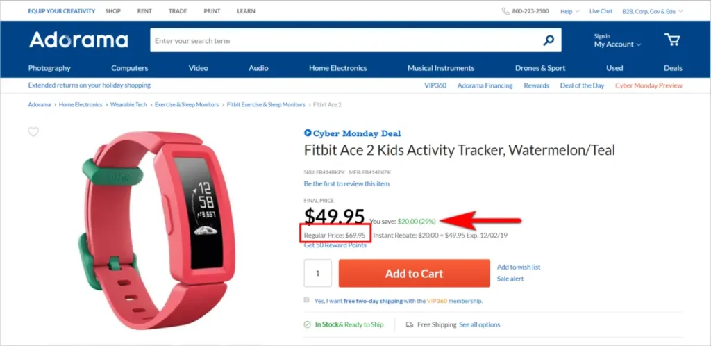
According to Dr. Jonah Berger, a marketing professor at the Wharton Business School, for items that cost less than $100, it’s better to present the discount in terms of a percentage, as that will be higher than the dollar amount saved.
For example, the Fitbit Ace 2, costs $69.95 (less than $100). So, the discount expressed in percentage, which is 29%, is higher than the amount saved (~$20.00). In this case, it’s better to display the discount in terms of percentage, as it appears more impressive than the actual dollar amount saved:
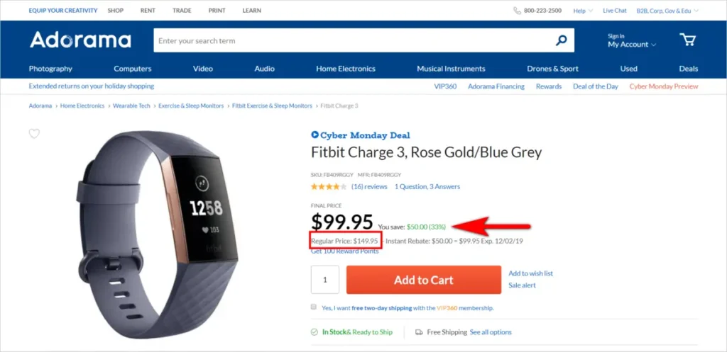
On the other hand, if the product costs more than $100, displaying the actual amount saved will be more compelling, as that number is higher than the percentage.
Take the Fitbit Charge 3, for instance. It costs $149.95, so the discount expressed in percentage (33%) is a lower number than the amount saved (~$50.00):
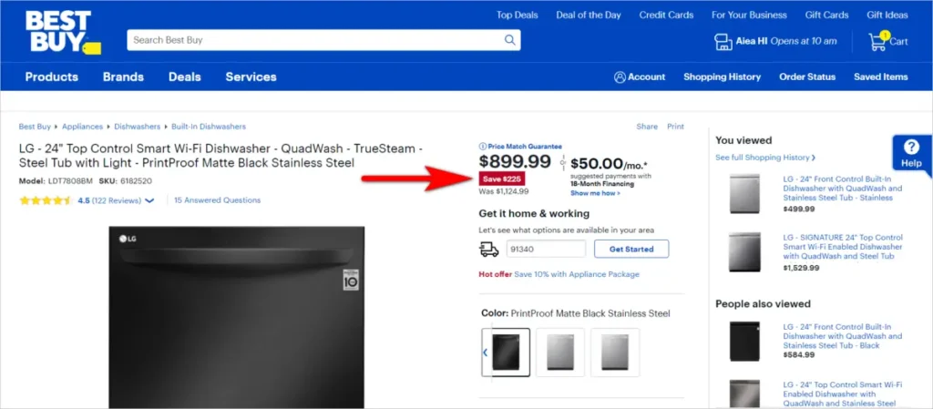
Showing the discount as a percentage for big-ticket items undersells the amount the customer saves. For an item at $1,124.99, for example, indicating that the customer is getting 20% off is less persuasive than saying they’re saving $225, illustrating the discounted price meaning in high-value purchases.
Give a Discount on Top of Another Discount for Enhanced Appeal
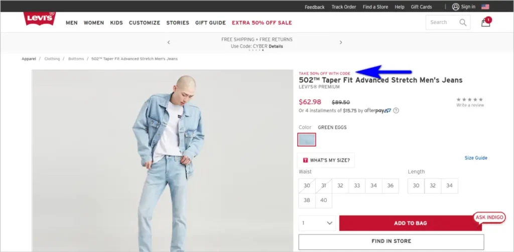
Understanding how to write a discount offer that significantly motivates action is critical to captivating your audience. People find a discount on top of another deal more attractive than a discount presented as one number, even if the amount saved is the same.
For example, Levi’s presents two separate discounts for the pair of jeans below. The customer initially gets about 30% off the base price, and then they can get an additional 50% off the sale price with the Cyber Monday coupon code. This discount presentation is bound to persuade more visitors to act compared to displaying a single discount and indicating that the customer is getting about 65% off the total price:
How you communicate a discount price matters. A methodically crafted discount offer can significantly outperform another despite coming down to the same amount saved.
3. Optimizing the Discount Code Presentation
How you ask for the discount code can impact whether a customer proceeds or abandons their cart.
Making the promo code box too visually prominent is tantamount to telling those on the checkout path to put off completing the transaction because there’s a better deal out there.
Indy Brand, for example, is bound to unnecessarily trigger the customer’s fear of missing out on a better price, as the discount code box draws too much attention:
So unless promo pricing codes are available constantly and displayed prominently throughout your site, visually highlighting the discount code field will only cause users to leave the checkout page to look for a code elsewhere.
This can hurt you in a few ways – the customer might …
- … find a discount code from an affiliate, costing you affiliate fees and lowering your margins.
- … get distracted while seeking out a discount might lead to customers abandoning their carts entirely due to completely forgetting about the purchase.
- … find the product on a competitor site and convert there instead.
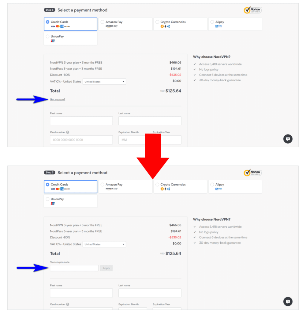
NordVPN tries to mitigate these risks by hiding the discount code field behind the underlined text. The text opens into a box when clicked on:
Another way to avoid customers leaving the site to hunt for coupons is to have modal text such as “Don’t have a coupon?” If the user clicks on the text, a lightbox popover should launch and tell the customer what they need to do to get a discount.
Offer an incentive that makes sense for your business. The popover can say something like “Join our mailing list and get 5% off your first purchase”, for instance. Or you can ask customers to refer a friend in exchange for a discount.
This way, customers don’t feel like missing out on a deal.
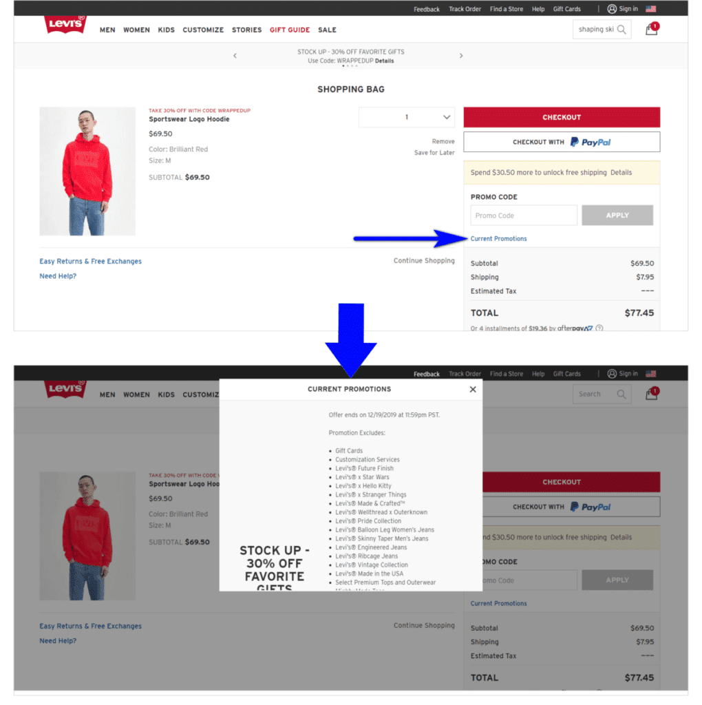
Levi’s, for example, has a visually prominent promo code box in the shopping cart but tries to get around the problem of customers leaving the site to look for a coupon by listing the current promotions in a popover:
4. Ensuring Discount Clarity for Customers
Clarity is a critical consideration when applying discounts.
It’s important that you’re clear about whether or not the discount has already been applied or will be applied at a later stage before the checkout. Visitors might leave if they are uncertain about how you handle pricing for discounts. Strikethroughs on the original price: Once you’ve applied the discount, make it very clear that you’re giving them the new, post-discount price.
J. Crew’s shopping cart, for example, does an excellent job of indicating the pre and post-discount price of the items. However, it fails to communicate that the customer is saving $648 immediately. That’s a missed opportunity.
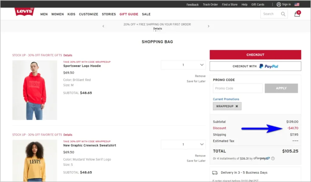
Leverage the persuasion power of discounts and nudge customers to continue on the checkout path by clearly indicating how the discount affected the order total, similar to how it’s done in the Levi’s cart:
Execute Discount Pricing Strategies Right
In our exploration of ‘Discount Pricing Strategies,’ we outlined the significant consequences of overusing discounts, including customer dissatisfaction and entitlement. Here, we focus on actionable strategies to avoid such pitfalls, ensuring discounts enhance rather than detract from your brand value.
Discounts are powerful tools but can easily backfire and do more harm than good. Disciplined marketers will ensure that they don’t shoot themselves in the foot:
- Avoid making discounts so typical that customers get trained to expect them.
- The potential repercussions of customer frustration, bad publicity, or loss of business due to discount expectations can be significant. Customer frustration can lead to negative word-of-mouth, where dissatisfied customers share their experiences with others, potentially deterring new customers from engaging with the business.
- Don’t miss out on making the discount more appealing by using the rule of 100 and applying a discount on top of a discount.
- Incorporating these tactics wisely can enhance the perceived value of offers without fostering unrealistic expectations.
- Avoid calling too much attention to the promo code field – put that behind a link.
- A discrete approach prevents customers from pausing their purchase journey to search for codes, which can disrupt the sales process and inadvertently lower conversion rates.
- Avoid ambiguity – make the effect of the discount evident from the start.
- Clarity in how discounts are applied reassures customers, fostering trust and reducing the likelihood of confusion or dissatisfaction that could harm your brand’s reputation.
Further, bad publicity over discount misunderstandings or perceived unfairness can damage the brand’s reputation and credibility. If not managed carefully, such negative perceptions can lead to declining customer loyalty and revenue, jeopardizing long-term success.
If you use discounts carefully, you’ll convert more visitors without harming your bottom line.
In summary, a clear and strategic discounting approach significantly enhances customer experiences, driving immediate sales and building long-term loyalty. As highlighted, careful discount application, avoiding frequent discounts, and focusing on the brand’s integrity is paramount. A disciplined discount strategy, integral to eCommerce Discounting Optimization, distinguishes your online store in a competitive marketplace, fostering immediate and sustained growth.
Integrating discounts thoughtfully within your broader promotional strategy ensures that these offers resonate with your audience, turning every discount into a powerful tool for customer engagement. This approach goes beyond price reduction, weaving discounts into your brand’s value proposition narrative.
Moreover, an effective promotional strategy extends its reach through community building around your brand. Engaging with customers via social media, email newsletters, and direct communication transforms one-time buyers into long-term brand advocates. This holistic approach to promotions, where discounts play a strategic role, not only drives sales but also deepens the connection between your customers and your brand.
As you refine your promotional strategy, consider the balance between offering discounts and maintaining the perceived value of your offerings. The goal is to use discounts as a tool for immediate sales boosts and as a strategic element of your overall marketing efforts, enhancing brand perception and customer loyalty.
By carefully positioning discounts within your promotional strategy, you set the stage for a thriving online store that excels in a competitive marketplace. This balanced, strategic approach to discounting and promotions is critical to achieving short-term success, sustainable growth, and customer loyalty.
