 You’ve looked at your site analytics and success metrics, and compared those with your core business objectives. You probably know what page or pages are vital to your conversion action and a basic understanding (or at least, an assumption) of what your audience is trying to accomplish when they come to your site. But even with all this information, how do you know what elements on your landing page are worth tuning and testing?
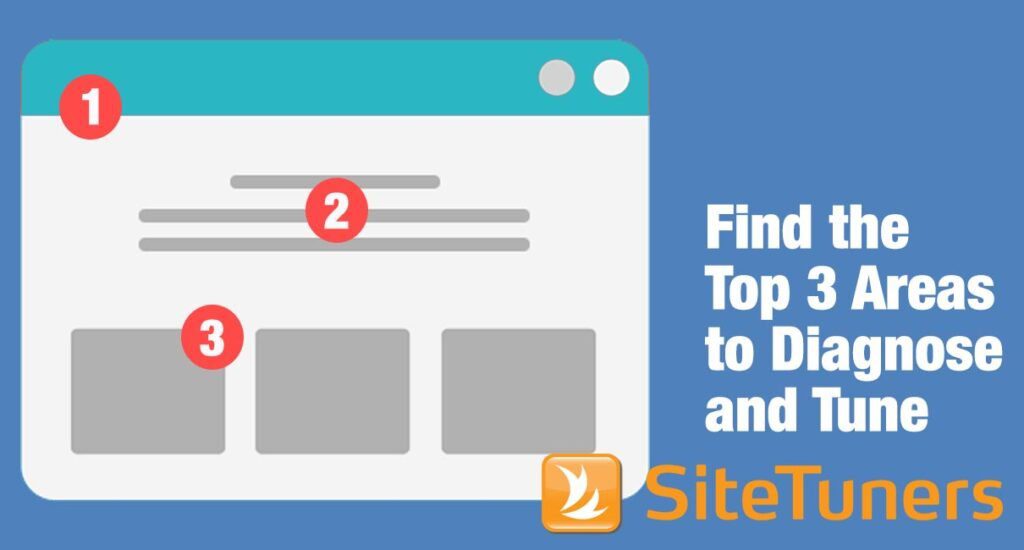
The first thing to keep in mind is that not all elements on your landing page matter. More likely than not, a few key changes to your page will result in the biggest conversion rate improvement. That means there are countless other changes you could make that won’t help your conversions at all. You’ll have to take your best, informed guess in prioritizing what to test first. Many landing page deficiencies fall into the following classes of problems.
Page Structure
Page structure defines how the real estate on your page is organized and used. By changing the sizes and positions of various page sections, you can dramatically impact the emphasis that key areas receive. Look at your landing page and consider how you might change and test any of these elements:
-
- Size and contents of page header or footer
-
- Size and location of page navigation (horizontal vs. vertical, use of mega-menus, etc.)
-
- Placement of trust symbols and credibility logos
-
- Separation of page shell and navigation from page content
-
- Size and location of forms or other calls-to-action
-
- Swapping of key page sections (e.g., a form located to the left of the text or to the right)
-
- Vertical stacking vs. horizontal arrays of page sections
-
- Single vs. multiple columns
Information Architecture
Information architecture creates a mental map of how your site works, and how your visitors can interact with it. Typical information architecture-related test elements include:
-
- Self-selecting by role or by task
-
- Clear and distinct descriptive link text and choices
-
- Sensible and prominent page titles
-
- Breadcrumbs or orienting context (“you are here”)
-
- Consistent placement of all page elements
-
- Number of available choices presented
-
- Alternative navigation methods
-
- Cross-linking to other key information
-
- Availability and format of on-site search
-
- Ability to avoid, minimize, reverse, or easily correct mistakes (e.g., on-page error checking, context-sensitive form fields)
Presentation
Presentation mainly has to do with the format in which you deliver your message. It has a lot to do with the look and feel of your site.
Typical presentation testing elements include:
-
- Degree of detail (e.g., full text, or links to supporting information)
-
- Writing format (prose, length of text)
-
- Choice of input elements (e.g., radio buttons or pulldown lists)
-
- Action format (e.g., buttons, text links, or both)
-
- Editorial tone of your writing
-
- Use of alternative formats and modalities (e.g., charts, figures, audio clips, video, presentations, demos)
Emphasis
Emphasis is about the relative importance that you place on something. Does your landing page try to draw attention to multiple items? This is a common conversion problem, because it generally distracts the visitor rather than focusing attention on the main conversion action. Ways you can test elements of emphasis include:
-
- Amount of screen real estate devoted to an item
-
- Use and size of relevant images (e.g., specific product or believable people)
-
- Image captions
-
- Font sizes and font families (e.g., headline sizes)
-
- Font emphasis (e.g., italics, bolding, underlines, background colors, text colors, capitalization)
-
- Background color blocks or background images
-
- Call-to-action button shapes, sizes, visual styles, and effects (e.g., beveling, borders, and drop shadows)
-
- Visual separators (e.g., horizontal rules)
-
- Use of whitespace and visual isolation to focus on important items
-
- Removal of distracting secondary information
If you were thinking about your landing page as you read the lists above, I’ll bet a few of them jumped out at you as things that might be worth testing. Maybe you’re concerned about how your page is organized, or the tone of the writing. Perhaps you’re concerned that you’ve got too many links on your landing page. Look at your data and see how your traffic is flowing. Are visitors doing anything to avoid clicking your button? Maybe alternate wording should be tested. Are people bailing out of your form before completing it? Consider testing fewer fields or different field labels. Use your data, and your own good sense, to come up with a short list of items you think could have an impact on conversion, and start testing an alternate version. But be warned: not every hunch you have will be a home-run. Through the course of testing, you are likely to test elements that make no difference in your conversion, and some that actually drag down conversion rates. But every test will add to your understanding of what performs best for your product/service and your audience.
This article originally appeared in Tim’s ClickZ column January 24, 2012
Take your conversions to the next level.Learn how our experts at SiteTuners can help kickstart your conversion rate optimization process or get better results from your CRO efforts. Give us 30 minutes, and we’ll show you a roadmap to your digital growth! |

