Conversion Design

a picture highlighting th 6 most common conversion killer on membership websites

6 Common Website Conversion Problems On this Client’s Membership Site

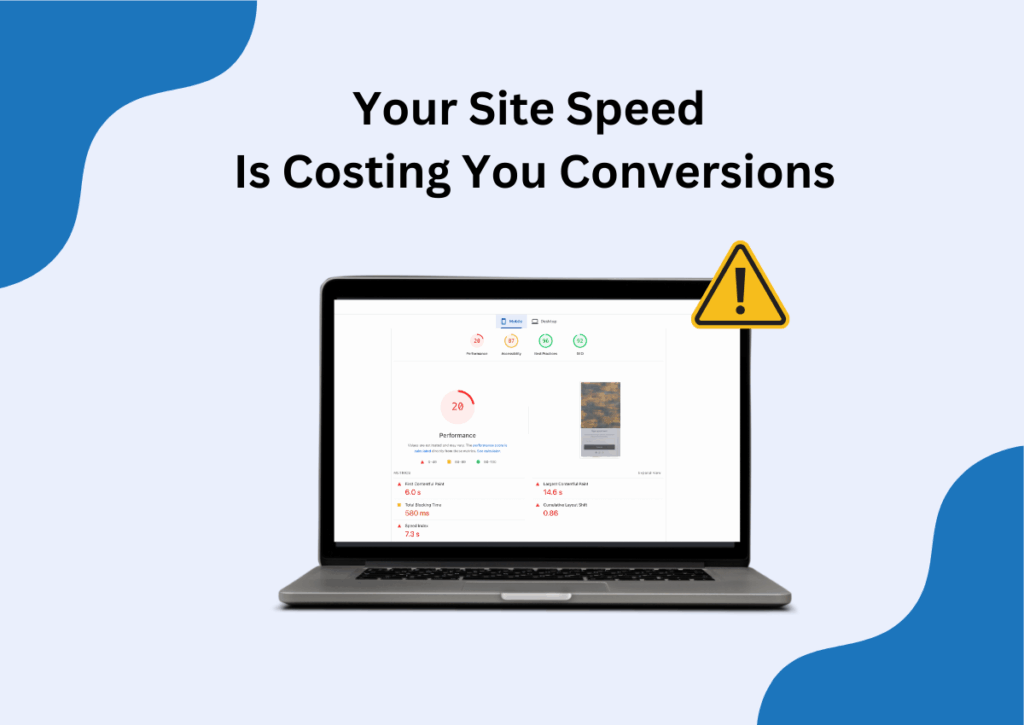
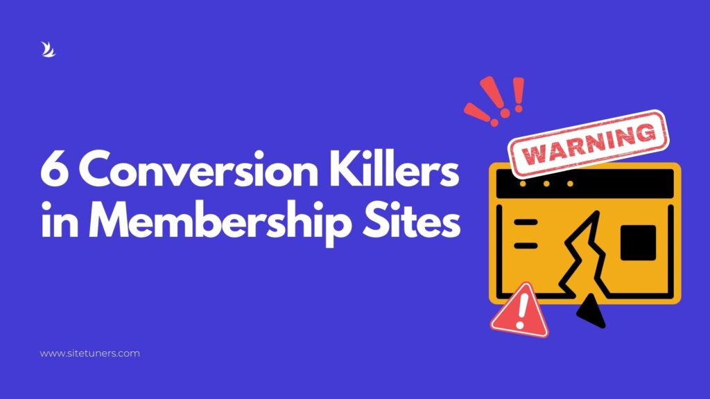
A recent website review revealed six conversion killers on a professional-looking membership site. Their confusing headline required multiple readings to understand what they did, the user journey forced decision loops after users had already chosen an action, a hero image dominated 50% of the homepage while adding zero value, mixed blue and green clickable elements confused users about what to click, and their “simple” contact form demanded excessive information. Our fixes: clear messaging, dedicated user paths, proper visual hierarchy, consistent action colors, and reduced form friction.

6 Common Website Conversion Problems On this Client’s Membership Site Read More »

personilzation on ecommerce websites can make or break your conversions. The biggest mistakes we see being made is by companies being too creepy

E-commerce Personalization Without Being Creepy

Most e-commerce sites get personalization wrong. They either go overboard with complex systems that feel creepy, or avoid it completely because they think it’s too complicated.
After working with over 2,100 clients and generating over $1 billion in revenue, we’ve learned that effective personalization isn’t about being sophisticated—it’s about being helpful.
This guide reveals the simple personalization tactics that actually drive conversions, from treating new versus returning visitors differently to location-based messaging that feels natural. You’ll discover why the least complicated approaches often deliver the biggest results.

E-commerce Personalization Without Being Creepy Read More »

SiteTuners graphic titled “6 Steps to a Conversion-Focused Web Design,” with a subheading “Why Visual Design Should Come Last.” The image includes a laptop showing a pie chart, design icons, and a pencil, symbolizing data-driven web design.

6 Steps to a Conversion-Focused Web Design: Why Visual Design Should Come Last

Everyone has a visual opinion because 90% of the information coming to our brain is visual, and 50% of our brain hardware is designed to process visual information. So, everybody feels that they’re qualified to opine about the design of your webpage or your website. Remember, though, that prioritizing visual design is similar to deciding what color to paint your bathrooms first when you’re remodeling your house. You should, instead, focus first on framing up the page and building it to be functional and structural based on what it’s supposed to do. Here are six steps you should follow to ensure you come up with a conversion-focused web design.

6 Steps to a Conversion-Focused Web Design: Why Visual Design Should Come Last Read More »

Scroll to Top
Scroll to Top