
Images were tricky enough when there was just the desktop to deal with, but now that users spend a little more of their time on mobile devices compared to desktops and laptops, things are even more nuanced.
There are general guidelines to follow across both device types:
- Don’t use stock photos for design – the images you use should emphasize the point of your content
- The images you use should be optimized for web, at minimum – even on desktop where the connection speeds are typically faster
Even if you clear those hurdles, though, there are a ton of things you have to think about to optimize images for all devices that are going to be used to visit your site.
There are use cases to watch out for, but before you think about the specific cases to improve, it might be worth giving your technology stack a quick review.
Updating Your Technology Stack
Depending on what you’re using to serve your web site content, you might not have everything you need to fix the site. That said, it pays to understand what’s possible within your system:
1. Display is the same for desktop and mobile
If you don’t have basic device-based personalization, no responsive design, and no mobile version of the site, then you’re basically missing out on the three hours per day that people spend on their phones. That’s a pretty lethal condition for a site:
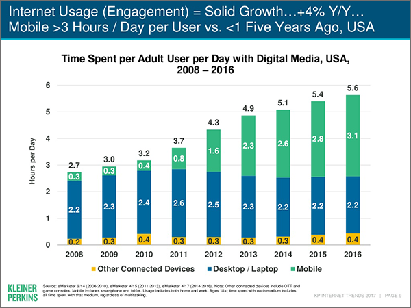
According to the Mary Meeker 2017 internet trends report, average smart phone use beats desktop and laptop use.
2. Basic responsive design
If you have responsive design but you haven’t thought through which images should and shouldn’t be served on mobile, where you’re cropping, and where just reducing the size of images is going to create issues, you’re better off than people who didn’t react to smart phones at all. However, your mobile display is still probably in pretty rough shape.
3. Mobile web site
You’re doing twice the maintenance, but you have more control over the user experience. The images are more in your control – so you can keep things legible, make sure the images count, etc. although it does take quite a bit of time.
4. Responsive design with some personalization
In some ways, this is the best of both worlds. You don’t maintain two separate sites, you still get some level of control over what displays and how they display, and you avoid the worst of the image problems on mobile. It does take quite a bit of web logic to make it work consistently, though.
Dealing with Image Issues
Once you’ve thought through your technology stack, you can start tackling individual image issues.
1. Is the image optimized?
Before you start optimizing anything for mobile, you need to check for overall image compression. This usually requires two things from marketers:
- Do you have guidelines that cover desktop and laptop, tablet, and mobile device dimensions, format types, and sizes?
- Do you have a tool that compresses images after saving? (Better if you have a tool that can do this at scale, running as a job on the web site. That is, something needs to consistently be doing this for your web site, doing the compression in the background as you upload images)
It pays to start with tools and processes that impact everything first. That will improve your loading time for all environments.
2. Does the image retain its usefulness on smaller screens?
Some images retain their usefulness on mobile devices. Other images just get regrouped to areas that don’t make sense, or are rendered less useful due to how deep the images are placed within the page.
For the latter cases, you can use personalization to make the images not load at all on mobile devices. It requires some technical work in the backend, but it should help you keep elements relevant for your users, and reduce the load time on mobile devices.
3. Do the pages take a while to load on mobile devices?
Mobile devices are great, but they usually have weaker processors and connections compared to desktops and laptops. That means if you are using responsive web design but not using different image sizes, you’re making your users wait an unnecessarily long time for the pages.
Thankfully, you can have things like 3 separate images with different sizes, and get your system to use responsive srcset, choose the right one for the use case, and keep things optimal.
The Right Image for the Right Device
It takes some work to get images to work correctly across multiple device types.
If you …
- think through your technology stack,
- use personalization to get rid of images that lose their utility on mobile devices,
- compress everything, and
- load smaller images on mobile devices
… you’ll get that much closer to making your omni-channel presence work better.