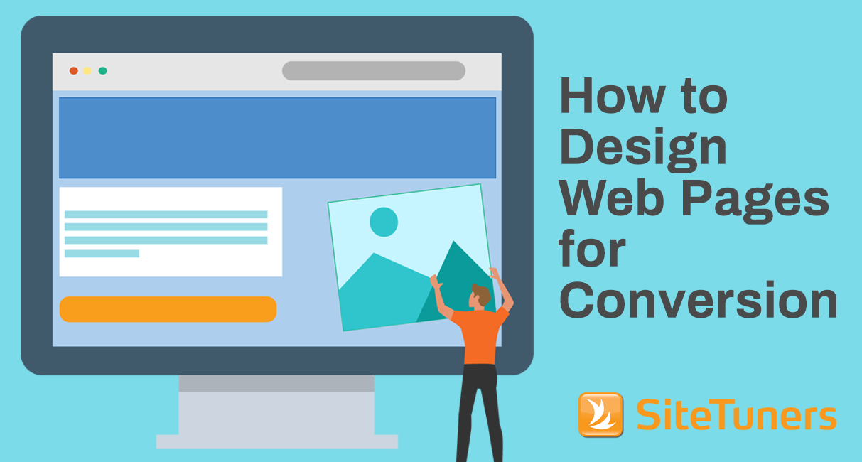
Not every page is designed to convert. Your home page is basically a sign post to other locations. Your category page is the crossroad on a path somewhere. Your product detail pages and your ad landing pages, however, are there to convince people you’re worth closing the deal with.
To do that, you need to remember a few things.
Put the most important elements above the fold
Let’s get the obvious out of the way – even in a mobile first world, you need to think about what elements are there on the first screen that loads for the users. If you have a form, that means the headline, the most important form fields, and the call-to-action (CTA) are all visible for most users as soon as your page loads – anything else just invites fewer conversions.
Carefully manage color, shape, and size
You need to direct user attention to the CTA once the user has read the headline. You have multiple knobs you can turn to do just that:
- Color. The elements that need to stand out should have a different color from the rest of the theme. Ideally, you want the site to be relatively consistent in color use, so the CTA can pop given a different color.
- Shape. Irregular shapes draw more attention than regular ones. You can use that to your advantage. Elements other than your CTA can use straight lines and corners with edges. Your CTA can use rounded corners, and command more user attention that way.
- Size. Obviously, use size to emphasize elements with a bit of caution. Taken to a comical extreme, using size to emphasize your CTA can make your site look unprofessional. That said, you can make the important elements of the page slightly larger, and command user attention without having a tacky site.
Color, shape, and size should be used with care, driving the users to look where you need them to look. Too many sites don’t turn those levers for maximum conversions. Don’t make that mistake.
Avoid animation for pages designed to convert
Even on the home page, animated banners are bad. That said, animated banners used at the deeper layers of the site, the ones that are actually supposed to convert, are a whole other class of bad:
- They take away attention from the CTA. Humans are wired to pay attention to motion. That’s something that resides pretty deep in our brains, from a time when motion meant a predator might be hunting you. So when users are reading through specs, checking your pricing, or considering clicking on your CTA, motion means interrupted tasks and fewer conversions.
- They push down the elements of the site that can convert. When users are on one of your product detail pages or ad landing pages, they’re basically on a fairly targeted trajectory towards the sale. You don’t want to push down the elements that have a high chance of working to make room for animated banners that users did not seek out. Even if you get them to click, you’ll essentially reset the process when you could have had the win.
Avoid design patterns that get in the way of users finding what they need.
Read 5 Web Navigation Mistakes That Are Costing You Conversions
Use negative space to drive user attention
CTA elements need to be surrounded with space that blends with the theme. If your background color is white, the CTA can be a blue island surrounded by a sea of white.
The key thing you’re managing is contrast. The more negative space you use, the more the important parts of the page can pop. Just as with the use of size, there’s an upper limit to the use of negative space.
You should tune your use of this so that conversions are optimized, without depending on this so much that your site looks less professional in the process.
Write CTAs that complete an “I want to” thought
When writing CTAs, you should know what the user is trying to achieve on a given page, and what the user expectation is after clicking on a given element. That will make it easier for you to write for the user rather than for your organization.
Make the CTA text as short as possible, while still completing an “I want to” sentence:
- For a piece of collateral that you’re trying to provide exposure to, the CTA text can be “download the white paper.” (Note that “I want to download the white paper” is a complete thought)
- “Find a sales contact” follows this rule; “where to buy” does not
- “More information,” and “$49.99” are terrible CTAs
You can add supporting points below the CTA or even within the button itself, as long as the core text of the CTA is written from the point of view of the user, not the point of view of the company.
Putting It All Together
If you carefully manage color, shape, and size, keep the important elements above the fold, avoid animated banners, and write CTAs for your users rather than for your company, your batting average should improve.
You should test and tune those elements until your site stops leaving money on the table.