Marty Greif’s
8 Essential Tips for Creating High-Converting Landing Pages

Trusted Worldwide by Over 2,100 Businesses
Over $1 Billion Generated for Our Clients

Focused on Conversion Optimization Since 2002
8 Tips for Creating High Converting Landing Pages
A landing page that merely looks good isn’t enough nowadays.
It needs to provide a seamless user experience that meets visitor expectations and drives conversions.
In this guide, we’ll walk you through essential tips to optimize your landing pages, focusing on user experience, clear messaging, and practical design choices.
What is User Experience?
User experience (UX) encompasses every interaction a visitor has with your company, starting with your landing page.
A great UX isn’t just about aesthetics; it’s about making sure every element on your page serves the user’s needs and guides them toward a specific action
What is a Landing Page?
A landing page is any webpage that a visitor first lands on, whether it’s a dedicated campaign page, a product page, or even your homepage.
The goal of a landing page is to convert visitors by meeting their needs and driving them to take a specific action, such as signing up or making a purchase.
Tip 1
Deliver What You Promised
One of the most common pitfalls in landing page design is failing to deliver on the promises made in your ads or search listings.
When users click on an ad, they expect to find exactly what was advertised.
Mismatched messaging can lead to confusion and high bounce rates.
You HAVE to design as if your visitor was lazy and/or stupid.
Smart people aren’t going to be upset by it because they can breeze through it.
To build trust and encourage conversions, your landing page must match the expectations set by your ads.
This means ensuring that the content, imagery, and calls to action (CTAs) are directly aligned with what the user was promised before they clicked
Tip 2
Use Appropriate Color Schemes
Your landing page’s color scheme should guide the user’s eye toward important elements, like CTAs, without overwhelming them.
You want to train your visitors with a color scheme… If red is your call to action color, don’t be using red elsewhere, except very minimally.
Consistent use of color helps users quickly identify key actions and navigate the page.
By keeping your CTA colors consistent and distinct, you create a visual guide that helps users understand where to focus their attention and what actions to take.
Avoid using your CTA color for non-CTA elements to prevent confusion and ensure that your calls to action stand out.
Tip 3
Remove Distractions
Ok, listen up….
Please, please, please, don’t have movement on your website…
It interrupts the thought process and makes it so that I have to stop what I’m thinking.
Distractions such as rotating banners, excessive animations, or too many options can overwhelm users and disrupt their decision-making process.
The goal is to create a clear path that guides users toward the desired action.
Simplifying your design helps ensure that users aren’t sidetracked by unnecessary elements, leading to higher conversion rates.
Tip 4
Use Videos Appropriately
I am not against videos.
However, I am against videos that automatically play because that is distracting.
Videos can be a powerful tool on landing pages, but they must be used wisely.
Avoid autoplay videos that can disrupt the user experience. Instead, offer videos that users can choose to play, with clear titles and benefits.
Remember, videos should enhance, not detract, from the user experience.
And ensure they are relevant to the content on the landing page.
Tip 5
Lightning-fast Page Load Time
Load speed, especially on mobile, has become so important that you really have to make it a priority.
The user expects it and Google rewards it!
Slow-loading pages frustrate users and can lead to higher bounce rates.
Optimizing your page for speed is not just about user satisfaction; it also directly impacts your SEO and overall conversion rates.
Tip 6
Capture Data Fields Easily for the Visitor
When asking for user information, make sure the process is as simple as possible.
Oh, and don’t be creepy.
Only request the information you truly need and provide clear guidance on how to fill out the form.
You’ve got to make it really easy for the user. You want to make sure that it’s easy for people to know what they’re supposed to do.
Simplify your forms.
Ask for essential information only.
Every extra field reduces your chances of converting by 10%
Tip 7
Avoid Impersonal Error Messages
Error messages can be a significant source of frustration for users, especially when they’re impersonal or unclear.
Friendly, informative error messages can help turn a negative experience into a positive one.
Such as: “Oops, it seems you’ve missed a spot”
Personalized error messages that guide users on how to correct mistakes can significantly improve the user experience.
Instead of generic messages, use language that is friendly and helpful, which can alleviate frustration and keep users engaged.
Tip 8
Use Videos Appropriately
Users are often wary of sharing personal information online.
By explaining why you need certain details, you can build trust and make users more comfortable providing the information you need.
Telling them why you need the information gets you so much further ahead.
Transparency is key when asking for personal information.
Clearly explain why certain data is required and how it will be used.
This approach builds trust with your users, making them more likely to complete forms and share the necessary information.
That’s a wrap!
Thanks for reading…
If you like the tips and insights above, and are interested in how we can help you…
Always here to help,
Marty.
At SiteTuners, we have created $1 Billion in value for 2,100 clients in 56 countries since 2002.
We’ll help you too.
If you like what you see here and want to improve your website’s conversion rate by 25% in the next 3-6 months, speak to one of our conversion experts.
In only 30 minutes we’ll show you how we can increase your revenue – no strings attached, just value.
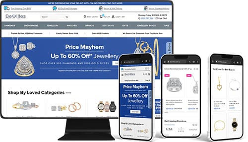
To save you the trouble of looking us up, check out some of our previous clients:








Ready to Do More With Your Business?
Find out why you are losing sales and leads.
Schedule Your Free Review
Select your time zone
Not ready to schedule a call?
Still have questions?
Partner with the top conversion experts in the digital marketing field

Trusted by Over 2,100 Businesses
Proven Track Record.
Don’t settle for anything less.
Our driven and dedicated full-service team of professionals has successfully helped businesses like yours, and we can’t wait to help you too.

$1 Billion Generated for Clients
Your Success is Our Primary Goal.
Not only will we focus on delivering the best results, we’ll also focus on you and your customers for every decision.

Focused on Conversion Rate Optimization Services since 2002
Qualified & Experienced.
We are experts in website conversion rate optimization.
Our team of dedicated conversion experts will do everything to ensure your business grows and is profitable.
Award-winning Conversion Rate Optimization
Ready to Do More With Your Business?
Speak With a Conversion Optimization Expert
In just 30 minutes, we’ll show you how we can drive growth and increase your revenue


