 Psychology tells us that the brain is inherently lazy.
This is why the title of Steve Krug’s book ‘Don’t Make Me Think’ is the core tenet in web site usability.
If you want to serve visitors a good experience so they convert, your site shouldn’t require them to expend a lot of mental effort to identify how to get closer to their goal.
This is known as minimizing cognitive load in the web usability world.
Here are some roadblocks to users navigating efficiently:
1. Content-Free Labels
Take a look at the home page below. Let’s say you wanted to find out what types of accommodations are available and what the rates are at this resort. What would you click on?
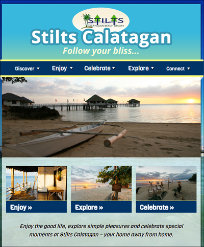
We get that they’re trying to be cute by using vacation-related words. However, these navigation items have no meaning to visitors.
A navigation item should set the users expectations about what happens when they click on it.
There’s no room for be ambiguity – labels have to be meaningful and distinct.
2. Large Graphics and Motion
Remember this hierarchy of where visual attention goes when laying out your page:
I. Motion
II. Graphics
III. Text
The human brain is wired to look at motion.
Every time something moves, the user will need to refocus, and that gets in the way of completing a task efficiently. Elements like rotating banners, because of their use of motion, sabotage user-attention on the elements that would actually help users navigate.
If you land on Kelly Moore’s home page, for instance, you wouldn’t really know what the site is about. Most of the above-the-fold real estate is taken up by a rotating banner and there’s no tag line, so the visitor will have no idea what’s possible to buy or do here.
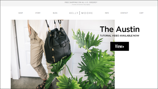
Motion and large graphics prevent users from noticing navigation elements and forces the user to use the navigation bar rather than the page body.
So, avoid large graphics or motion, unless they directly support your primary call-to-action (CTA).
For a hotel or resort, for instance, it might make sense to have large images to showcase the features or facilities. However, these elements shouldn’t get in the way of the users navigating effectively.
Sliders don’t work. Here are elements that need to be on your home page.
Click here to read Forget Sliders: Here’s What Needs to Be Prominent on Your Home Page.
3. Specific Products on the Home Page
When you present random items on your home page, even when they’re your bestsellers, you’re really just guessing at what the customer wants (unless you’re doing programmatic personalization).
Remember that your home page needs to do two things:
- Earn the visitor’s trust, so they stay
- Serve as a sign post for the rest of the site
As a sign post, the home page has to have information scent for all the tasks visitors can do. It needs to be able to tell the visitor what they can do in the site.
The content on the home page body should echo the main navigation options available at the top. Users look at the page body first; when that fails them, that’s when they look at the navigation bar.
By having specific products that take up home page body, you’re making navigation obscure.
If you’re an e-commerce site, for instance, you should visually represent the different product categories, so that visitors know right away what’s possible to buy on your site.
4. Lack of Visual Signifiers for Affordance
If an element can be interacted with, it needs to be visually obvious that it can be interacted with.
In the following checkout flow for instance, there is no signifier that the entire address box is a hotspot that needs to be clicked on. Since there seems to be no other clickable element aside from ‘Save & Continue,’ the user will assume that’s the only action they need to take to move forward.
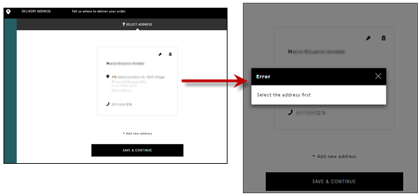
The actions that the visitors need to proceed need to be visually highlighted, so they’re not missed.
5. Items in Non-Standard Location
The human brain, being lazy, uses shortcuts a lot.
On the web, when users don’t find things where they expect them to be, that adds to the cognitive load. You make users think.
This product detail page, for instance, breaks predictability by …
- … putting the description on left and the image on right. It’s traditionally the other way around. (And that’s optimized for the left to right reading and scanning.)
- … putting the CTA button too far down.
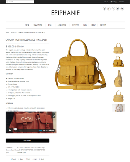
This page seems to only cater to highly motivated buyers because the ‘Add to Cart’ button is obscure – it’s way below the fold and the color blends with the rest of the site.
Remember that the ‘Add to Cart’ is the most important element of your product page. Make sure you differentiate it from the rest of the site, and that it’s located where visitors expect it to be.
(Consider pinning or repeating the CTA – there should not be screens without the actions a user can undertake.)
It’s also a mistake to put warnings or action buttons in a completely different area of the page relative to what the user is working on.
If you have a form, for example, remember that people will not always fill it out correctly. When they miss a field, make sure that the error message is close to that interactive element that they missed. If it’s a long form, don’t have the user hunting for the area where they made a mistake.
6. Vague Action Button
Be as specific as possible about what a button does.
As with all other navigation items, the CTA button should tell the user exactly what they get by clicking on it.
This means that the button shouldn’t simply say ‘Continue,’ ‘Proceed,’ ‘Get Started,’ or ‘Submit.’
It should complete this phrase (from the user’s perspective):
“I want to __________. “
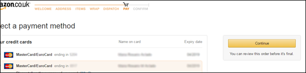
This is especially critical in a checkout flow when the customer will want to know whether ‘Proceed’ means they can still review their order or if it means they will be now charged for the purchase.
Amazon.co.uk recognizes that anxiety by clarifying an otherwise vague ‘Continue’ button by adding ‘You can review this order before it’s final.’
7. Missing Breadcrumbs
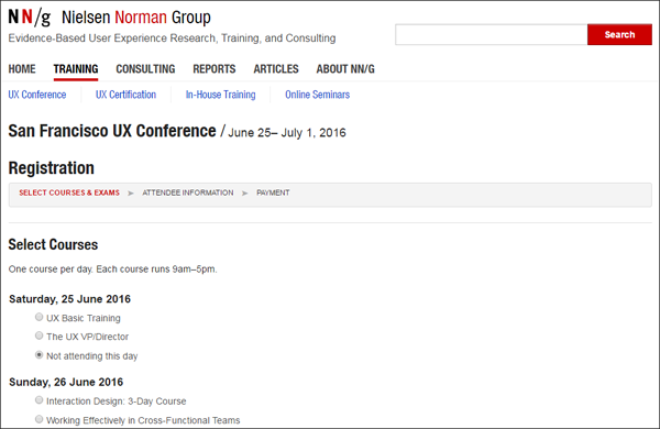
Pages should have a title to indicate that it’s tied to the action that the user previously took. This reassures them that they’re on the right track.
Nielsen Norman group for instance, clearly displays the conference name and date when you select a course.
You’d be surprised how few organizations – even companies designed around web usability – don’t follow that simple usability rule.
Your Visitors are Lazy
If you make your users think – if you shake your visitors out of auto-pilot mode – it’s usually game over for you, unless your user is unusually motivated.
Don’t fall into that trap.
By the same token, you can do a lot to ensure you maximize your chances of conversion. If you make sure your labels are clear and distinct, stay away from large graphics and motion, use your home page as a sign post, utilize signifiers for user actions, avoid vague labels and missing breadcrumbs, you will have a leg up over the competition.