 It’s been 8 years since the iPhone launched. “Mobile usability” is actually something some sites are getting right – that was certainly not the case in the 2008 to 2010 phase, when that phrase was something of an oxymoron. But lo and behold, more and more marketers are getting the memo – more businesses have at least launched an m. presence, or a Responsive-Web-Design-enabled site.
There are still some stragglers out there with only desktop experiences available (we’ll get to those in a bit), but user experience on mobile devices appears to be on the right path, like desktop UX in 2003. And that’s pretty much where we are now with mobile – the experience is better than before, but that’s not saying very much, because it’s a step up from basically useless.
This post is about the next path in the refinement journey of mobile user experience. We’ll examine common usability problems on mobile, and show why these problems can often be solved using data and design tweaks.
1. Bounce-Heavy Long Pages
Think back to the beginning of RWD. In the beginning, the goal was just to adjust the columns of a web site so that all the content get exposed no matter how narrow the screen size is. That’s it – the browser “responded” to the size of the screen.
Getting the content to display on any screen size whether via RWD or a mobile variant used to be impressive. That was 7 years ago. So if, right now, you have a site that can serve the right-sized column to the correct device, you just solved the most pressing problem of 2008. You know, congrats and all that, but maybe don’t pop the champagne quite yet.
For a lot of those who converted to RWD or served up a mobile variation, the problem is that they fixed the column – but not the content presentation. So for long, nuanced pages that are broken up into several subtopics, that essentially get served on mobile as a very long, very linear, near impossible to scan page.
That’s a problem.
Still, it’s not a difficult problem to solve. On mobile, you could have a mini-Information-Architecture (mini-IA) map for that page, like a table of contents. You could use an accordion that opens up the subtopic content, or you can just use anchor links to the specific areas, as long as the “content map” is the first thing users see on that page.
Once you’ve added the mini-IA, you can check tools like Screenfly to see if the areas that need to get accessed the most are visible above the fold.
Done, and done.
2. Generic Task Pages
For those with just desktop experiences, or those who have RWD or m. pages with essentially the same content organization, the problem usually boils down to this:
Nobody looked at the data.
See, here’s the thing. Even if you don’t have a survey tool, (and it’s definitely better if you do) you have plenty of data to assess what pieces of content users are consuming on their mobile devices.
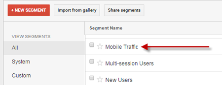
At a minimum, you should compare the most accessed pages and the pages with the most organic traffic on desktop with their mobile counterparts. Assuming you have Google Analytics, there’s a default segment you can use for mobile traffic, and it should be easy to find:
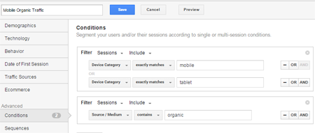
As for the mobile organic traffic, with Google Analytics open, you can create the advanced segment by clicking this link. What you should have is a segment that has the following conditions:
Once you have all the segments you need, you can export the top 100 pages or so on desktop, then compare those against the top 100 for mobile. When you have pages that rank considerably higher on mobile than they do on desktop – usually, this would include pages for contacts or price checking, but your mileage may vary – you can consider the content for those pages “mobile-oriented tasks.”
You should display those more prominently on your set of mobile widths for RWD, or your m. pages.
3. Control-Heavy Mobile Pages
If you’re not familiar with the concept of “chrome,” on web sites and various applications, those are the “controls” of a given system. So for a word processor, those would be things like Home, Insert, Page Layout, etc. On a web site, those can contain things like your primary navigation and left navigation.
The core idea behind mobile versus desktop real estate use is this:
On mobile, you don’t have too much room for chrome.
It’s that simple – chrome is great for navigation, and you definitely shouldn’t hide it for desktop experiences. But for mobile, where you don’t have much room, you should opt to use space for content rather than chrome. You can hide the main navigation options behind a hamburger menu, but you need to make it really easy to see. You use tiered navigation display on your menu to make up for the loss of the left navigation.
Once you get a knack for establishing the right balance, it should be dead simple for you to create control-light experiences on mobile, while keeping the main navigation elements exposed on the desktop.
Putting it All Together
Remember: Putting together a site that supports RWD or m. isn’t the end of your mobile optimization journey. At best, it’s bare minimum you need to compete in today’s environment – it’s no longer a legitimate unique proposition. Tons of sites have RWD or m. pages.
To separate yourself from the pack, you need to use data wisely, think about how much chrome space you have to work with, and utilize organization tools like mini-IA to make your pages handle mobile devices well. If you tackle mobile correctly, it wouldn’t be something you dread – it could be one of your key differentiators.