
You’ve heard us say this often: your baby is ugly.
It’s true of a vast majority of web sites – from sites that hide critical calls-to-action below the fold, to those that make data entry a beast of a burden, there’s an overwhelming number of sites that make people in the UX space cringe.
Usability is hard, folks.
So it’s that much more pleasant, and that much more valuable, when the rare unicorn of a site gets the experience right. For users of the site, they get what they need quickly, and without hassles. For UX specialists and CRO professionals, however, there can be much, much more going on: we can breakdown why something works as well as it does, and start testing similar elements on our sites.
Kayak.com is one of those unicorns. It’s a site that makes UX look easy, while doing the hard work required in the background to make it seem like magic.
Let’s examine the magician’s tools. We might be able to pick up a trick or two.
1. Utilizing User Tasks as a Starting Point
Here’s the first thing you see when you land on Kayak:
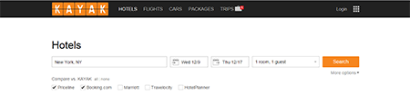
Notice that your eyes are intentionally drawn towards two places:
- the navigation bar, and …
- the search bar.
The navigation bar only caters to the core tasks you can perform (limited choices), and there’s zero chance you’ll confuse “flights” from “cars” (distinct choices). The search bar starts automatically filling out potential cities/countries as soon as you start typing, and their type-ahead is fast. From the very beginning, you’ll get a sense that this has undergone thorough usability testing, and you’ll feel that usability is right up there as a site goal.
By contrast, this is what you see when you land on Booking.com:

Note that the right side is promoted content, and there’s no reason for you to tell them if you’re travelling because of work or leisure … yet. This is the opposite of what Kayak is doing. Booking.com is thinking about how to maximize internal exposure and improve their matching algorithm, while Kayak.com is thinking about how to get the user his or her needs based on the specific task.
2. Making an Experience Predictable
Even for sites that focus on user tasks, consistency and predictability can cause a bit of a hiccup. But note how similar the results are between a flight search and a car search for Kayak:
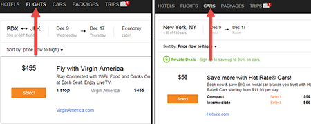
Pay special attention to three items:
- the size differences between the elements
- the location of prices, names, and descriptions
- the locations and colors of the calls-to-action
This ensures that when you switch to a related task, the time it takes to re-orient yourself to the page is basically zero. That’s great for cognitive load – the user will need to think about the choices themselves, not the mental model used to construct the page.
Is Your Site Asking Visitors to Do the Heavy Lifting?
Minimize cognitive load on your visitors to increase conversions. Find out how HERE.
3. Using Colors and Spacing Effectively
Try and tell which elements of this Hipmunk page you can interact with:
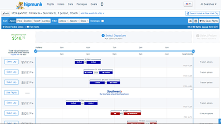
Are the elements in the middle things you can interact with, or are they being used to convey information? If you’re looking for the CTA you need to interact with for your task, where do you need to look?
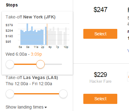
Okay, now try and look for the interactive elements on this page:

Note how all the interactive elements you need are in orange, from the time adjustments, to the search bar changes and CTAs. That way, you don’t need to memorize which elements you can interact with; you are presented those elements. That’s great for memory load. The near 2-color layout enhances how quickly you can find the controls.
It’s not just the colors though – there’s also the negative space. If you look at the distance between interactive elements and the items closest to them, you’ll notice the white space and lack of clutter around the elements you’re supposed to interact with. Those are not accidents.
4. In-Context Controls and Information
Think about when you need to see how expensive flights are when you prefer to leave at a certain time.
What’s the best way to present that information?
Would you like a table, where the price ranges are listed? That would mean you need to take a hit on memory load, as you’ll need to recall the information when you need it, as opposed to recognize the ranges as you need them.
Would you like a long list of airlines prices and departure hours, a la Hipmunk? That seems like a missed opportunity to use controls.
One way you can solve the problem is like this:
As the Kayak slider gets used to adjust the time, the price range appears. That means no additional strain on memory load, and no need to scroll through dozens of options first.
Putting It All Together
Kayak put a lot of work so that the distractions and clutter seem invisible, and the controls and information are right there when you need them. Now, to be fair, it’s much tougher to do this for, say, an eCommerce site that carries a broad range of products.
Regardless of industry, though, most of the principles stay the same. If you begin with the user task in mind, keep your interface as consistent as possible, use colors and spacing to indicate where users can interact, and provide controls and information exactly when the users need them, you can expect to make significant UX gains.
Work with the best!Kickstart your optimization with a 90-minute Website Review from the pioneers in conversion rate optimization. Our CRO experts at SiteTuners can help diagnose your website from a conversion and usability perspective. |