We crave trust. Without it, we would be consigned to a world where we must examine everyone’s actions with suspicion and assume that they are working only for their purposes and not ours. Because of the sheer number of social interactions that we have with complete strangers, we must at least extend some trust. Otherwise, many acts, both small and momentous, simply could not happen at all.
Even with total strangers in the “real world,” we at least have their appearance and body language to go by. But what do you do online? Almost anyone can quickly create a Web site or landing page and masquerade as a wide variety of businesses. Many of these enterprises are untrustworthy. We are often barraged in the media about various scams perpetrated online and have our guard up.
As an online marketer, your job is very difficult compared to your brick-and-mortar marketing counterpart. You must not only overcome anxieties, but do so in the most challenging of circumstances.
Online trust must be developed without any face-to-face contact, and it must be created instantly in the few precious seconds it takes a Web site visitor to evaluate your value proposition.
So how can you build instant trust online?
The following pillars of trust can be employed with great effectiveness.
Appearance
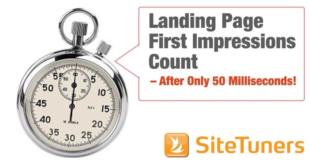
First impressions matter. We do judge a book by its cover. Recent research indicates that people will form an initial impression of your landing page or Web site within 50 milliseconds. This is almost as fast as visual processing happens in the brain, and can be considered an instantaneous and automatic response. In other words, we subliminally decide where the page falls on our “cheesy” to “professional” continuum. And this initial reaction extends to a more considered review of the page, and will impact our likelihood of taking the desired conversion action.
Don’t get disqualified based solely on how you look
We prefer well-dressed and groomed job candidates. We try to put our best foot forward on first dates. The same should be done online.
-
- Professionalism of design: Regardless of the intended audience or your business purpose, the visual design should be professionally executed. It should hang together and function as a single unified whole. Fonts, colors, and graphical elements must combine into a single visual “look.”
-
- Sparseness and neatness: Clutter can be your worst enemy, whether it is visual embellishments, or dense, longwinded text. Less is more. Ruthlessly edit everything on the page until it is pared to its essence and has a natural and unforced feel. Give your page room to breathe.
-
- Organization and clarity: Too many choices of what to do on the page can be paralyzing. Similarly, a disorganized page increases the visitor’s “cognitive load” and forces them to spend time simply trying to figure out in what order they should digest the information that you have presented. As the title of Steve Krug’s excellent book on Web usability so elegantly puts it – “Don’t Make Me Think!”
Transactional Assurances
Will we be spammed if we enter our e-mail in a form? Will the goods promised ever be delivered after we order from an online catalog? Will our very identity be stolen? Such questions are always in the background when we navigate around the Web.
Relieve point-of-action anxieties before they arise
The mechanics of the conversion action matter. Whether you are trying to collect an e-mail for an online newsletter, or have someone purchase an expensive item from you, reassurances are needed about the transaction.
-
- Forms of payment and delivery: Many ecommerce catalogs only show acceptable forms of payment and return policies after the checkout process has been started. In fact, they must be seen before they are needed, and prominently displayed above the fold on every page. The same is true of well-known delivery and shipping methods.
-
- Data security and privacy: The site that you transact with must be certified as safe by outside experts in terms of its ability to protect your data. Having privacy policies and computer security trustmarks from well-known vendors will instantly show someone that you have safeguarded their data properly.
-
- Policies and guarantees: Often the transaction is not at issue. It is what happens afterward that concerns people. By prominently featuring your warranties, return policies, and guarantees, you can assuage these anxieties. Often, a visual seal can be created to draw the eye to these important elements.
Experts and Media
Your visitors are not likely to have heard of you. Unless you represent a truly world-class consumer company, people are unlikely to know your brand promise. They do not know what you stand for.
Borrow trust from better-known brands
-
- Reviews and awards: Many services and products have won awards or at least been reviewed by relevant industry publications. Using the award seals or “reviewed by” language can be very effective.
-
- Paid endorsements and spokespeople: Paid endorsements can transfer the trust or at least the celebrity of the spokesperson to the product or service in question.
-
- Marquee clients: Using client logos with permission, or at least prominently featuring a written list of clients (unless specifically prohibited from doing so by contract language) will create powerful visual proof of your legitimacy. They confer an implicit halo effect – if you have worked with large companies, of course you can handle smaller “regular” ones.
-
- Media mentions: Media companies are experts at self-promotion and drumming their brands into our consciousness. Any association with them confers a notoriety and solidity to your landing page. Often “media” outlets can also be broadly defined as bloggers or authoritative voices in your specific niche.
There are several caveats when using expert and media logos. They must appear above the fold and be seen at the same time as the call to action (not below or after it) in order to provide the context for the content on the page. On the other hand, they must be displayed subtly, so they do not dominate the visual conversation. The logos are often well designed, distinctive, and instantly recognizable. So you may have to actually de-emphasize their impact by reducing size, decreasing color saturation (possibly using grayscale), and decreasing contrast with the background color chosen to display the logos.
Consensus of Peers
We often follow the lead of people like ourselves. If we see many friends driving a particular make of car, we are more apt to consider it. If our circle of acquaintances turns us on to a new musical group, we are more likely to pay attention. Regardless of the actual cultural “tribes” that we belong to, our peers exert a very strong influence on us.
Support automatic compliance by demonstrating “social proof”
There are two important preconditions for “social proof” to be effective: 1) there has to be many people who are taking similar action, and 2) they must be as much like us as possible.
-
- Objective numbers: “The many” can be demonstrated by showing how many people have bought, downloaded, or started a free trial. The number should be cumulative since the inception of the business or product. Spell out the digits of each number (e.g., “Over 1,000,000 downloads”), and use larger fonts to draw additional attention.
-
- Likeness: Create affinity by demonstrating that the people taking action are similar to your Web site visitors. This can be done by picking appropriate colors, editorial tone, and graphics to make your visitors feel at home. You can also have a large number of detailed testimonials that discuss common situations faced by similar people.
If you build on the four pillars of trust above, you should have a solid foundation for improved conversions.
This article originally appeared in Tim’s ClickZ column April 14, 2010


