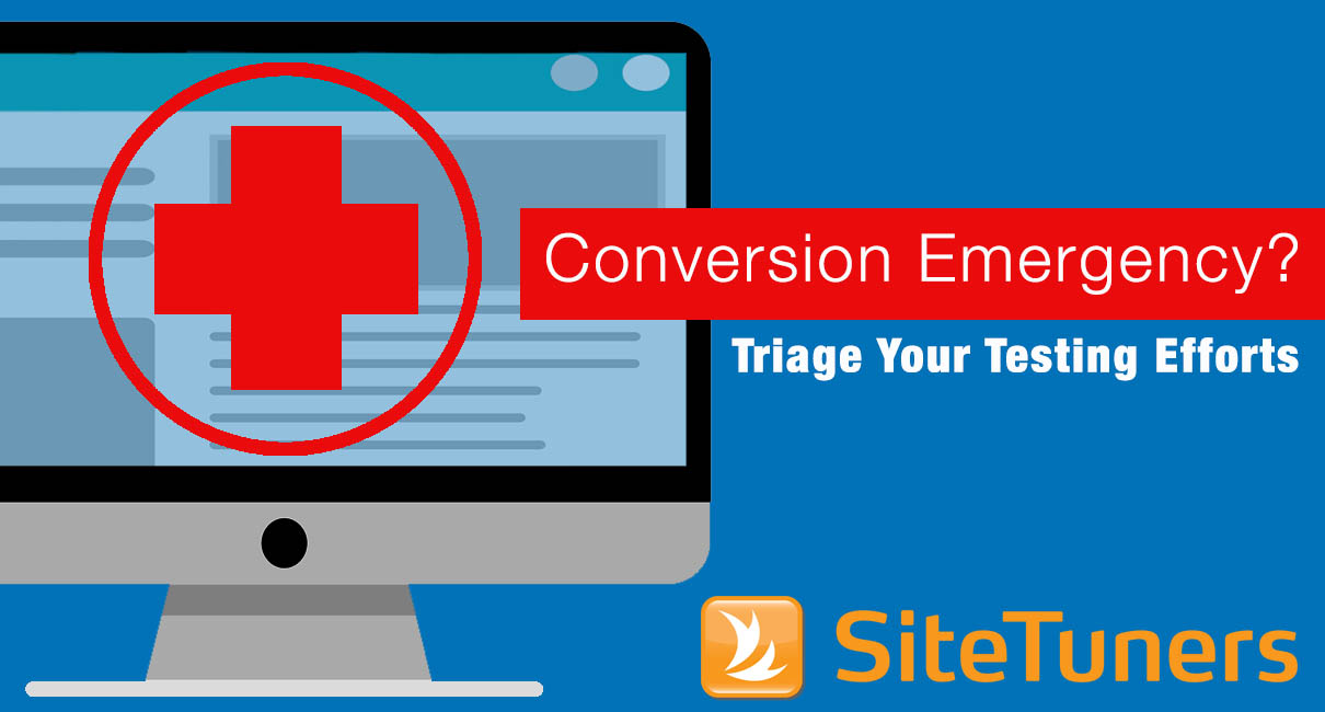
 Landing page testing can be likened to hospital emergency room triage. You have to prioritize the most critical issues first. There’s no point fixing a superficial or tactical problem when something more fundamental undermines a landing page’s effectiveness.
In conversion tuning, not all things on your landing page impact your conversion rates. A few key changes to your page will result in the biggest conversion rate improvement, and conversely, there are numerous trivial changes that won’t help at all. Since you don’t know ahead of time which those are, you must resign yourself to the fact that not all of your testing ideas will pan out. In fact, some of your elements may already be great performers, and your proposed alternatives will actually drag down conversion rates during the test.
If your website is having a conversion emergency, chances are good the diagnosis for what ails it falls under one of these categories:
Page Structure
Page structure defines how the real estate on your page is organized and used. By changing the sizes and positions of various page sections, you can dramatically impact the emphasis that key areas receive.
Typical page structure testing elements include:
• Size and contents of page header
• Size and contents of page footer
• Size and location of page navigation
• Placement of trust symbols and credibility logos
• Separation of page shell and navigation from page content
• Size and location of forms or other calls to action
• Mirror images (swapping) of key page sections (e.g., a form located to the left of the text or to the right)
• Vertical stacking versus horizontal arrays of page sections
• Single versus multiple columns
Information Architecture
Information architecture defines the way that information is organized on your website. It should basically create an accurate mental map of how your site works, and how the visitor can interact with it.
Typical information architecture-related test elements include:
• Self-selecting by role or by task
• Clear and distinct descriptive link text and choices
• Sensible and prominent page titles
• Breadcrumbs or other context (“you are here”)
• Consistent placement of all page elements
• Navigation (organization of menu options)
• Number of available choices presented
• Alternative navigation methods
• Cross-linking to other key information
• Availability and format of on-site search
• Ability to avoid, minimize, reverse, or easily correct mistakes (e.g., on-page error checking, context-sensitive form fields)
Presentation
Presentation mainly has to do with the format in which you deliver your message. Although it is a close cousin of both page structure and emphasis, it has its own distinct flavor.
Typical presentation testing elements include:
• Degree of detail (e.g., full text, or links to supporting information)
• Writing format (inverted pyramid versus traditional prose)
• Choice of input elements (e.g., radio buttons or pulldown lists)
• Action format (e.g., buttons, text links, or both)
• Editorial tone of your writing
• Use of alternative formats and modalities (e.g., charts, figures, audio clips, video, presentations, demos)
Emphasis
Emphasis is about the relative importance that you place on something. Resist the temptation to pump up the volume on everything, since this just annoys your visitor. In fact, there’s evidence that obvious and obnoxious visual elements are automatically tuned out by some people (so-called banner blindness). Instead, try to selectively focus attention on key elements on your page, and de-emphasize everything else.
Typical emphasis testing elements include:
• Amount of screen real estate devoted to an item
• Use of relevant images (e.g., specific product or believable people)
• Image captions
• Font sizes and font families (e.g., headline sizes)
• Font emphasis (e.g., italics, bolding, underlines, background colors, text colors, capitalization)
• Background color blocks or background images
• Call-to-action button shapes, sizes, visual styles, and effects (e.g., beveling, borders, and drop shadows)
• Visual separators (e.g., horizontal rules)
• Use of white space and visual isolation to focus on important items
• Removal of distracting secondary information
This article originally appeared in Tim’s ClickZ column July 18, 2011
Take your conversions to the next level.Learn how our experts at SiteTuners can help kickstart your conversion rate optimization process or get better results from your CRO efforts. Give us 30 minutes, and we’ll show you a roadmap to your digital growth! |