Summary Your website and landing pages have the important job of persuading online visitors that you’re someone they’d want to do business with. Avoid the most common landing page mistakes to ensure that your potential customers can easily accomplish their tasks and convert on your website.

In this article, we’ll teach you to look at your landing pages from your users’ perspectives. You’ll learn seven landing page mistakes you might be making and how you can fix them (with examples!)

Table of content:

        1. Why Landing Page Optimization is Important 
        2. How to Make the Best Landing Page
        3. Seven Landing Page Mistakes 
        4. Avoid Common Landing Page Mistakes

More digital marketers are now aware of the benefits of landing pages. That’s the good news. But a lot of them are still making landing page mistakes that prevent them from reaping great results from their efforts.

In fact, most landing pages are still designed to look pretty. But they fall short when it comes to metrics that actually matter. For instance, online shopping conversion rates hover below 3% worldwide, with only the hair care and food and beverage verticals successfully posting higher figures. For B2B, the average conversion rate is at 0.6%, but the top performing websites convert around 5% of their visitors.

This just goes to show that until now, the majority of landing pages aren’t optimized for conversions.

Why Landing Page Optimization is Important

Landing pages often get ignored.

For every 83 dollars spent on traffic acquisition, only a dollar is spent on landing page optimization. Traffic, however, is a competitive market. Marketers are always trying to get top of search results and to convince super affiliates to promote their products and services.

Even if you do get tons of traffic, your efforts would be in vain if you’re still sending your visitors to an unoptimized website or landing page. You can increase traffic by a thousandfold and still perform badly sales and revenue-wise due to poorly performing pages.

Your landing page plays an important role. It informs your visitors about your brand and offer. It then persuades your target audience to take the desired conversion action.

Landing pages have tremendous impact on your bottom line and deserve your attention and investment. Having an optimized website or landing page ensures that you’re not wasting money on both organic and paid campaigns.

How to Make the Best Landing Page

Now, even if you’re not neglecting your landing pages, chances are you’re looking at them from a marketer’s perspective. Because of lack of regular interaction with end-users (unless you’re a very small business), we often make assumptions about who the end-users are and what motivates them. We are experts on our own websites, but we are ignorant to the gaps in the knowledge that end-users may have.

So, while you may see your pages as usable, in reality, you might be presenting a difficult web experience to your visitors.

Seven Landing Page Mistakes

Here are seven challenges you may be putting your visitors through, and how you can correct the experience to create the best possible landing page:

1. Unclear Call-to-Action

User’s POV: What am I supposed to do here?

Image of Sandalworld homepage

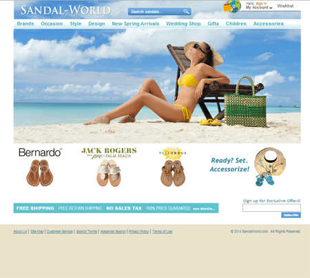
On Sandal World’s home page, none of the key images are driving people towards clear and defined tasks.

Users might not know what to do on the page because …

  • there’s no call-to-action (CTA) at all, or,
  • there are too many elements competing for attention with the CTA.

Fix: The CTA should be the most striking part of the page. Remove images and graphic embellishments that do not directly support the intended CTA.

Image of Clarks homepage

On Clarks’s homepage, the visitor attention is immediately captured by the big, bold sale message and the calls-to-action directly beneath it. 

By making the call-to-action instantly noticeable, the visitor is guided towards their next steps on the page.

2. Too Many Choices

User’s POV: Which one do I click on?

Users might be confused because of too many items and too many links on the page.
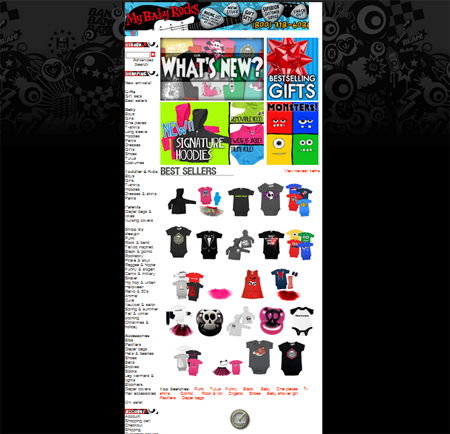
Image of PunkBabyClothes old homepage

The old PunkBabyClothes.net website showcases several of their products on their home page, but the images do not give a notion of the variety of products that they’re selling.

Fix: Don’t put product-level stuff on the homepage or try to show everything you sell on the page. The point is not to advertise or sell on the homepage; the point is to give the visitor a map of the world with limited, clear choices, and follow the trail to go deeper into the site towards more relevant things. Use category-level images (a montage or collage of different items) to represent each category. Categories should geographically, logically, or hierarchically get more specific as users drill down.

Image of PunkBabyClothes new homepage

The new PunkBabyClothes.net website does a better job of letting visitors know the breadth of their products by displaying the product categories. 

By doing so, visitors are also less confused and are able to self-select. They simply need to click on the category they’re most interested in to shop for the item that they want.

3. Asking for Too Much Information

User’s POV: Why do you need that information for this?

Marketers often ask users for information prematurely which users might deem intrusive.

Image of ebook download pop-up form

Simplilearn.com requires visitors to provide their phone number before they can download an ebook. While this is only one additional piece of information, it can be a huge source of friction for visitors who regard their phone number as sensitive personal information.

Fix: Ask for the least amount of information needed to move forward, so you can shorten your lead generation form. You can even allow people to download your e-book without asking for an e-mail address. The e-book will establish your thought-leadership, and not gating it will make it possible for it to become viral.

Image of an ebook download form

This ebook download form leaves much to be desired in terms of copy, but at least it only asks for the visitor’s email address and first name.

Make Web Visitors Do What You Want

Get your website visitors to do what you want them to do

Learn how to convert your online visitors on your website

4. Too Much Text

User’s POV: Do you really expect me to read all of this?

People generally don’t read on the web, and a sea of text on your page will only overwhelm your visitors.

Image of too much text on homepage

Illumination Consulting commits two grave errors on their homepage: 1) There are chunks of text that web users are unlikely to read, and 2) Using reverse colored text against a dark background with poor contrast that makes the copy hardly legible.

Fix: Write in newspaper style:

  • important stuff upfront,
  • short bulleted lists
  • links to click on if users want more in-depth information
Image of SiteTuners homepage

On the SiteTuners homepage, we purposely kept the text to a minimum and made sure to use headings and font variations in order to support our users’ scanning behaviors.

5. Not Keeping Your Promises

User’s POV: Did you deliver to me what you promised me upstream of this conversation?

Visitors come from somewhere and their expectations were set. Look at the upstream traffic sources and examine the intentions – what are you promising and how can you deliver on that promise on the landing page?

Image of ad and landing page mismatch

Cybersecurity company Aqueity fails to deliver what they promise on their ad on their landing page. There’s a clear mismatch in messaging. The ad copy is nowhere to be found on the landing page, which can cause visitors to think they’ve landed in the wrong place.

Fix: Ads upstream should say exactly what the visitor will get if they click on it. You’ll get fewer clicks, but the people coming through will have had their expectations set. Line up the experience upstream with what happens on the page.

Image of ad and landing page alignment

Integrity Technology Solutions does a good job of establishing relevance by maintaining the information sent from their ad to the landing page. Their landing page headline mirrors the copy on the upstream ad, which lets visitors know that they’re in the right place.

6. Visual Distractions

User’s POV: What am I supposed to look at?

Half of our brain is devoted to processing visual information, and we can’t help but look at motion. Using motion that distracts from your CTA will be detrimental to conversions.

Image of rotating banner

The rotating banner on Global Business Consulting’s homepage is very distracting. The movement hogs attention and makes it hard for online visitors to visually prioritize.

Fix:  Remove all movement from your landing pages including rotating banners.  They are a distraction and difficult to read for the visitor.

7. Lack of Trust

User’s POV: How do I know you’re not a scammer or that you can get the job done?

Establishing online trust is difficult as it has to be done anonymously, and you don’t know the visitor’s psychology – what moves them and what their needs and intention are at the moment. Online trust also has to be achieved instantly as you don’t have the time to meet with your visitors over multiple interactions.

Image of lack of trust on a web page

The absence of trust elements on Paymentwall’s landing page makes it difficult for online visitors to immediately establish the trustworthiness of the company’s products and services.

Fix: Put trust symbols above the fold, keep the design professional, and make sure the following are visible on the page:

  • Reviews and awards
  • Marquee clients
  • Media mentions
  • Trade associations
Image of trust symbols on a homepage

Paddle.com uses several trust symbols on its landing page:

  •  It tells visitors about the 2000+ existing customers that are already using Paddle
  • It borrows authority from more familiar companies by using their logos
  • It showcases badges to further cement trust

Avoid Common Landing Page Mistakes

We all want to have the most beautiful, stylish, or coolest landing pages. And that’s not necessarily a bad thing when you consider that your website and landing page are critical in forming first impressions. 

However, you shouldn’t fall into the trap of designing your landing pages for design’s sake. Remember that the purpose of your website and landing pages isn’t only to attract but to convert your online visitors. 

Look at your landing pages from your users’ perspective. Avoid landing page mistakes by:

  1. making your call-to-action clear,
  2. presenting clear and distinct choices,
  3. asking only for necessary information,
  4. making sure the page has no readability issues,
  5. matching user intent,
  6. avoiding visual distractions, and
  7. making trust elements visible.

If you do these, your visitors are much more likely to take your desired conversion action.

Speak with a Conversion Expert

Give us 30 minutes and we’ll show you how we can help you achieve better results