 People are visual creatures. More than anything else, we’re good at processing visuals as most of our brain is devoted to it.
That’s both a good thing and a bad thing for online marketers.
Bad because while people can easily scan visual information, it’s difficult for the brain to get priorities out of web pages with different objects competing for attention.
The good news is you can control how your page is scanned – you can prioritize information so visual attention goes where it’s supposed to go and visitors take your desired action.
Let’s dive in.
1. Visual Space
The amount of real estate you dedicate to an object can determine whether it gets noticed or ignored. So pay attention to the …
- negative space,
- border, and
- size
… you give a particular object.
You’ll get visitors to notice bigger fonts and areas without clutter. You can use negative space to draw attention to your headline and call-to-action (CTA). And your CTA will have a better chance of popping out if you make it larger than other content areas.
2. Irregular Shapes
People notice irregular shapes before regular ones.
On a page largely built with straight lines, you can call attention to your CTA by making the corners of that area rounded. It will also increase visual affordance as people can identify that it’s a button and can be interacted with.
3. Motion
Our brain is wired to look at motion.
We can’t help but look if something is changing in our visual field because we have to instantaneously determine if it’s a threat or not.
Having said that, make sure to use motion sparingly on your pages – use it only if it directly supports your main CTA.
Remember that …
- in the presence of graphics text won’t get read, and
- in the presence of motion, graphics won’t be looked at.
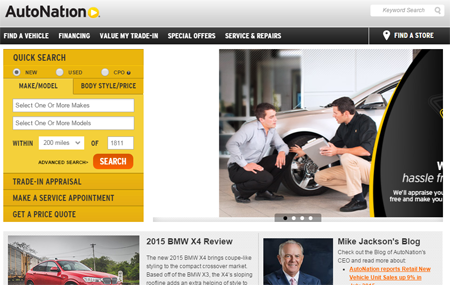
The detailed Quick Search box on AutoNation’s page doesn’t stand a chance against the rotating banner ads beside it. If you have rotating banners on your page, get rid of them. Either its motion will draw too much attention (only while the motion is happening!) for users to notice more important navigational parts of your page, or it’ll be completely ignored by visitors (banner blindness) which means it’s a waste of real estate.
4. Faces
As with motion, you also have to tread lightly with faces. They’re a rich source of information about potential threats or benefits in the environment, so our eyes are naturally drawn to them.
Use faces deliberately- consider the direction of the gaze. Photos of people looking past an important part of the page will be taken as a signal of something else interesting and will direct attention away. You want photos of people looking in the direction of your CTA, instead.
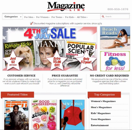
This Magazine Line page has a model and an athlete staring straight at the viewer, so those two covers hog visual attention. The Good Housekeeping cover doesn’t stand a chance because it’s relatively weaker- it’s pastel-colored, low-contrast, and has no faces in it. Even the face in the Beach Reads sections won’t get as much attention as the person’s gaze is directed towards the book and not the viewer. (We doubt though that the ESPN and Maxim cover images are the most important parts of the page.)
5. Contrast
Another way you can direct visual attention is through contrast. A red button as your CTA will stand out against your green theme. A different shade of green, not so much.
When you use trust elements like logos from other companies, you can play with contrast to control visual attention. You want the logos to draw enough attention for you to benefit from the association with the company, but you don’t want another company’s logo to be the central focus of your page.
The way you downplay a logo with near universal reach and instant recall is contrast; if you gray out the logo against your gray theme, your blue call to action will still pop out.
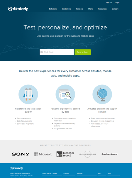
Optimizely keeps client logos subdued compared to the rest of the page by having them in grayscale.
Sculpting User Attention
You compete for attention all the time. You do this on Google and Bing; you do this on Facebook and Twitter; you do this on Gmail and Yahoo Mail.
So, when you do finally command attention, don’t waste it by competing with yourself – visually prioritize. Make sure the elements on your page support your desired action instead of taking away attention from it.