“What am I supposed to do now?” That’s the last question you want crossing your Web visitor’s mind, especially if they have arrived at your site through some sort of marketing offer. From the perspective of your visitor, it should be clear and obvious where they need to click on your landing page to get them closer to their goal. If your visitors have to spend time deciding where to look and what to do, they’ll most likely get frustrated and leave your site in search of more effortless experiences.
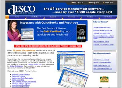
In the example shown, would you know what to do? Are you supposed to look at the picture of the model holding the laptop? Inspect the detailed report screenshots? “Call before December 30th,” as instructed in the reverse-color text in the band near the center of the page?
In fact, the answer is “none of the above.” The desired conversion action is to start a free 30-day trial by signing up online. Yet the only way to do this is to click on the small black iPhone picture. Unless you have an iPhone, chances are you would tune this image out completely. Even if you noticed the graphic, it is unclear that the image is clickable, rather than simply informational. Because of the hidden nature of the call to action, and the large number of visually more dominant elements on the page, the desired conversion action is very unclear.
Focus on What Matters Most
The most criminal waste of attention happens when your landing page focuses your visitors on unnecessary tasks or distractions. Turn down the volume on your landing page by eliminating flashy visual elements that distract from your desired conversion goal. Your call to action should be the most visible graphic element on the page.
You should also prune your landing page of unnecessary choices that can lead visitors away from your conversion goal by sending them to less important content on your site. If your page includes minor or supporting conversion actions in addition to the primary conversion goal, resist the urge to give them all equal emphasis. Minimize the prominence of the supporting goals and allocate a disproportionately larger amount of screen real estate to your main goal.
Apply the Obvious Standard
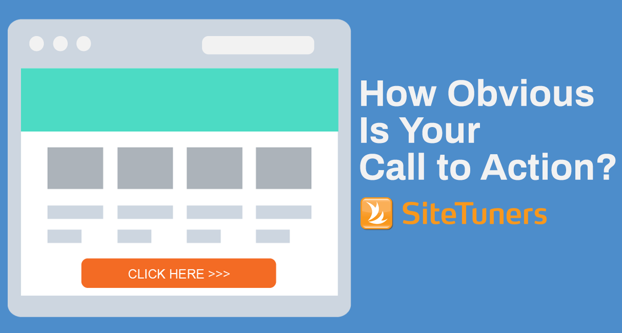
If your call to action is not obvious, you are losing money. If your visitors can’t tell almost immediately what your page is about and how to get to their goal, you will undoubtedly lose conversions.
Here’s how to keep your landing page intent clear:
-
- Clear page headline: Each page on a website (and each standalone landing page) must be about something. It must have a clear purpose, and that purpose must be spelled out in a headline that spans the top of the page.
-
- Well-defined “action block”: There should be a single place for the visitor to interact with your page and that place should be visually called out with a subtle background color. This action block should draw the eye towards the desired activity on the page. The rest of the page should be plain and visually restrained. White background for the content portion of the page is recommended unless there is a compelling need to use a different color.
-
- Sub-headline in your action block: The purpose of the action block must be clearly stated. What are you asking the visitor to do in the action block? What specifically is going to happen within it?
-
- Clear call to action: Within your action block, you must have a single, clear call to action. The call to action must describe what happens next and what the visitor can expect once they click on your button. It should not be general or generic like the “Continue” or “Submit” text that is commonly used on websites. The wording of the call to action must be from the visitor’s viewpoint, and not your company’s. To put yourself in the visitor’s shoes, try using button text that completes the following sentence – “I want to…”
In short, keep your call to action clear by making sure it is the most visually prominent thing on the page, placed above the fold, and written in words that reflect the visitor’s perspective, and you should never have to worry about visitors wondering “What am I supposed to do now?”
_______________________________________________________________________________________________
This article originally appeared in Tim’s ClickZ column January 11, 2011