5 Best Practices to Improve Your Website’s Mobile Experience
Summary: In an age where mobile matters more than ever, following UX best practices to increase conversions will give you a significant leg up on your competition.
By Alejandro De Mosteyrin Muñoz
8 min read
Mobile experience is on its way to becoming just an aspect of digital experience.
It’s still worth discussing separately, for now, but that may not be the case pretty soon. It’s clear that mobile traffic has grown massively in recent years.
The 5 best practices we are going to cover:
- Optimize Mobile Navigation to Improve the Mobile Experience
- Design for Speed to Improve the Mobile Experience
- Improve Returning Visitors’ Mobile Experience
- Add Shortcuts for Mobile Users
- Test Your Site for the Mobile Experience
Data from Statista show, for instance, that 50.81% of worldwide web traffic now comes from mobile devices, and that’s excluding tablets.
Statcounter, meanwhile, reports a slightly higher figure of 55.68%, with web traffic from mobile finally getting ahead of desktop in 2017.
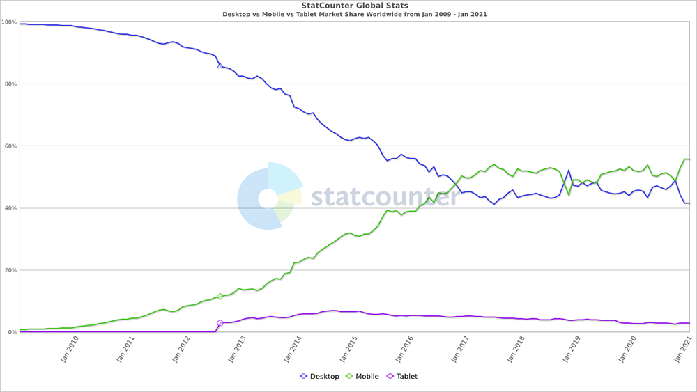
From the graph above, you can see that it took 7 years from takeoff before mobile finally outpaced desktop.
Mobile user experience may have been bleak in the past, but things are definitely starting to look better:
- Standards are emerging.
- Best practices are more widely being adopted.
- And while you’re going to see the odd site with no mobile play at all here and there, those sites are being pushed to the fringes.
In other words, we’re exiting the Wild West phase of mobile.
And with Google’s move to mobile-first indexing, more website owners will be compelled to pay attention to their mobile sites. Since Google now uses the mobile version of a website for search indexing and ranking, having a poor mobile experience will result in poor search performance.
So, if your mobile experience feels like you’re still living in the Wild West, these 5 tips should help you find a way out.
1. Optimize Mobile Navigation to Improve the Mobile Experience
The biggest challenge that we continue to see on a lot of mobile sites is good navigation.
Navigation is crucial to your mobile website as it acts as a map for your online visitors, allowing them to easily find content or information that they need. Designing good navigation means ensuring findability and searchability, as well as helping retain information scent.
You can achieve this by doing the following:
- Optimize your content-to-chrome ratio
- Organize your navigation elements
- Use big touch targets for navigation
Let’s get to it.
Optimize Your Content-to-Chrome Ratio
First, some cleanup.
The part of your site that contains the navigation elements is called the “chrome”.
The chrome is the total amount of space your site uses for navigation elements. That includes the URL bar, the back button, the forward button, the primary navigation at the top of your page, and the left navigation.
On desktops, you have a lot of space for the chrome. So, it makes sense to show all the primary navigation elements on all pages.
On mobile, you should optimize the chrome-to-content ratio better. That is, you should devote what little space you have to more of the content, and less of the navigation.
Here’s how you can maximize the content shown:
- Don’t list your primary navigation options on every screen. Instead, have the menu display upon something that the user needs to activate. This means having the menu display when the user interacts with a navigation element like the hamburger menu.
- Ensure that the trigger for the menu is easily seen. Once users signal that they want to see navigation elements by tapping on the hamburger menu, you can actually devote as much real estate as needed to the navigation elements.

Sites like Everlane devote pretty much all of the screen to content, with a small area for the hamburger menu.
There’s a caveat to this.
According to the Nielsen Norman Group, elements like the hamburger menu tend to hurt discoverability by hiding navigation. While this is mostly true for desktops, hidden navigation still has a negative impact on mobile usability (albeit, a smaller usability penalty compared to the negative impact on desktop usability.)
Using a combination of hidden and visible navigation (similar to the way Williams-Sonoma below does it) is an alternative to consider for mobile experience.

William-Sonoma’s mobile site, for example, uses the hamburger icon for shop categories but displays the search bar prominently instead of just a magnifying glass/search icon. This allows mobile visitors to get to the items they want faster. The site also gets extra points for using text labels under icons, which reduces ambiguity.
Organize Your Navigation Elements Deliberately
Identifying what people access most while using their mobile phones is key to displaying the right things on the right devices. With so little space to work with, you can’t afford to display all categories alphabetically.
When users tap on menus on mobile devices, they expect the content to be easy to sort through. Here’s what you can do to help make that happen:
- Review Google Analytics or other clickstream tools and filter for mobile traffic.
- When you’ve identified the most visited areas, segment those by commonalities (common topics, most used product categories, etc.).
- Display the most commonly accessed topics or product areas on your hamburger menu – don’t rely on default sorting.
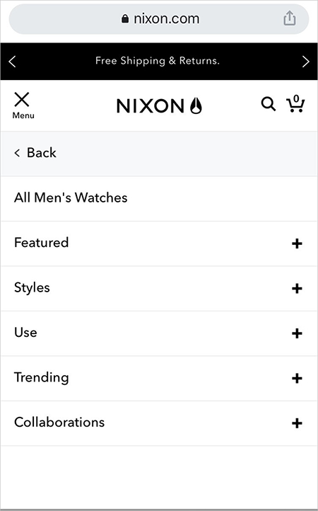
Once the user taps the hamburger menu, the Nixon.com mobile site displays segmented product categories, instead of displaying everything at once.
You should actually be doing this even for your desktop website. That is, prioritizing navigation elements based on the following criteria:
- What’s often used by the majority of your online visitors
- What drives revenue or sales for your business
If your traffic now comes predominantly from mobile, you have an even more compelling reason to organize navigation based on top-selling products and the preferences of your mobile audience.
You could, for instance, include a visual navigation in the main content area, so your mobile visitors immediately see your main product or service categories. Bike brand Trinx does this on their mobile site:
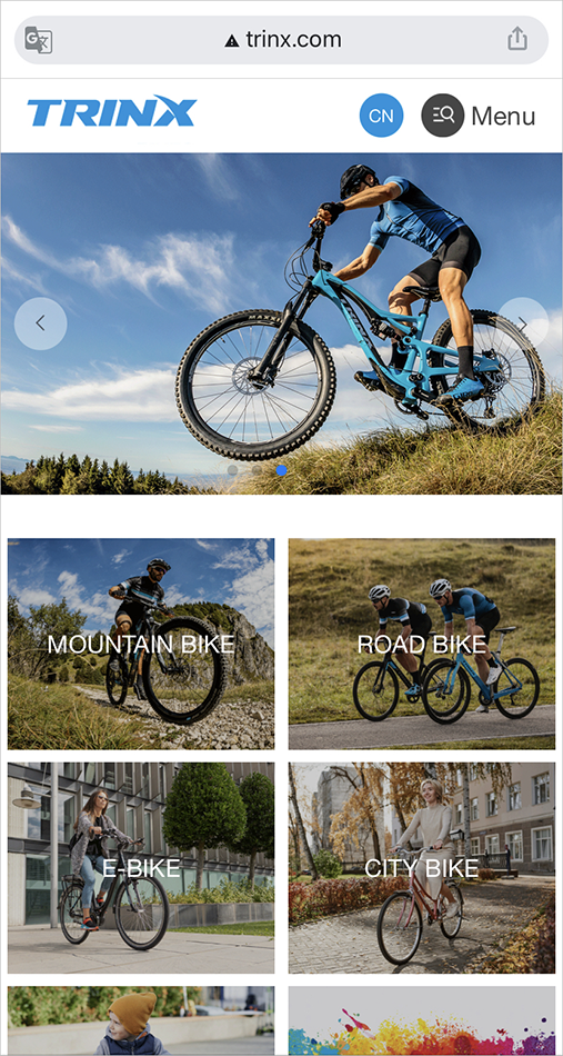
Use Big Touch Targets for Navigation
When visitors tap on menu launchers, you basically have the license to use the entire mobile device screen. You need to utilize this fully.
Most mobile users rely on their thumbs for smartphone interactions, so making the touch targets larger can have a dramatic impact on reducing user errors.
Of course, larger targets mean fewer elements on display, so you need to know your audience pretty well. What do they care about most in your product line?
Ensure Your Touch Targets Meet the Minimum Viable Size
Making calls-to-action larger as a best practice is not unique to mobile sites.
That said, there are specific measurements that you do have to meet for mobile, given that thumb actions are far less precise than mouse actions.
Consider this:
- An average person’s fingertip is about 1.6 – 2cm (0.6 – 0.8 in) wide.
- An average person’s thumb has an impact area of about 2.5 cm (~1 inch).
A study shows that the minimum physical measurement of a touch target should be 1cm × 1cm (0.4in x 0.4in).
Make sure the size and spacing of your touch targets take into account the physical constraints of the people using their phones.
2. Design for Speed to Improve the Mobile Experience
Research reveals that 53% of consumers will leave a mobile site that takes longer than 3 seconds to load.
There are a couple of things you can do to keep most of those visitors from leaving your site due to speed:
Hide Latency
You can serve above-the-fold elements while loading the elements further down the page in the background.
This is called lazy loading, a fairly common technique to hide the actual loading time.
Be cautious when it comes to hiding latency by lazy loading, though. Google warns that improper implementation of lazy loading on your mobile site may inadvertently prevent Google from crawling your site content.
Serve Smaller-Sized Images
There are techniques like srcset that allow you to serve larger images on desktops, while serving smaller images on mobile devices. You can use this to your advantage and make the loading time on mobile devices much shorter because you’re serving a smaller overall page.
Test this carefully before rollout, however, as it’s somewhat easy to botch implementation.
You can use Google’s PageSpeed Insights to conduct an audit and identify potential areas for improvement.
You’ll also want to plan for the changes in Google’s algorithm, as they add Core Web Vitals as a ranking factor. (We discuss Core Web Vitals in this article: Learning Google Analytics 4 and Other Google-related Tasks for 2021)
Grow Your Business Exponentially with Proven Conversion Rate Optimization Expertise. |
3. Improve Returning Visitors’ Mobile Experience
If you have entered any data into a form on a mobile device, or attempted a multi-step checkout on a smartphone, you know how frustrating it is to lose all the work you’ve done so far.
Plugging in values into tiny devices without a proper keyboard is cumbersome. So, if you value your returning visitors, have a mechanism in place so that returning visitors can avoid having to do the work again from scratch.
If your content management system (CMS) requires cookies, you can use cookies. If your CMS is cloud-based, use the cloud-based counterpart.
Another area you should be paying attention to is the cross-channel mobile experience. A lot of online visitors switch between different devices before finally converting on their preferred device.
A seamless experience for returning visitors means they can easily continue what they were doing in their previous session. This includes ensuring that the data or information they’ve entered on another device is not lost in the hand off.
Whatever you do, don’t let the returning visitor’s hard work go to waste.
4. Add Shortcuts for Mobile Users
Mobile traffic may have overtaken desktop, but mobile conversion rates continue to hover below their desktop counterparts. SaleCycle’s 2020 Ecommerce Stats Report reveals, for instance, that while mobile sales continue to rise, majority of shoppers still prefer converting on desktop.
The lower mobile conversion rate is due partly to the ambivalence and low trust of mobile users. However, there’s a simpler, more relevant reason: converting on mobile is a difficult task.
SaleCycle notes, for example, that add to cart rates for mobile is almost equal to that of desktop sites. This means that mobile users are comfortable shopping on mobile sites but hesitate when it comes to completing their transactions.
So, by consciously reducing the effort required to use your mobile site, you can improve the mobile experience and encourage visitors to convert. You can utilize the built-in features of most mobile phones to provide your users with shortcuts that increase ease-of-use.
Here are some examples:
- Click-to-call. This lets your mobile users tap the phone number or phone icon to call you instead of having to use the numeric keypad to type in your phone number.
- Social or third-party login. Allowing your mobile visitors to use a Facebook or Google account to register and log in to your mobile site saves them the extra effort of typing in their email address and password. It also saves them from having to remember another username and password when they come back to your site later.
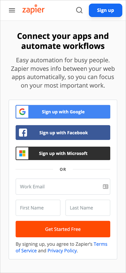
Zapier has third-party login enabled on their sign-up form. This lets online visitors create an account using their existing Google, Facebook, or Microsoft account.
- Credit card scanning. Data input is one of the biggest sources of friction for mobile checkouts. Using mobile features such as the built-in camera to capture and automatically enter credit card information on the payment form removes the hassle of typing in lengthy numbers.
5. Test Your Site for the Mobile Experience
Even if you have a key mobile device to test your site on, UX gaps will still be likely to fall through the cracks.
You can use Chrome’s DevTools Device Mode to simulate how your webpage will appear on different mobile devices:
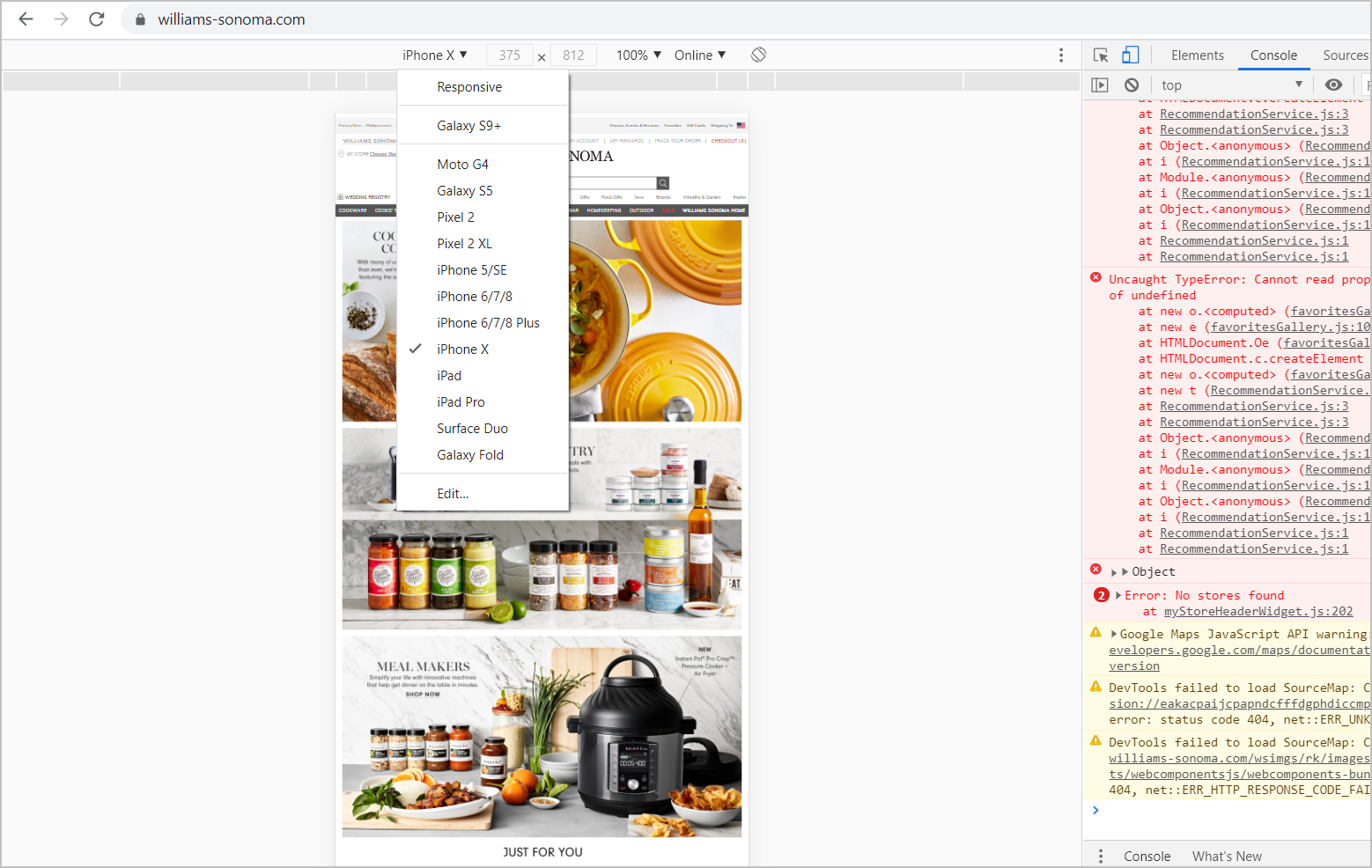
Then, you can check on 3-5 actual mobile devices after you launch features or sets of pages. Make sure you get to multiple types of functionality, including your video player.
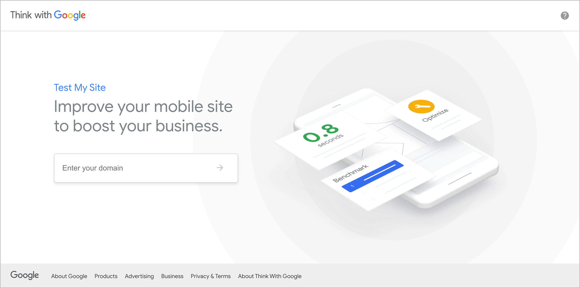
You can also check your mobile experience using Google’s Test My Site. You just need to enter your website URL, and Google will generate a full report with recommendations on improvements for your mobile website.
Follow Mobile UX Best Practices to Increase Conversions
Getting mobile experience right is hard, but ultimately, rewarding.
Those who …
- improve mobile navigation,
- design for low page load time,
- improve the user experience for returning visitors,
- leverage shortcuts on mobile, and
- use multiple tools to test their sites
… have a significant leg up on the competition in an age where mobile matters more than ever.
This post was originally published in March 2016 and has been updated to reflect the state of online behaviors and mobile experience and technology in 2021.
Subscribe to the SiteTuners Weekly EmailGrow Your Business Exponentially with Proven Conversion Rate Optimization Expertise. |

