 If you look at major e-commerce sites, with the prevalence of rotating banners and large static images, you’d think that home pages are primarily meant to be commercials.
Your home page actually has just two main reasons for existing, and presenting a few offers that might be relevant to only a handful of your visitors is not one of them.
Here’s why your home page exists and how you can make sure it does its job:
1. To establish trust
Unless you are a Fortune 500 company, when people get to your site, they decide whether to look at what you have to offer, or look somewhere else because you did not meet the bare minimum required to make them trust you. They assess your credibility based on your page’s production quality and the presence or lack of trust symbols.
Production quality
Content on your site should be well-contained. There should be boundaries, the sides of the page delineated and the header and navigation page constrained.
Pay attention to each of the effects that you use in design. They may be perfectly fine on their own, but when you put them together, they might not necessarily fit well.
Different font treatments, for instance, can easily make your page cheap and cheesy. The font type and size, foreground and background color, drop shadows, underlining, bolding, and strikethroughs should all have a purpose- use them to show that something is different from everything else, and help the user organize information.
At a minimum, have a professionally-designed logo. If you need a decent logo custom designed, you can hire freelancers from web sites such as elance.com or logotournament.com.
![]()
Photocutouts.com’s logo just doesn’t cut it. It’s just dropped into a sea of whiteness in the upper left, barely readable, and looks like it was cut and pasted from somewhere else.
Transactional assurances
By doing away with banner ads, you can elevate transactional assurances on your home page to relieve visitors’ anxieties about payment, delivery, data security, and product guarantees.
It’s vital to prominently show acceptable forms of payment and delivery methods even before the checkout process, so make sure they’re visible above the fold on your home page. The same applies to warranties, return policies, and security trust marks from well-known vendors that show customers how you protect their data.
Learn more about the four pillars of building instant trust online.
2. To get visitors off the home page
Ideally, your home page should show the visitor what is possible to do or buy on the site. if you’re an e-commerce site, you don’t accomplish that by devoting a large chunk of your prime real estate to a few offers or events at the expense of navigation or your categories,.
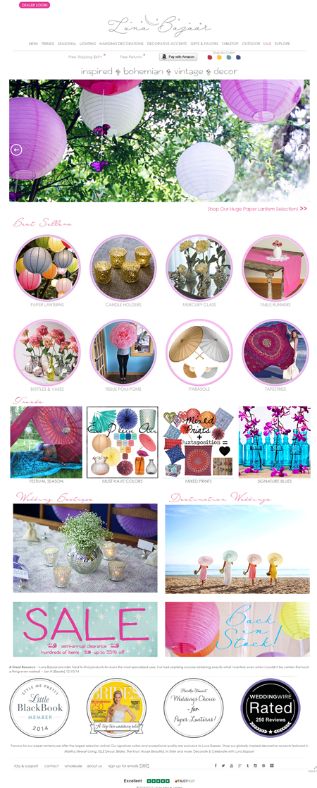
Luna Bazaar’s rotating banner takes over the screen real estate. If users view the page on a small screen, all they’re going to see is a large image and will have no idea what the site offers unless they sit through the rotating commercial. Best sellers, trends, and events, which are a guess at what customers want, take up a lot of space too and push down some compelling media mentions when those should be front and center.
Don’t rely on visitors using your text-based navigation bar – people will only go to the navigation bar if your page body fails. Counting on the visitor to go up to the nav bar, pull it down, and look at the sub-categories is an unreasonable expectation.
So, instead of showcasing promotions or individual products on your home page, put your permanent categories that convey the breadth of your product offering above the fold. Have a tile-like navigation with a few simple high-level groupings with images of constructed collages representative of those categories that users can use to drill down to find the product they’re looking for.
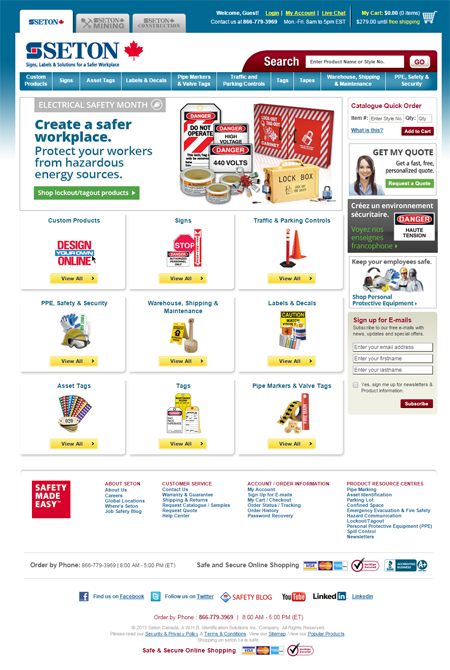
Seton’s site production quality leaves a lot to be desired, but they’re spot on with the collages to represent the high-level categories in the body of the page.
You can perhaps have one category of ‘Featured’ or ‘New’ products, but even that should only be there if the user is a frequent visitor. If you don’t have a reasonable expectation that people are coming back once a week, then you shouldn’t have ‘New’ as top-level category because within each category, you can feature ‘New’ or ‘Sale’ items.
Sign Posts, Not Content
The home page is a sign post, supposed to help people find what they need. It’s not where your content really lives – it’s not a commercial. So get people there, make sure you’re trustworthy, and get people what they need.
Work with the best!Kickstart your optimization with a 90-minute Website Review from the pioneers in conversion rate optimization. Our CRO experts at SiteTuners can help diagnose your website from a conversion and usability perspective. |