Wondrium Increased Free Trial Registrations by 32.98%

Increased Free Trial Registrations by 32.98%, Annual Paid Subscriptions by 34.02%.
Wondrium is a platform that offers engaging and educational content through videos, courses, tutorials, practical lessons, travel stories, documentaries, and much more. Its goal is to make lifelong learning and personal enrichment a fun and fulfilling experience for all.
Their business began in 1990 as The Teaching Company, best known for creating The Great Courses, which offered college-level video courses on topics such as history, science, and philosophy. With 30 years of experience and over 20 million courses completed, they are adding new and unique content to expand to offer more experiences that meet the needs of all lifelong learners.
“I am really excited about the results of the test, the entire process, and how you came up with the page. We tested a lot of stuff on our website this year, and nothing produced a lift like this.”
– Cale Pritchett – CMO Wondrium
Overview
SiteTuners’ team took a strategic approach by designing a new pricing page with a different layout that encouraged users to explore pricing options before signing up.
Adding pricing to the navigation provided users with a clear path to explore their options, ultimately increasing their chances of initiating a free trial.
We built trust, answered vital questions, and aligned the user journey on the page with the users’ expected intent when they landed on the page.
We also added trust-building elements to the page to make users feel more confident in their decision-making process.
The Power of CRO: Eliminate Conversion Barriers and Boost Your Revenues
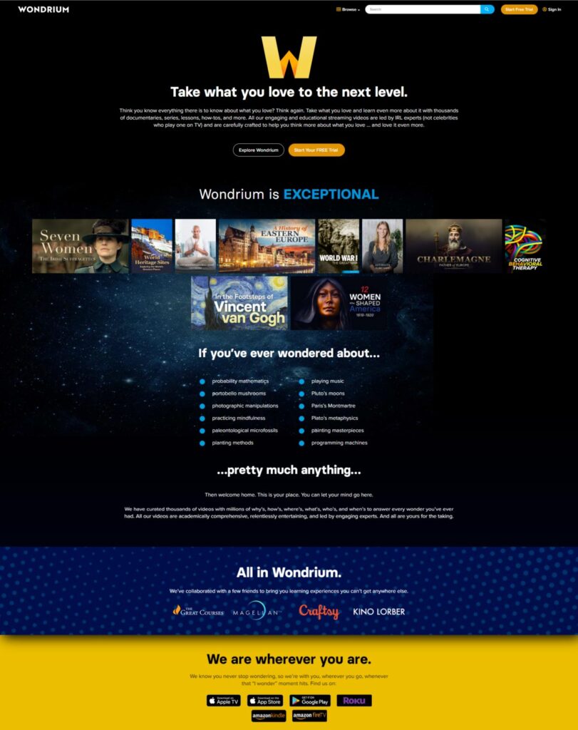
Even though it had been growing rapidly for several years, Wondrium still sought improvements to the conversion of its website to further fuel subscriber growth. After thoroughly analyzing the existing landing page, we identified numerous conversion barriers impeding progress.
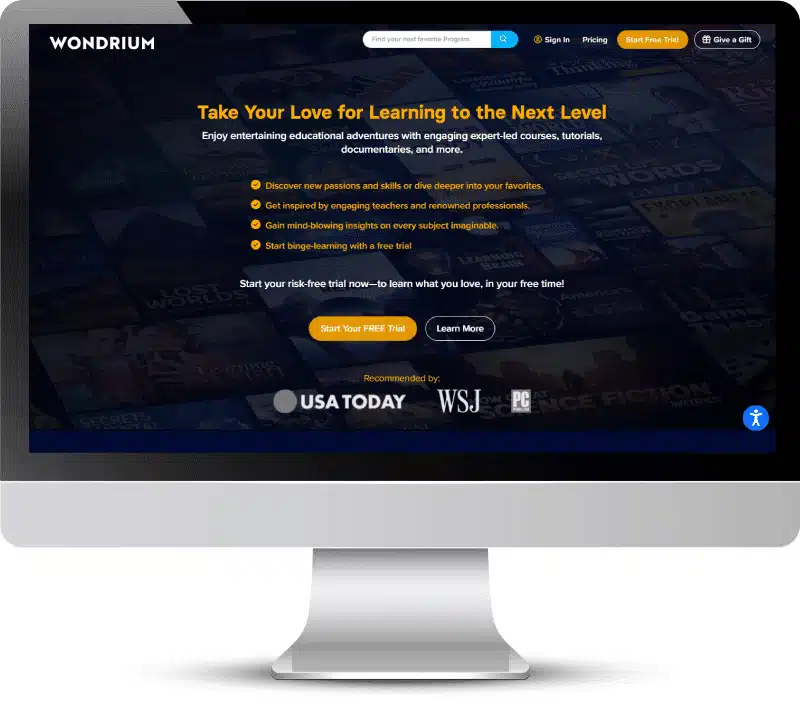
Before:

To address these challenges, we employed multiple best practices for Conversion Rate Optimization, including improving the user journey with clear, concise language that aligns with user intent and an enhanced overall user experience to increase trust. Our approach focused on simplifying the conversion process and making it easier for users to navigate, resulting in a more successful outcome.
Here are some of the biggest improvement opportunities we found:
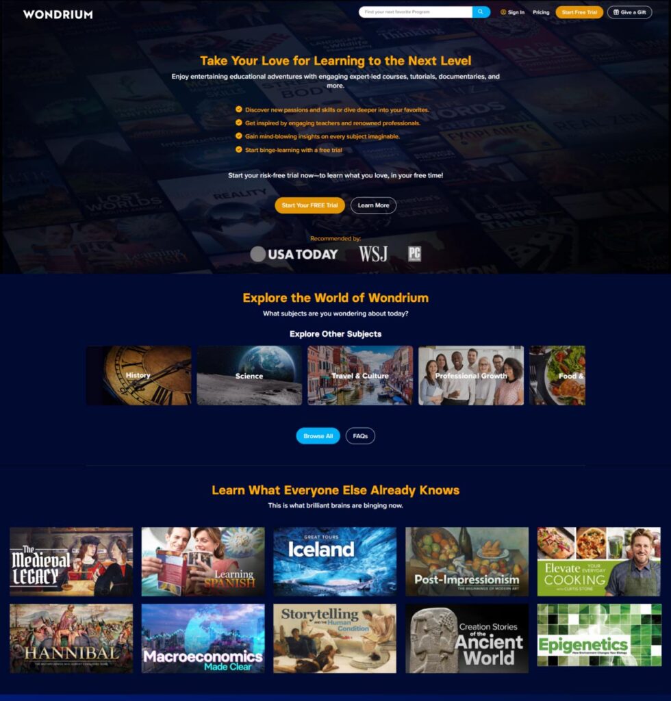
After:

Don’t Let Valuable Leads Slip Away: Convert Visitors Into Customers
We discovered a significant roadblock to user conversion. There were numerous ways a user could enter and leave the page without entering the purchase funnel. That means there were too many ways for the user to leave the experience without converting.
Our team implemented a pivotal change in the user experience. Previously, when users clicked on tiled squares, they were directed away from the page, creating a significant obstacle for conversion.
To eliminate this hurdle, we implemented a pop-up feature that provides users relevant information and details without taking them away from the page. This innovative solution has removed dozens of exit points, streamlining the user journey and increasing the likelihood of conversion.
Speak Their Language: Attract Your Ideal Customers With an Effective Communication
In this case, the communication strategy seemed technically correct in targeting the right audience. Still, it failed to generate the desired conversions. The language used was complex and elevated. It may have seemed appropriate for a niche audience of “smart people who like to learn,” but it made the content difficult to skim and scan.
To tackle this issue, we took a two-pronged approach. First, we simplified the language to make it more accessible to a broader audience without sacrificing the essence of the message. Second, we minimized the amount of text to make the content more scannable and easier to digest.
Being Open With Prices Can Build Customer Trust
Wondrium’s primary desire was for the user to start a free trial. So, the user would be taken to a signup page, choose a plan, and enter their credit card information.
Aligning User Journey With User Intent for Seamless Experiences
When users land on their site, it is important to simplify things for them and answer basic questions. Another factor we found was that Wondrium was not answering essential questions like “What is the price” or “How much is this plan going to cost me.” The most significant change our team made was to ensure we were answering the normally expected user intent questions, such as what the company does and what I will find here.
We built trust, answered vital questions, and aligned the user journey on the page with the users’ expected intent when they landed on the page. We also added trust-building elements to the page to make users feel more confident in their decision-making process.
Results
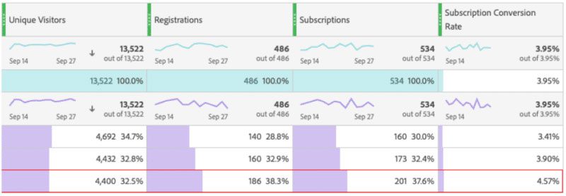
The results of the case study show a significant increase in both free trial registrations and annual paid subscriptions. Specifically, free trial registrations increased by 32.98%, indicating that the changes made to the Wondrium website successfully attracted more users to sign up for a free trial.
Additionally, the annual paid subscription rate increased by 34.02%, suggesting that it positively impacted converting free trial users into paying subscribers.
