Overland Homepage Test Plan – 14% Increase in Revenue
3.6% rise in conversions, 10% growth in average order value, and an increase of 14% in revenue.
Overland is a family-run business that has been making luxury items from natural materials for nearly five decades. Their outerwear, clothing, and home accents are all inspired by the American West.
SiteTuners designed a homepage test plan to address critical questions that web users ask themselves when they land on a page.
It pays to think about questions that visitors ask themselves, and to craft the best responses possible.
Company
Type of project
Content strategy
Results
3.6% rise in conversions, 10% growth in average order value, and an increase of 14% in revenue.
Overview – Boost E-commerce Conversions by Answering 3 Critical Questions
There are different types of traffic sources and visitors to think about, plus there are internal, business-level considerations to account for.
At the most basic level, though, an effective homepage needs to address 3 questions that web users ask themselves when they land on a page:
A website’s homepage isn’t supposed to be the destination where visitors hang around. A good homepage should be more like a signpost that directs visitors deeper into the website, to get them closer to what they’re looking for, as quickly as possible.
That may sound simple, but making good signposts can be rather tricky, even for seasoned marketers who have made dozens of signposts in their careers.
Fine-Tuning Overland’s Homepage
The Overland homepage was focused on conversion to begin with. Before the engagement for the split tests and conversion optimization began, the homepage already had a lot of good things going for it.
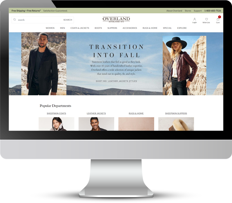
Overland’s original homepage (displayed below). Before the test was conducted, there had already been a ton of work devoted to the homepage to make it convert well.
Answering Your Visitor’s Critical Questions
To make an already effective homepage convert even better, you need to dive into the weeds to ensure that visitors know they are in the right place, that they feel good about being there, and that they understand what they need to do next.
Let’s tackle those concepts individually:
Assuring Visitors That They’re in the Right Place
Web visitors come from a myriad of possible traffic sources. They can come from e-mails and free organic searches, or paid sources like PPC and paid social traffic.
When you have dedicated landing pages for those traffic sources, you have some measure of control. When the URL you’re optimizing is your homepage, you are out of luck because the page must work for everyone.
The Overland homepage already had some elements like the imagery and the messaging in the banner, that assured visitors they’re looking in the right place.
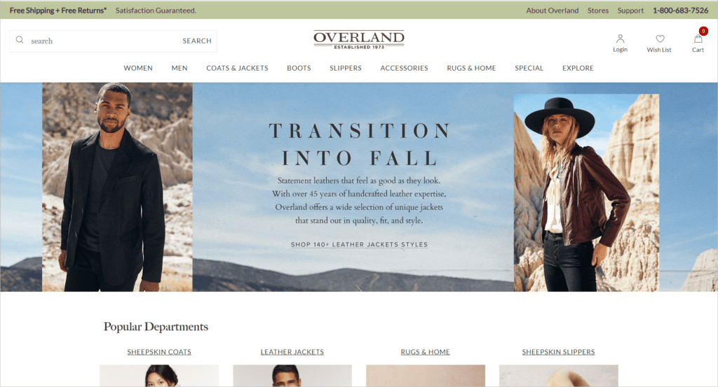
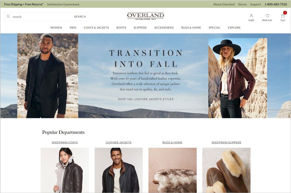
However, to beef that up and make sure visitors immediately feel they’re in the right place, “Shop 140+ Leather Jackets Styles” was added on the banner to immediately communicate the range of products available.
New homepage (displayed below). The number of styles available is getting communicated early in the new version of the page.
Calls-to-action (CTAs) and parts of the body content that are likely to be scanned can help you communicate the extent of products offered. It takes discipline and thorough testing to understand which CTAs and which parts of the body content can give you conversion lifts. But that discipline can really pay off.
Making Visitors Feel Good about the Site
Once you’ve established the information trail and visitors feel they’re in the right place, the next question to tackle is how they will feel about the site. Getting this part right requires a few things:
In Overland’s case, good design and consistent use of imagery were covered even before the tests began. The old homepage already had stunning photos, and the page clearly adhered to a strong set of brand guidelines.
What needed some testing was the messaging about the brand. That’s where the SiteTuners recommendations came in:
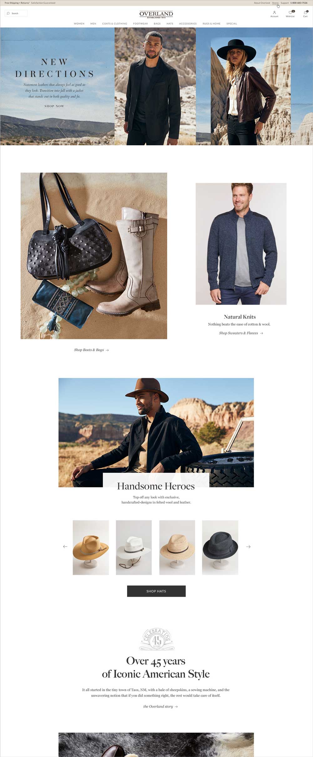
New homepage (displayed below). The “About” section was placed higher up the page. Making the brand story more accessible can help make visitors feel good about the site.
Improving a homepage to make people feel good about the site isn’t always about big, dramatic design changes. Sometimes, the small, deliberate, precise strokes can give you pages that convert better.
Letting Visitors Know What They Need to Do Next
Even if visitors feel that they’re in the right place, and even if they feel good about the site, they still won’t convert if it’s not clear which path they should take.
For a dedicated landing page, this problem can be relatively simple to solve: you can drive your PPC traffic to a specifically targeted page with a clear call to action.
But what about the homepage?
Remember, the homepage has to serve a wide range of visitors. The people who are coming from organic traffic looking for a rug for their home are very different from the visitors from pay per click traffic who are looking for a coat. But they may very well land on the same homepage.
This is where you’ll need to make some tough calls about what goes above the fold.
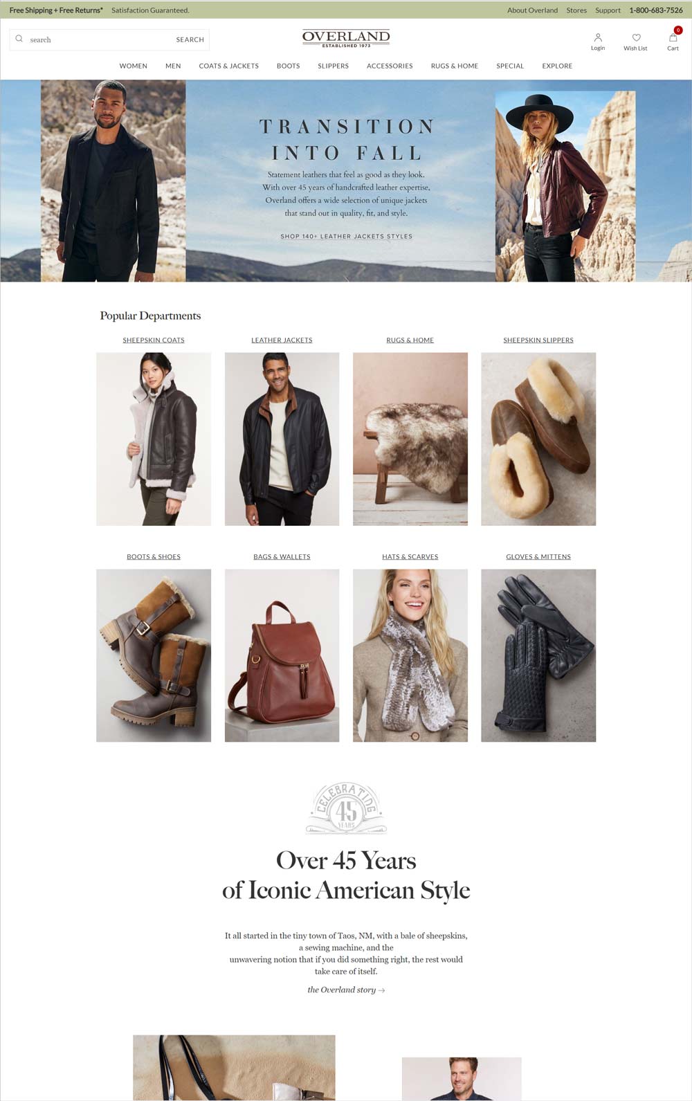
In Overland’s case, a few categories of products drive most of the sales. SiteTuners suggested tweaks to the homepage so that those core categories are all visible when visitors first land. Adding visual navigation elements ensures that each distinct set of visitors all had a path they could easily follow to focus on what they need as quickly as possible.
New homepage (displayed below). Displaying the categories that people use most or that drive the most sales to the site as visual navigation elements help visitors get to what they need quickly, before you lose their attention.
If you take the time to review the analytics and display categories that people care about most, you’ll get more of your visitors to engage with the site.
Results
Overland tracked website performance after implementing SiteTuners’ recommended changes to their homepage.
The results showed that:
Conclusion – Gains from Answering the 3 Questions Better
Ensuring you understand what your visitors are asking can help lead not just to a better overall user experience, but good return on investment for your digital efforts.
If you remember to make all the tactical changes you need to…
… you’ll be more likely to maximize your conversion rate and revenue.