Nyraju Skin Care E-commerce Landing Pages – 277% Increase in Conversions
277% increase in conversions of landing page conversion.
Nyraju Skin Care is one of the pioneers in the natural and organic skin care market for African Americans.
Nyraju wanted to increase their online sales and revenue by optimizing their landing pages and e-commerce funnel.
SiteTuners worked with them to do a tactical redesign of their e-commerce website.
Company
Type of project
Content strategy
Results
Increased landing page conversions by 277%.
Overview
The first step in increasing e-commerce sales is to eliminate the sources of friction and barriers to successful conversion. SiteTuners conducted a diagnostic audit of Nyraju’s mission-critical pages to identify design and usability problems that prevent visitors from converting. We then recommended improvements to address these issues and help Nyraju benefit from quick wins.
Based on SiteTuners’s recommendations, Nyraju Skin Care revised the mission-critical landing pages in their e-commerce funnel. These changes resulted in as high as a 277% increase in conversions!
SiteTuners’s recommendations for Nyraju Skin Care were based on the following principles:
Fine-Tuning Nyraju’s E-commerce Pages
Nyraju Skin Care wanted to increase conversions from their e-commerce website but did not want to undergo a major website redesign. Instead they utilized SiteTuners’s expertise in tactical redesign to optimize their existing landing pages.
Prior to the facelift, Nyraju Skin Care’s overall conversion rate was 1.31%. The homepage was converting at 2.10%.
SiteTuners reviewed the landing pages that had a significant impact on customers’ purchase decisions. Nyraju Skin Care then implemented SiteTuners’s proposed changes to their landing pages and monitored performance using their analytics tools.
Below are the original and optimized versions of the landing pages:

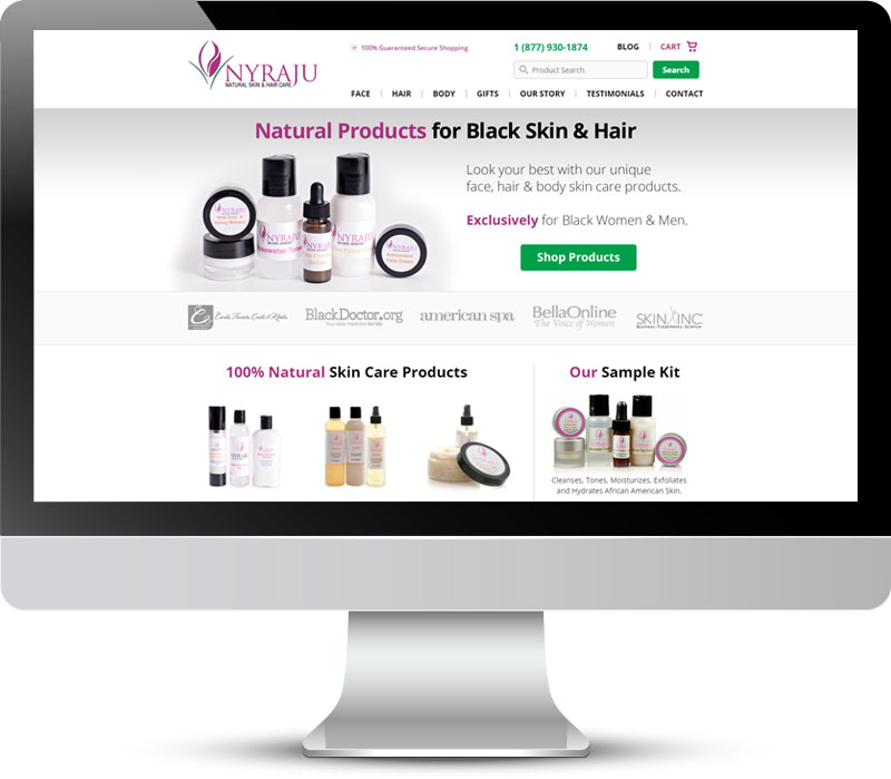
Typically, new visitors first land on Nyraju’s homepage. If they don’t have a specific product in mind, they then click on a category they’re interested in, like the one below:

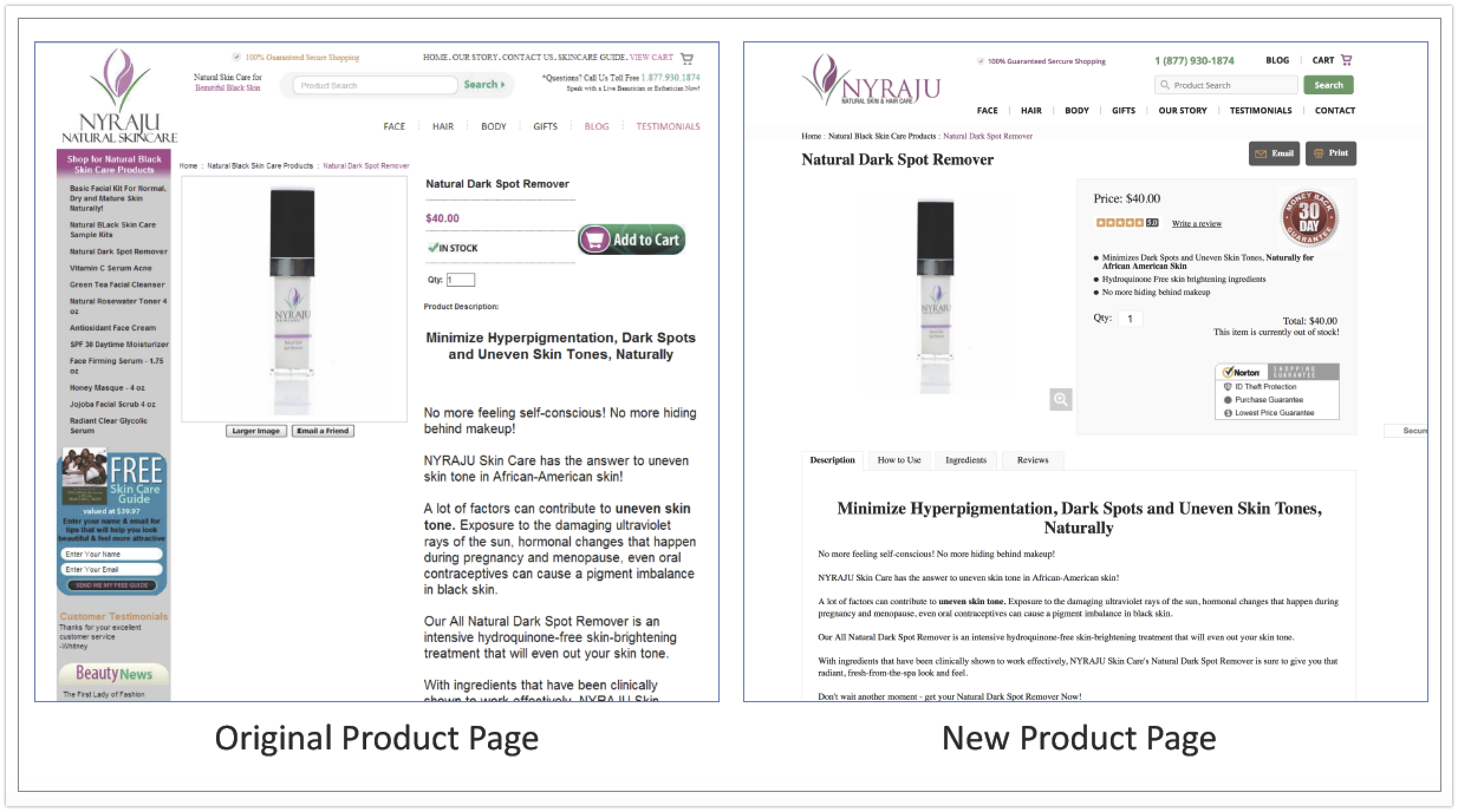
They then click to a product detail page:
If a visitor clicks the add-to-cart button, she is immediately taken to the cart page below:
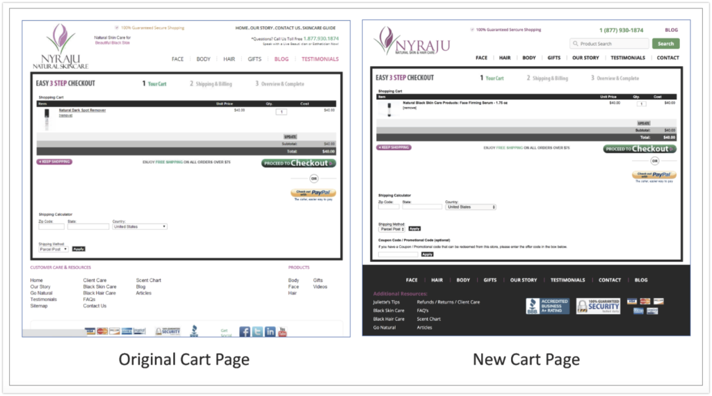
Nyraju Skin Care’s conversion goal is a completed sale.
Fix Obvious Problems First
We identified the conversion leaks in Nyraju’s e-commerce funnel and recommended changes to their landing pages based on the principles of conversion-centered design. These CRO principles are at the core of SiteTuners’s framework for designing intuitive, persuasive, and engaging web experiences.
1. Build trust
Trust is a basic element in e-commerce transactions. Your users won’t buy from you if your website doesn’t convey trustworthiness. As your company and brand’s online representation, your website must have a clean, professional, and consistent design that inspires confidence from visitors. Having prominent trust symbols and following web conventions also help users develop a sense of familiarity with the website.
In Nyraju’s case, the original homepage looked cluttered with too many offers – including an automatic slider – on the main content area, and also had chunks of text meant for search engine optimization. The biggest trust element – the phone number – blended into the background. The other trust symbols (BBB, 100% Guaranteed Security) were at the bottom of the page, which rendered them ineffective. Most people don’t scroll to the bottom of the page, so they wouldn’t see any of the trust logos.
We recommended that the content area be decluttered by removing the rotating banner and replacing it with a single offer. We also suggested the addition of client logos to reinforce trust. We moved some elements (like the search bar and phone number) to more standard locations on the page.
2. Be relevant
Visitors initially decide whether or not they feel good about your site within seconds. How well your landing page matches user intent greatly affects that decision.
First, the landing page must mirror the ad messaging and keywords used to attract the visitor.
Next, the landing page should provide useful information about the product/service being advertised.
Finally, the landing page should have great usability and user experience.
In Nyraju’s case, visitors who land on the homepage would have no problem learning what the company is selling. But if a customer lands directly on a product page, the messaging is inadequate to match intent.
SiteTuners recommended having visual navigation such as image-based categories on the content area in lieu of the slider. This way, visitors can self-select and self-navigate. They’ll also know instantly what products are possible to buy from the e-commerce store rather than having to read text. Images are a much faster navigation tool in this case.
3. Have a strong value proposition
The value proposition lets visitors know why they should buy from your company; what’s in it for them. Having a strong value proposition is critical in persuading visitors to take action.
Nyraju Skin Care’s original landing pages promised 100% Natural Black Skin Care, but this was not clear. They also relied on lengthy text to explain the benefits of their products. But people generally don’t read text on the web, so they are bound to miss these points.
Your website should focus on benefits, so visitors know outright why they should buy a product or service. We recommended using a combination of images and bullet points to make the value proposition more obvious. We also encouraged putting “before” and “after” images to demonstrate to visitors the benefits of using Nyraju products.
4. Be consistent
Consistency in design, branding, and messaging is crucial in obtaining visitor trust. Achieving consistency is not just about having professional-looking landing pages, it’s also about maintaining the information scent throughout the funnel.
Nyraju’s original homepage and landing pages were sorely lacking in design consistency. Some of the elements on pages didn’t match others, like the headline and the visuals. On the product page, the images of reviewed products were pushed up and misaligned with the rest, causing the site to appear broken. The left navigation and content promotion also drew too much attention.
To achieve consistency, SiteTuners suggested aligning the product images and removing the left navigation. The inclusion of the headline and use of bullet points in the product pages were also encouraged to create a continuity.
5. Get rid of distractions
Clutter kills conversions. Landing pages should be free from unnecessary design or interaction elements that distract visitors from completing the task.
Nyraju Skin Care’s homepage and landing pages had too many elements on the main content area:
There was a slider that automatically moved, changing from one category to another. Several unrelated promotional banners were also competing for visitor attention. To eliminate distractions, we advised that the slider and the promotions be replaced with image-based navigation of top-level categories. We also recommended removing the left navigation on the category and product detail pages since it wasn’t adding any value to the page.
6. Have a clear call-to-action
Clarity alleviates visitors’ fears from the risks of an online transaction. It also increases landing page transparency from the user’s viewpoint. Having a clear information architecture, good copywriting, and clear calls-to-action are necessary for clarity.
SiteTuners worked to increase clarity by improving the visibility of the main call-to-action. We also suggested changes in the visual hierarchy and button copy to better align them with user intent. For instance, Nyraju could include a photo of their bestselling sample kit in the visual navigation, so first-time visitors can easily find it.
7. Make conversion easy for users
Ease of use is an important factor in online conversions. Visitors should find a landing page simple and effortless, without frustrating user experience issues. They shouldn’t have to expend too much mental effort to accomplish a task on a website.
Aside from decluttering the Nyraju Skin Care website, SiteTuners emphasized following web conventions to make navigating the site easy. We also suggested improvements to the site search to improve product findability.
Testing Results
Nyraju tracked the performance of the optimized landing pages after implementing SiteTuners’s recommendations.
The results showed that:
Overall, Nyraju Skin Care’s revenue and order volumes have doubled.
Conclusion
There’s only one thing that truly matters when it comes to e-commerce: the bottom line.
The first step to increasing sales and revenue is to remove the barriers to conversion on a website. Optimize your landing pages according to tested and proven principles of conversion-optimized landing pages, and you’re well on your way to increasing e-commerce sales and revenue.