AutoWeb Landing Page – 16% Increase in Conversions
16% increase in mobile landing page conversions.
Digital automotive pioneer and a leading automotive marketing services company, AutoWeb (formerly Autobytel), was experiencing less than optimal new car lead conversions from Google Adwords campaigns to its Car.com brand – in particular, Car.com’s mobile pay-per-click (PPC) landing pages.
AutoWeb turned to SiteTuners and Google to increase new car lead conversions and page views, decrease bounce rates, and enhance its overall ad spend.
“As a matchmaker between in-market car buyers, their next vehicle purchase, and our industry partners who help them fulfill that purchase, it’s paramount to provide the best consumer experience possible,” said Wes Rock, AutoWeb’s Vice President of Digital Marketing.
“SiteTuners understands the importance of the 7-principle design approach to improving the landing page experience. The right content, design, and calls-to-action help drive consumers to their next vehicle purchase quickly and efficiently without sacrificing lead quality – and this is, without question, the experience they’re looking for today. Based on these results, we’ll continue to refine the consumer experience across other AutoWeb brands and campaigns.”
Company
AutoWeb’s Car.com
Type of project
Landing page redesign
PPC funnel test plan
Content strategy
Results
Increased landing page conversions by 4%.
Retest increased conversions by 16%.
Overview
Optimized landing pages have definite advantages for companies using Google Adwords. When landing pages are designed for conversions, they turn more clicks into leads and customers. This generates a better ROI from Adwords campaigns.
Google prefers landing pages that provide a better experience with proper search intent alignment. Optimized landing pages are more likely to get higher Quality Scores and rank better than unoptimized landing pages.
Based on Google’s recommendation, SiteTuners worked with AutoWeb to increase the number of leads for new car sales coming from Google Adwords campaigns to its Car.com brand. AutoWeb, Google, and SiteTuners created optimized versions of Car.com’s mobile landing pages and tested these against the originals, which initially resulted in a 4% increase in conversion rate and a 3% reduction in lead acquisition costs for the company.
A relaunch of the test in July 2018 resulted in a nearly 16% increase in conversion rate.
The new versions of Car.com’s mobile PPC landing pages were designed based on the following conversion optimization principles embodied in Google’s standards for landing pages:
Here’s how these principles were applied in the mobile PPC test for Car.com
The Car.com Mobile PPC Funnel Test
After identifying the conversion leaks in Car.com’s mobile PPC funnel, SiteTuners designed new versions of the landing pages for the funnel.
Car.com’s mobile PPC funnel was tested using A/B parallel testing. Google and SiteTuners compared the performance of the original versus the optimized landing page variations based on traffic from Google Adwords campaigns, particularly mobile users in the market for a new car.
The test involved Car.com’s multi-step mobile PPC funnel, wherein visitors first landed on either a “Brand” or “Model” landing page depending on the keywords they were searching.
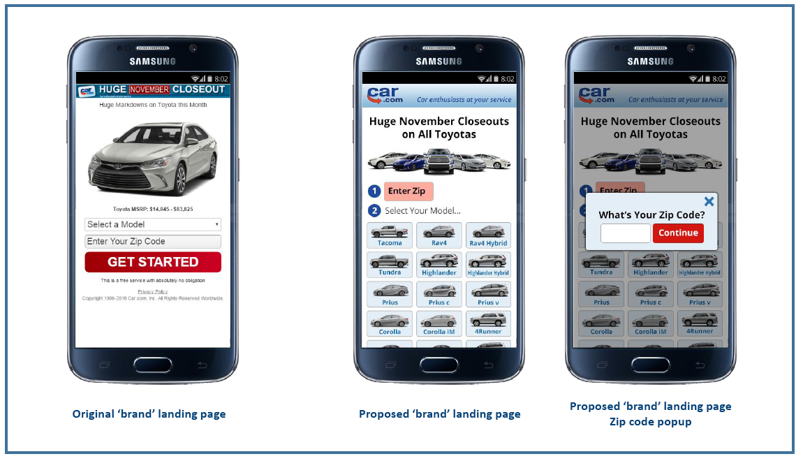
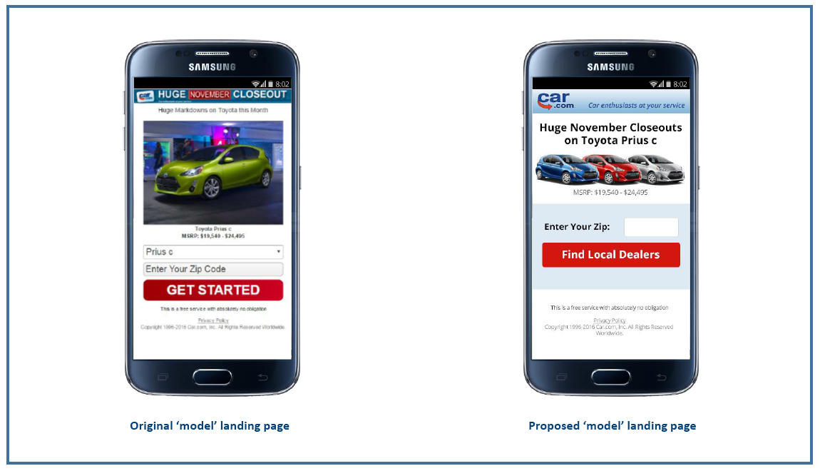
The original and optimized versions of Car.com’s “Brand” and “Model” landing pages are below:
Brand Landing Page
Model Landing Page
Implementing SiteTuners 7 High-Converting Landing Page Design Principles
Trust
Three things happen when a user visits a website or web page:
Visitors first need to see the company as trustworthy to have the confidence to transact with the website. The website must be able to convey trustworthiness by having a clean, professional design that is consistent with the brand.
On the Car.com mobile landing pages, the logo and tagline in the header of the proposed versions were enlarged to make them more obvious and improve legibility for users.
Relevance
Landing page relevance directly influences how users feel about a page and their decision to stay or hit the back button. A highly relevant landing page aligns with user intent, making users feel comfortable about the page which contributes to trust. This means a conversion-optimized landing page must not only have a strong headline that is relevant to the keyword and ad used to get visitors to click, but also have great usability and user experience.
In Car.com’s case, it wasn’t enough for mobile visitors to be taken to separate mobile landing pages based on the search terms used. Alignment with user intent and visitor experience on the “Brand” landing page was improved by using images of existing car models as opposed to the dropdown which some visitors may not see or find difficult to tap on mobile devices.
Similarly, the image of a single car on the “Model” landing page was replaced with one that showed the same car in different color variations to let visitors know that they have several options.
Value Proposition
The landing page’s value proposition tells visitors the value of the offer. It lets them know what’s in it for them. A conversion-optimized landing page must have a strong value proposition to persuade visitors that taking the desired conversion action is worth their while.
Car.com’s optimized versions for the “Brand” and “Model” landing pages were designed with this in mind.
First, the ad-like header containing the “Huge November Closeout” message at the top was removed where it was likely to be ignored by visitors. Instead, it was incorporated into the headline to be more obvious. The new headline was also made more compelling for visitors searching for huge discounts on cars since it expressed time-sensitivity to the offer.
Distraction-Free
Mobile landing pages need to be free from clutter. It is not ideal for unnecessary elements to take up the already limited real estate of mobile screens. The same goes for design or interaction elements that distract mobile users from completing their tasks on the page.
In Car.com’s case, the dropdown navigation boxes were removed on both the “Brand” and “Model” landing pages, as these could confuse visitors. On the “Model” landing page, the dropdown was unnecessary, given that visitors landed on the page from a specific search term.
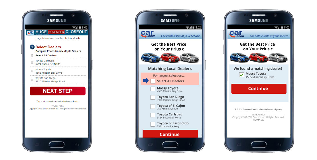
After the visitor enters a zip code, they are taken to a dealer selection page as shown below:
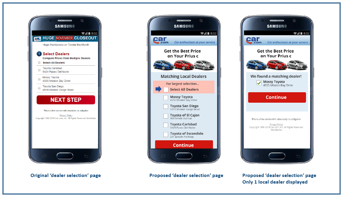
Step 2: Dealer Selection
Consistency
Having a consistent look, branding, and messaging is crucial to building visitor confidence. To achieve consistency, landing pages should look uniform and maintain the information scent throughout the funnel.
To achieve a consistent experience for the Car.com mobile PPC funnel, uniformity in the design elements, images, and messages throughout the process was implemented.
For instance, the same image of the visitor’s preferred car model is used from the “Model” landing page up to the contact information form to create a continuity of experience. Also, the headline on the dealer selection page continues to focus on the visitor’s goal.
Ease
A landing page should be simple and easy to navigate and understand so that visitor decision-making is a no-brainer. It should support visitors in accomplishing their goals. It should be free from usability and user experience issues that frustrate visitors and cause them to bail out.
Ease of use is very important on mobile landing pages where tiny screens tend to amplify the effort required to do certain tasks. The optimized versions of the Car.com landing pages were designed to be effortless for visitors.
On the new “dealer selection” page, for instance, the “Select All Dealers” option is emphasized for mobile users who are not sure which dealership they want. If search results return a single dealer based on the visitor’s zip code, then that dealer is preselected as an option which removes the extraneous click required from the visitor.
Similarly, the “I consent” button is emphasized on the “optional marketing consent” popup which makes the primary option more obvious to mobile visitors which will be shown in Step 4.
Visitors must select their preferred dealer/s and then click on the red call-to-action button, after which they see the contact information form below:
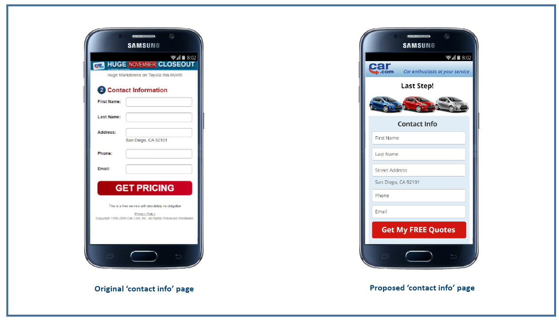
Step 3: Contact
Clarity
Clarity allays online users’ fears and lends transparency to the landing page. This is achieved with a clear information architecture and visual hierarchy, good copywriting, and having a clear call-to-action on the page.
The Car.com mobile landing pages were designed with a clear headline that explains the purpose of the page, for clarity. On the contact information form, the title states “Last Step” to give visitors a sense of progress and let them know that they’re very close to their goal.
The text on the call-to-action buttons from the “Model” landing page were also changed to match what the visitor wants to accomplish on the page (e.g. “Get Started” vs. “Find Local Dealers”) which was shown on the “Model” landing page at the beginning.
Car.com’s conversion goal is achieved if the visitor completes and submits the form by clicking on the red call-to-action button.
A “thank you” popup with an optional marketing consent appears after the successful submission of the visitor’s contact information (see below):
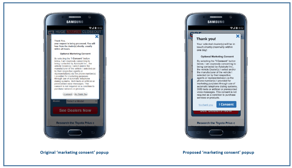
Step 4: Thank You
Testing Results
Split testing results showed that the optimized version of Car.com’s mobile PPC funnel initially increased conversions by 4% and at the same time, the optimized version decreased cost per conversion by 3%. A relaunch of the test revealed increased conversions by nearly 16%.
Additional Initial Results:
By following conversion-centered principles that reflect Google’s criteria for excellent landing page experience, Car.com’s proposed landing pages had a lower bounce rate but higher page views per session. This suggests that visitors had the confidence to go deeper into the funnel compared to before. At the same time, session duration was lower as users converted more quickly in the optimized mobile PPC funnel.