 In the seventh of our 12 days of LPO tips, SiteTuners takes you through best practices for finding what to test and tune.
Now you just need to find what to test and tune.
And then it hits you. You have dozens of areas that will benefit from the tests. You need hundreds of variations to cover all the elements that you need to start with. For many conversion points, you did not write the content, did not have design input, did not perform the heuristics analysis – but you are expected to make the conversions improve.
Where do you start? What do you do?
You prioritize for impact.
Use the Pareto Principle to Tune for Impact
You’re probably not new to the concept of 80/20, and it’s as true for web site usability as it is for wealth distribution. Just as you can move the needle by changing the few things that matter, you can make very little impact by changing a lot of the things that don’t.
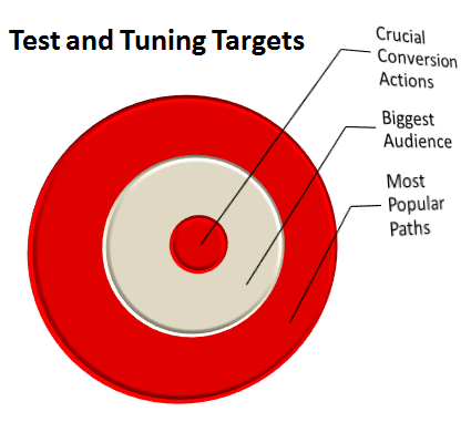
Maximize your chances of improvement by starting with areas that more closely tie into financial gain:
1. Most important conversion actions. For sites with e-commerce micro-conversions, the most common and most profitable actions are known. Start testing and tuning from there.
2. Biggest possible audience. The more visible areas tend to, on balance, lose the most visitors in the funnel. Find your high traffic low performers by looking at which visited areas have the highest bounce rate, and testing from there.
3. Most popular paths. Find out where your common type-in traffic lands, and find where people end up when they type in keywords for the industry. Those visitors are likely to behave differently, with the latter being tougher to convert. Segment that traffic, then use the bounce rate to look at lost opportunity. From there, you’ll be able to prioritize for maximum gains, and tune for impact.
Functions, Flows, or Offers?

• Function and usability focus. When digital marketers talk about testing, this is what they talk about. Button sizes for CTAs, layout and prioritization for items above the fold, length of content, color contrast, trust elements, and a range of other usability improvements on one page.
• Single or Multiple Page Flows. There are some cases where small actions are less intimidating to visitors. When multiple interactions are required for a conversion, it may be a good idea to test a single page that has the minimal number of steps laid out, versus several pages with micro-actions.
• Content and offer focus. Sometimes, it’s the offer, the price, or the promotion that needs work, rather than the page usability or the conversion flow.
How Detailed is Your Test?
There are a couple of ways to conduct on-page tuning tests.
1. Granular Tests. If you have a lot of traffic, running small tests are quick and easy ways to test elements. It does not take a lot f time to set up, it requires less work and emotional investment, and is ideal for champion-challenger gradual improvements. The drawback is that the type of gains may be limited, and individual elements may mislead when looking at conversion gains (Blue CTA caused 1% gain in conversions). The elements are not independent of each other, but running this type of test may sometimes SEEM to indicate this.
2. Overhauls and Nested Tests. If there’s limited traffic or runtime, overhauls may be the best way to go. You can test nested assumptions in one go, and it creates for a more “holistic” view of the test, where the gestalt principle is used – the elements are treated as more than the sum of their parts. The drawback is that it takes more work to create coherent changes when doing overhauls.
What Not to Tune for Impact
Now, just because you’re running tests doesn’t mean you can skip usability research, throw spaghetti at the wall, and see what sticks. You still need to follow best practices in the creation the pages to test:
• Visitors tend to ignore the upper-right and lower-left corners. Do not put your CTAs there.
• Think about what elements should be above the fold, but also realize that the fold is not the actual visible limit to the visitor. Research shows that people start filtering content when they get two-thirds through the fold. Factor that in.
• The important content is expected at the central portion of the visible page.
• Visitors pay attention to the upper-left corner of a page when they are trying to get oriented.
And that’s it. Once you identify what to and not to test, it’s a matter of execution and refinements.
Next: “Automate Your A/B Test Processing for High Confidence Results.” SiteTuners covers the impact of testing.
Take your conversions to the next level.Learn how our experts at SiteTuners can help kickstart your conversion rate optimization process or get better results from your CRO efforts. Give us 30 minutes, and we’ll show you a roadmap to your digital growth! |


