Summary: Turn visitors into customers, and keep them happy enough to become repeat customers!
When COVID-19 hit in 2020, it resulted in almost 150 million new online shoppers. E-commerce experienced 10 years’ growth in just 90 days.
More than a couple of years later, the world is opening up and e-commerce growth has slowed down, but marketers still face similar challenges they did during the peak of the pandemic.
The saturation of the e-commerce space has led to a rise in customer acquisition costs. To get the most bang for your buck, you need to increase your chances of converting visitors into loyal customers.

25 E-commerce conversion rate optimization tips to stay ahead of your competition:
- Improve E-commerce Website Speed
- Convey Your Unique Selling Proposition (USP)
- Build Trust to Increase E-commerce Conversions
- Make Your E-commerce Website Secure
- Cater to Early Stage Visitors
- Aim for Effortless Navigation
- Help Customers Recover from 404 Errors
- Make E-commerce On-site Search Helpful
- Show the Depth and Breadth of Your Products
- Limit Choices to Help Shoppers Decide
- Use Product Images Deliberately
- Make Your Call to Action Persuasive
- Employ the Scarcity Principle in Your E-commerce Website
- Leverage Social Proof/ Customer Reviews
- Optimize Price Presentation in Your E-commerce Website
- Offer E-commerce Discounts Strategically
- Get Shoppers to Add More to Their Cart
- Optimize Your E-commerce Checkout Experience
- Offer Different Shipping Options
- Clearly Communicate Delivery Times to Boost E-commerce Conversions
- Pay Attention to Your Thank You Page
- Optimize the Entire Post-Purchase Experience
- Show Your Corporate Social Responsibility (CSR)
- Use Behavior-Triggered Popups
- Up Your Social Commerce Game
Conclusion: E-commerce CRO in the New Normal
The growth of e-commerce worldwide made the digital competition tougher, with cross-border e-commerce, the shift of traditionally offline products to online, and the popularity of marketplaces being just a few of the drivers.
This new level of competition makes delightful customer experiences and brand-building more imperative than ever.
1. Improve E-commerce Website Speed
Fast site speed is great all around – it’s delightful for user experience, it’s fantastic for search engine optimization (SEO), and it’s a boon for search engine marketing (SEM). That said, it takes a lot of work to keep page load time down.
What You Can Do
- Monitor your page load time on tools like Google Analytics to see if there are outlier pages that get viewed a lot, but have high load times.
- Use tools like Google PageSpeed Insights to help check for potential issues.

Google PageSpeed Insights showing results for Amazon.com’s mobile website.
- Manage the number of plugins and tracking scripts you have. Check if any of them have an outsized effect on load time with tools like Pingdom.
- Ensure you’re using a Content Delivery Network (CDN).
- Use features like srcset to load the right image for the right device, and keep image load time low for mobile devices.
Some of the steps required are rather technical, but they’ll be worth it down the line. Slow load time can limit the number of conversions you have. Keep in mind that web users have the patience of a lit match. They’re also not as invested in your website as you are. If you make them wait for the page to load, they can easily leave and go to your competition instead. So ensure you have a roadmap to tackle page speed issues.
2. Convey Your Unique Selling Proposition (USP)
If your company is to stand out from all noise and competition online, your brand identity needs to come through on your e-commerce website. One way to do this is to immediately tell customers your unique selling proposition.
You can help e-commerce shoppers make a decision by talking about how you’re different from the competition. Ensure that what makes you unique is given prominent real estate on your pages.
What You Can Do
- Make the tagline below your logo functional, and have it communicate your differentiator.
- If you can show things like certification logos that speak to your unique selling proposition, display them prominently above the fold.
Here are some examples of e-commerce websites that use their tagline to distinguish their company from competitors:

People Tree’s tagline, “Sustainable and Fair Trade Fashion”, immediately conveys how the company is different from other fashion brands.

Lane Bryant’s tagline below the logo in the upper left corner of the page says “Fashion Sizes 12-28”. This makes it obvious right away what the fashion company’s niche is.
Conveying your USP efficiently makes it more likely for shoppers to transact with you and helps greatly in your e-commerce conversion rate optimization efforts.
3. Build Trust to Increase E-commerce Conversions
Trust is a prerequisite in e-commerce – people will only transact with you if they trust you.
To optimize your conversion rate, you need to be very deliberate about how your site is likely to be perceived.
What You Can Do
- Ensure that your website has a modern look and feel. Research suggests that online buyers tend to rely on gut-feel to determine whether or not a website is trustworthy, and that’s mostly based on first impressions.
- Display your phone number prominently. Follow web conventions as much as possible – show your number at or near the upper right-hand corner of the site.
- Show security seals like those for VeriSign, Norton, or McAfee. Give those extra visual emphases on pages where users have to put in their information.
- “Borrow” credibility from logos of large companies that use your products and services or media mentions from known institutions. Keep the logos muted, so they don’t overpower critical navigation elements.
It takes a lot of work to immediately build trust and credibility online. A good starting point is being very specific about where and how trust elements are used.
Learn other ways to establish trust and get e-commerce customers to buy from you. Read “Making Web Visitors Feel Good: 6 Things to Consider to Build Trust Online”.
4. Make Your E-commerce Website Secure
You can build quite a bit of user trust through logos of media reviews and marquee customers and still get the user to feel wary about transacting with you if their browser warns them that your site may not be secure. This will cost you sales even if you play your other cards right.
What You Can Do
- If you haven’t done this yet, migrate from HTTP to HTTPS. Ensure you have a proper redirect plan so you don’t lose traffic and search engine rankings in the process.

The browser warning visitors that the website is “Not Secure” can heighten fears around user information getting stolen.
- Update your content management versions and plugins regularly, so you don’t expose yourself to security attacks on those fronts.
Securing the site takes work, but it makes it more likely for your e-commerce shoppers to pull the trigger when they want something from your site.
Learn how to ensure domain migration doesn’t hurt your SEO efforts. Read “Domain Migration SEO: A Checklist for Web Professionals”.
5. Cater to Early Stage Visitors
A significant number of marketers focus on just the bottom of the sales funnel. However, optimizing only for the people who are ready to pull the trigger can damage the business in the long run. A healthy marketing practice draws in people from the top, middle, and bottom of the funnel.
What You Can Do
- Create early stage content like detailed guides, and do not gate these assets. If you educate customers about a high-consequence decision, they’re much more likely to trust and go with you when they are ready to get started on the purchase.
- Have the entire customer journey above the fold, instead of just providing a path for bottom-of-the-funnel visitors. The more complicated the buyer’s journey is (i.e. high-ticket conversions), the more critical it is to have the entire customer journey represented above the fold.
Ensuring that your entire sales funnel is healthy rather than just squeezing out value from the bottom of the funnel ensures you’ll be more likely to succeed in the long run.
Learn more about meeting the needs of early-stage website visitors. Read “Catering to Early Stage Visitors to Improve Conversions”.
6. Aim for Effortless Navigation
Getting the visitor to the correct page sounds simple, but in reality, only the most deliberate marketers get this right. There are steps you can take to ensure shoppers can efficiently get to the product they need.
What You Can Do
- Expose navigation elements on larger screens. Do not use the hamburger menu when your user is on a laptop rather than a smart phone, for example.
- Try not to create false bottoms, or screens where it doesn’t look like the user can scroll but there’s content below the fold.

KellyMooreBag.com’s homepage suffers from a false bottom problem primarily because of the large graphic. It’s not immediately obvious that there’s more content below the fold.
- Ensure interactive elements have affordance signifiers – buttons and other interactive elements should look clickable.
- Have clear navigation labels. Website users should be able to immediately tell what will happen when they click on a navigation element.
- Follow web conventions. Web users spend most of their time on other websites, so the more you follow general web guidelines, the easier it will be for visitors to navigate your site.
Prioritize usability over aesthetics. It might be tempting to use snazzy web design trends, but that should not be done to the detriment of navigation. Keep in mind that if e-commerce shoppers cannot find what they’re looking for, it won’t matter how pretty your site is.
Learn more about navigation blunders that get in the way of conversion rate optimization for e-commerce. Read “5 Web Navigation Mistakes That Are Costing You Conversions”.
7. Help Customers Recover from 404 Errors
You should spend time analyzing your e-commerce website to find out where shoppers tend to encounter errors, and fix whatever you can. That said, errors are a fact of life in online marketing. For visitors who encounter errors, you should think about how they can get back on track.
What You Can Do
- Make error messages descriptive and straightforward.
- Use website analytics to find out where most users go, and offer links to those areas from your 404 error page.
- If you have optimized on-site search, offer a search bar on the 404 error page to help people find what they need.

KateSpade.com’s 404 page manages to get their brand identity across while helping customers recover. Users are given different options such as paths to different product categories, a search bar, and a link to customer care.
You shouldn’t give up on visitors who encounter 404 error messages. With the right data and some changes, you should be able to help some of them recover and find what they need on your site.
Learn more about how dealing with errors can aid with e-commerce conversion rate optimization. Read “How to Help E-commerce Visitors Recover With 404 Page Design”.
8. Make E-commerce On-site Search Helpful
When somebody uses your on-site search engine, they are telling you something about user intent. It’s one of the only ways to find out what visitors are trying to find in their own language. You can both improve search directly and use the data from on-site search to improve your overall e-commerce website.
What You Can Do
- Place your search bar in a conventional location, where shoppers expect to find it (like the upper-right corner of the page).
- Improve the results for frequently used phrases by adding curated or featured results.
- Help visitors refine their searches to find what they need by giving them additional advanced search options.
- Improve results by enabling features for synonyms, “Did you mean …?”, and related functionalities.
- Regularly evaluate on-site search analytics data to find out what people are searching for.
- Understand which terms and phrases lead to errors and visitor failures, and improve those searches.
Search is one of the areas marketers can overlook when managing the day-to-day grind. Try not to make that mistake, and improve your chances of helping e-commerce customers find what they need.
Learn more about optimizing on-site search to help with conversion rate optimization for e-commerce. Read “Increase Your Website Conversion Rate through On-Site Search Optimization”.
9. Show the Depth and Breadth of Your Products
“Am I in the right place?” is one of the 3 questions your webpage needs to answer when visitors land on your site.
One way to help shoppers see right away that they’ve come to the right place is to quickly and efficiently show what’s available to buy on your e-commerce website. However, this doesn’t mean bombarding visitors with individual products on your homepage, when they haven’t even told you what they’re looking for yet.
What You Can Do
- Present your top-level product categories as clear visual navigation elements.
- Show a composite image that can represent a category to quickly communicate what visitors can expect on the category page. Make the categories very distinct to minimize visitor confusion about how they can drill down to the product they’re looking for.

B&H’s use of composite images to represent different product categories makes it effortless for web visitors to identify what the company sells. This also makes it easy for users to drill down to the product they need.
- Consider displaying the number of available items under a category. This way, the visitor feels confident right away that you have what they’re looking for. However, be careful that this doesn’t overwhelm users, instead.

Shutterstock indicates the number of available graphics for a particular topic. However, the site mitigates against possibly overwhelming the user by giving them the option to use a filtering mechanism. On top of that, they also provide common use cases as visual navigation elements.
It doesn’t take a lot to convey breadth and depth, but you usually wouldn’t get there by accident. E-commerce websites that quickly show breadth and depth have carefully tailored the experience to make that happen.
10. Limit Choices to Help Shoppers Decide
Barry Schwartz, an American psychologist and author of The Paradox of Choice, mentions in a TED talk that “… some choice is better than none. But it doesn’t follow that more choices is better than some choice.”
In e-commerce, too many choices lead to decision paralysis – it can cause the potential customer to put off the task for another time.
There are a few things you can do to avoid adding to the visitor’s cognitive load and help them pick an option faster.
What You Can Do
- Present a few top-level categories. Instead of trying to minimize the number of clicks required to get to a product page, optimize to make each click easy. Go narrow and deep, instead of broad and shallow – five painless clicks will beat three difficult clicks every time.
- Ensure visitors can detect “information scent”. The limited number of categories that you display should meet visitor expectations after a click.
- Highlight product distinctions, so visitors can immediately tell what makes a product different from the others.
- Visually bias users to the option you want them to pick. You can manipulate visual emphasis through the size, callouts, color contrast, and display order.
As an example, let’s take a look at how American Eagle makes it easier for shoppers to pick a pair of jeans:

Amercian Eagle’s “Women’s Jeans” category page (left) and “Mom Jeans” sub-category page (right).
Instead of simply presenting all available products on the category page, American Eagle helps shoppers choose. This is done through a wizard-like experience that narrows down the shopper’s options based on their preferred fit, rise, etc.
This helps avoid overwhelming shoppers with choice. For instance, their “Women’s Jeans” category page presents visual navigation for different types of jeans like mom jeans, jegging, and high-waisted jeans. When the shopper clicks on “Mom Jeans”, for example, they’re taken to a sub-category page where they’re shown another visual navigation element, this time with different types of mom jeans.
Making decisions tires the brain. Be deliberate about how you show choices using your information architecture and web design.
Learn more about helping potential customers make a decision. Read “Simplifying Choices for the Brain to Improve Conversions”.
11. Use Product Images Deliberately
The tactile experience that a physical store provides has always been its advantage over online stores. It’s harder to sell clothes online, for example, because shoppers can’t try them on.
One way you can alleviate shoppers’ fears that their expectation of the product isn’t going to match reality is to use product images strategically.
What You Can Do
- Complement model images with customer-submitted visual content. Shoppers are more likely to trust photos of the product taken by real people than professionally-shot ones.

American Eagle has product images down pat. Aside from model images, their product detail page has a “How other people wore it” section, which lets shoppers see the product styled in different ways by real people.
- Highlight the product’s distinguishing feature. If you’re selling similar items, ensure that the product image showcases how an item is different from the others.
- Show the product in different settings. Let shoppers visualize what the product will look like in real life. If you’re selling furniture for instance, showing the product in context will allow shoppers to imagine what the product will potentially look like in their home. One way of doing this is by using augmented reality (AR), if that’s something you can pull off.
Product images play a critical role in persuading e-commerce shoppers. Using them strategically will help in your e-commerce conversion rate optimization efforts.
12. Make Your Call to Action Persuasive
There are steps you can take to make more of your visitors understand what they need to do on a page to proceed. Primary among those steps is having a clear call-to-action (CTA) button that visitors will be likely to click. That requires some testing and some tactical decisions.
What You Can Do
- As much as possible, have a single, clear CTA button on the page. If you have two or more key buttons, create a visual hierarchy (e.g. using ghost buttons for secondary CTAs).
- Apply web usability best practices before running split or multivariate tests.
- Run split or multivariate tests to see what works best:
- Color – Reserve a color for your CTA that has high contrast with the rest of the theme of the site.
- Shape – Experiment with rounded corners to drive attention.
- Size – Test how large you can make the button without making the design look unprofessional.
- Make CTA button labels specific and straightforward, rather than vague and cute. Users should know what they’ll get if they click the button.
- Pay attention to the context of the button. Apply principles like scarcity and social proof to make your CTA more persuasive.
Learn other tips you can employ to make shoppers click your CTA button. Read “9 Ways to Make Your E-commerce Call to Action Irresistible”.
Grow Your Business Exponentially with Proven Conversion Rate Optimization Expertise. |
13. Employ the Scarcity Principle in Your E-commerce Website
The pain of losing is psychologically about twice as powerful as the pleasure of gaining something.
Potential losses are natural motivators. Put another way, if you have a product that a user wants, scarcity increases the perceived value from the customers’ perspective. You don’t always need to employ this, but you should get good at determining where applying the scarcity principle can help give you a conversion lift.
What You Can Do
- Use “number of stock items left” to motivate some visitors to act right away rather than delay the decision.
- Show promo end dates with a counter to get some of the would-be procrastinators to make a decision faster.
Scarcity is a situational tool – you might not always apply it, but if you apply it to the right product lines, it can help move the needle.
Learn more about employing the scarcity principle to help with e-commerce conversion rate optimization. Read “4 Ways Fear is Part of the Conversion Process – And What it Means for You“.
14. Leverage Social Proof/ Customer Reviews
People are social creatures. When we’re uncertain, we tend to look to what other people have done in the same situation.
This is the reason customer reviews are powerful in improving visitor trust on e-commerce websites. Reviews provide shoppers key information that can help them make purchasing decisions.
What You Can Do
- Have rating and review indicators above the fold.
- Do not leave out negative reviews.
- Enable feedback for reviews (e.g. some form of “Was this review helpful?” verbiage).
- Optimize customer-submitted visual content.

The reviews section of American Eagle’s product detail page has customer-submitted photos. These images paired with the other details given by the reviewer (i.e. their weight and height, the size they ordered, and the fit, rise, and length of the product) help shoppers visualize how the product would look on them and what size they should get.
- Display relevant averages. Avoid showing averages if you don’t have enough reviews yet.
- Use “Be the first to review” instead of showing no reviews.
- Collect reviews by deploying methods like post-purchase emails or review incentives.
Reviews have a lot of potential pitfalls – there are a ton of things that can go wrong. The potential conversion gains are relatively large, though, so you’ll still want to bring your A-game and get reviews right.
Learn more about leveraging customer reviews to boost conversions. Read “8 Customer Reviews Best Practices to Optimize Conversion Rates”.
15. Optimize Price Presentation in Your E-commerce Website
How you display your price points can make or break certain transactions. Managing pricing display can be one of the key levers you can use for e-commerce conversion rate optimization.
What You Can Do
- Remove the currency symbol (e.g. 100 instead of $100).
- Strip out extra characters (e.g. 100 instead of 100.00).
- Lower the position of the price within the page.
- Tuck a smaller price into an insignificant position.
- Change the leading digit (e.g. 499 instead of 500).
- Drop a whole number if possible (e.g. 99 instead of 100).
- Divide the price when it’s a subscription or something similar (e.g. 10 a month, instead of 120 a year)
- Combine savings.
- Show price points in decreasing order.
- Test adding an option that will not sell well to make other choices more attractive.
Learn more about reducing the pain shoppers are bound to feel when parting with a finite resource (i.e. money). Read “10 Techniques to Make Pricing More Appealing”.
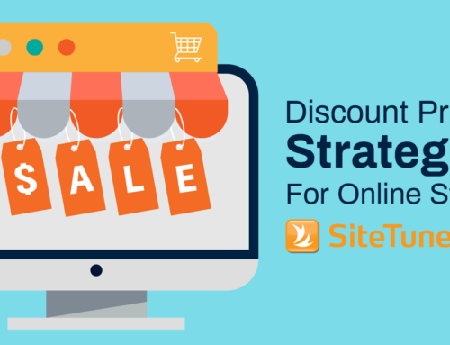
16. Offer E-commerce Discounts Strategically
Discounts can be a boon for conversions, but you don’t want to overuse this tool. Companies that rely on discounts too much create a race to the bottom. It can make it more difficult for your website to convert over time if you train customers to wait for discounts.
If you play your cards right, however, discounts can be a powerful tool in e-commerce conversion rate optimization.
What You Can Do
- Don’t offer discounts regularly. If you provide discounts, make sure it’s to get new visitors into the sales funnel, build a relationship with existing customers, reward referrals, or push new platforms.
- Display discounts in a form that will be perceived higher by shoppers. For items below $100, for example, it’s better to show the discount as a percentage.
- Avoid making the promo code box too visually prominent.

ShopDisney.com visually de-emphasizes the promo code field by putting it further down the page, below most folds. The site also mitigates against users leaving and looking for a promo code elsewhere by having a “View Current Promotions” link that launches into a modal.
You need to be very deliberate about how you use discounts, as the benefits of using these right can be great, but the risks are also significant.
Learn more about using discounts to help with e-commerce conversion rate optimization. Read “Discount Pricing Strategies Online Stores Should Consider”.
17. Get Shoppers to Add More to Their Cart
Conversions are not just about getting people to add a particular item to their cart and then proceeding to checkout. Part of what you’re trying to do is optimize order value per customer. That means you need dedicated strategies to maximize item counts and item values in the cart.
What You Can Do
- Bundle products.

Fashion e-commerce website Culture Kings tries to get customers to add more to their cart by offering discounts on pre-bundled products. Their “Summit Bundle” page, for instance, nudges customers to shop an entire look that includes a top, a pair of shorts, and footwear.
- Show related products to maximize order value.
- Offer a discount on a particular price threshold.
- Upsell to the free shipping threshold.
- Allow shoppers to make installment payments.
If you think about the different levers you have for the cart and carefully run experiments to validate ideas, you won’t end up leaving money on the table.
Learn more about increasing the average order value to help with conversion rate optimization for e-commerce. Read “4 Ways to Get Customers to Add More to their Shopping Carts”
18. Optimize Your E-commerce Checkout Experience
It takes quite a bit of work to get a healthy number of visitors to the checkout screen. You need a plan to ensure that a decent number of people proceed to purchase from you after they get there.
What You Can Do
- Get the e-mail address early in the checkout process. This way, even if the visitor leaves without completing the form, you have a way to contact them and nudge them to go back to the cart and convert later on.
- Limit distractions. Once shoppers are on the checkout screen, reduce the number of elements you present to a bare minimum.
- Set user expectations. Show a progress bar and the next steps, and communicate what each step entails by using clear and specific labels.
- Show additional charges as early as possible. Surprising potential customers late in the game can result in them getting annoyed and leaving.
If you put in the work to reduce friction during checkout and plan for shoppers who’ll leave without completing the purchase, you’ll maximize your bottom-of-the-funnel opportunities.
Learn how to optimize your checkout experience for both those who are ready to convert and those who can be convinced to checkout at a later time. Read “E-commerce Checkout Best Practices to Consider to Increase Conversions”.
19. Offer Different Shipping Options
The products you offer are not the only things that can make or break a deal. According to Shopify’s “The Future of Commerce Trend Report 2022”, fulfillment has a significant influence on shoppers’ decision to buy online.
So, even if you have something the visitor wants, you can still fail to get a conversion by offering poor shipping options.
What You Can Do
- 75% of consumers worldwide are significantly influenced by free shipping. If you offer free shipping for a price threshold or for a particular deal, ensure that your free shipping messaging is impossible to miss.
- Offer shipping options that match your audience’s needs. Fast shipping influences 60% of global shoppers. However, fast shipping is a relative term.
A Narvar study conducted among US consumers in September 2020 showed that 88% of shoppers expect online orders to arrive in 3 or more days.
So, it’s imperative that you know your audience and what their expectations are to create your shipping strategy. For instance, Gen Z and millennial customers tend to want to receive their orders faster and will be more willing to pay for expedited shipping than older shoppers.
- Partner with third-party logistics providers (3PLs). Leverage their fulfillment networks to meet the demand of consumers for fast shipping.
- Provide local delivery, BOPIS (buy online, pickup in-store) or click-and-collect as options. Shopify data from 2020 shows that customers who choose local pickup are 13% more likely to push through with online transactions. They also spend 23% more than shoppers who pick regular shipping.
If the price points are similar between you and your competitors, shipping details can tip the scales one way or the other. Getting this part of the experience right can be a big boon to your e-commerce conversion rate optimization efforts.
20. Clearly Communicate Delivery Times to Boost E-commerce Conversions
Another factor that can help conversion rate optimization for your e-commerce website is the visibility of delivery timelines during checkout.
In the 2021 Shopify eCommerce Market Credibility Study, 45% of shoppers say that an estimated delivery time is something that’s important for them to see during checkout.
What You Can Do
- Show estimated delivery times. This is one of the top considerations for online shoppers when making purchasing decisions. By not showing an expected time of delivery, you’re leaving money on the table.
- Mitigate delays by managing expectations. Shoppers are aware that supply chain problems are resulting in shipping delays. And they’re more supportive of brands that communicate accurate shipping times. Be very specific about delivery and shipping information. Keep the customer updated every step of the way. Inform them when the product has been packaged, when it has left the warehouse, and when it’s out for delivery, for instance. This can be done through a series of e-mails or SMS using post-purchase automation tools.

American Eagle’s checkout page nudges customers to complete the purchase sooner rather than later. The shipping method section indicates the dates when the customer can expect to receive the product if they order by 1PM EST.
Transparency around delivery times is also something that can positively impact customer retention and lifetime value. A Shopify survey conducted in 2020 revealed that 69.7% of customers would be less likely to shop with a company again if they experience a delayed package and are not informed about it.
Proactive and well-timed communication is key to keeping the shopper’s confidence in your brand in the face of shipping delays.
21. Pay Attention to Your Thank You Page
For most sites, the Thank You page is an afterthought, a place to send people who completed a transaction that does not deserve a lot of thought.
Seasoned online marketers, however, understand that it’s so much more than that. It’s a page that can be used to build goodwill, affirm the customer’s decision to buy from the company, and in the right hands, a section to sell additional products.
What You Can Do
- Keep the customer hyped about the purchase by reminding them what they’re getting out of the transaction.
- If your technology can handle it, recommend related products that the customer may also be interested in.
- Ask the customer to download your app, if you have one, or visit your blog.
- Ask the shopper to join your loyalty or rewards program, if they aren’t a member yet. Don’t miss the opportunity to leverage the customer’s excitement – a customer who signs up for your loyalty program is 47% more likely to make a second purchase from you than a shopper who doesn’t.

Aside from providing the transactional details, Williams Sonoma’s Thank You page also encourages continued engagement by nudging the shopper to join a rewards program and by presenting product recommendations. The Thank You page also keeps the customer excited by showing product details (including the product image) along with discounts that the shopper enjoyed.
A Thank You page can be transformed from a throwaway page to a revenue generator when given enough attention.
22. Optimize the Entire Post-Purchase Experience
A good marketer optimizes transactions; a great marketer optimizes customer lifetime value (CLTV). It’s more expensive to get new customers than it is to retain existing ones, so you should definitely not stop caring about the user experience when a visitor becomes a customer.
What You Can Do
- Optimize transaction emails. Give the customer order information they need, but also work on getting a fraction of your customers to become mailing list subscribers.
- Ask for feedback after some time, to get reviews and testimonials and build social proof.
- Use emails for upsells and cross-sells, but ensure you get the timing right. Estimate when customers need to be reminded about replenishment or a product upgrade.
- Tap into the “unboxing phenomenon”. Consider how you can make packaging exciting. This can influence shoppers to share your products on social media and to buy from you again. You’ll need to strike a balance between branded and sustainable packaging, however.
With advertising and acquisition costs rising, it’s critical to optimize for CTLV rather than individual transactions.
Learn more about improving the post-purchase experience to help with conversion rate optimization for e-commerce. Read “5 Tips to Improve the Post-Purchase Experience of Your Online Customers”.
23. Show your Corporate Social Responsibility (CSR)
A Corporate Social Responsibility (CSR) or an Environmental, Social, and Governance (ESG) presence can enhance your standing with the visitor.
GreenPrint’s Business of Sustainability Index (with data collected in March 2022) showed that 75% of American consumers are “concerned about the environmental impact of the products they buy“. Meanwhile, 66% of the respondents expressed a willingness to pay more for environment-friendly products.
Shoppers’ willingness to support purpose-driven brands is also starting to translate into sales. Consider these numbers from the 2021 Shopify eCommerce Market Credibility Study:
- 44% of shoppers opted to buy from companies that are serious about sustainability
- 41% of consumers chose to purchase from brands that are committed to social causes
What You Can Do
- Use real images of your employees on outreach programs rather than stock photography.
- If your brand takes ESG seriously, you can display third-party certifications or proof points in key areas of your website. These elements need to be visible because they influence a shopper’s buying decision.
- Use compostable, recyclable, or reusable packaging. Shopify data from 2021 showed that 46% of shoppers are more likely to buy a product online if they can recycle the product packaging.

Toms highlights the causes it supports from their homepage to the shopping bag until the checkout page. The reminder that they donate 1/3 of their profits is also strategically located close to the call-to-action buttons.
Think through how you’re going to tactfully convey your company’s fair practices or your concern for the community and the environment. If you do this well, you can leave a good impression and enhance your chances of converting.
24. Use Behavior-Triggered Popups
No matter how good your website is, you’ll have e-commerce shoppers on the fence who are going to close the browser or tab without converting. If your marketing technology stack is developed enough, you don’t have to treat all those visitors as lost causes. You can make a last-ditch attempt to get a fraction of them back.
What You Can Do
- Ensure that you have the technology to launch popups based on conditions (e.g. visitor has viewed at least 3 pages).
- If a visitor shows exit intent (i.e. the visitor appears to be getting ready to close the browser or tab), show a popup modal to try and get the visitor to stay. Or, get their e-mail address to continue engaging with them after they leave the site.
- Test a few different offers to learn which ones get visitors to stay the most.
Behavior-triggered popups won’t turn an underperforming site into a high-conversion digital touchpoint. However, used correctly, the popups can help you get small conversion wins.
25. Up Your Social Commerce Game
Social commerce, or buying and selling directly within a social media platform, is on the rise worldwide.
According to a study by Accenture, global social commerce sales reached $492 billion in 2021. That number is expected to reach $1.2 trillion in 2025.
Given that a typical social media user spends an average of two and a half hours per day on their favorite platform, this might be a market your brand cannot afford to ignore.
What You Can Do
- Know where your target market is. Instagram and Tiktok shopping might be all the rage, but it doesn’t automatically mean that you should set up shop there. Determine where it makes the most sense for you to sell first.
- Consider hosting Livestream shopping events. Investigate if there’s a need for live streams for your brand based on your customer’s buying behavior and their attitude towards live streams.
- Engage through live chat. Considering the amount of time people spend on social media platforms, it makes sense to let them easily reach your brand through live chat in social apps.
- Apply UX best practices to your social shop. Make your shop easy to navigate, for instance. Consider having product categories that users can utilize to drill down and find the product they need.
- Show your products in context. One reason shoppers are drawn to live streams is the ability to see the product in context. They even request the host to put on an outfit, for instance, to get a sense of the fit and drape of the material.
Even if you don’t hold Livestream shopping events, you can nudge shoppers to buy an item by showing it in a lifestyle setting in your social media content. This way, consumers can visualize how a piece of clothing would look on them, or how an accessory would look when paired with different outfits.

Petite Studio, a clothing company that caters to women 5’4” and under, shows their products in the context in their “Tuesday Try-on” Instagram Stories.
Regardless of which social platform you sell on, you’ll have more success if you keep e-commerce usability and user experience best practices in mind. Be personable, make navigation easy, take advantage of the power of images and videos, and leverage social proof.
Conclusion: E-commerce Conversion Rate Optimization in the New Normal
The pandemic increased the pool of users who shop online. That said, it also increased the number of businesses that compete for online attention.
Brick-and-mortar shops that used to not be a part of your competition are now bidding on keywords you’re bidding on, paying for social media boosting to steal shares away from your social audience, and paying for display campaigns that used to be exclusive to you and your old competitors.
All of this is driving up the cost per acquisition, so it’s imperative that you eliminate the leaky parts of your sales bucket. It’s important that every part of your e-commerce experience gets reviewed and optimized.
E-commerce players need to increase conversion rates as the costs of digital ads and the number of organizations competing for eyeballs rise. Companies also need to think long-term and strengthen brand-building efforts, as those with strong brand awareness and loyalty are likely to weather online or offline disruptions.
Subscribe to the SiteTuners Weekly EmailGrow Your Business Exponentially with Proven Conversion Rate Optimization Expertise. |